


Current state and future state text boxes powerpoint slide backgrounds
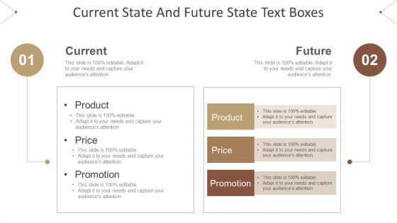





Try Before you Buy Download Free Sample Product
 Impress Your
 Audience
 100%
100% Editable
 Save Hours
 of Time


Our Current State And Future State Text Boxes Powerpoint Slide Backgrounds are available round the clock. Always have help at hand.
People who downloaded this PowerPoint presentation also viewed the following :
Current state and future state text boxes powerpoint slide backgrounds with all 6 slides:
Create an intimate atmosphere with our Current State And Future State Text Boxes Powerpoint Slide Backgrounds. Get folks to feel closely connected.

FAQs for Current state and future state text boxes
Effective textbox background design principles include maintaining sufficient contrast for readability, using subtle colors that complement your presentation theme, ensuring consistency across slides, selecting appropriate opacity levels, and choosing backgrounds that don't compete with text content. These design elements enhance visual hierarchy by creating clear content separation, improving audience focus, and delivering professional aesthetics, with many presenters finding that strategic background choices significantly boost message clarity and overall presentation impact.
Color psychology significantly influences textbox effectiveness by guiding user attention, conveying brand personality, establishing visual hierarchy, and triggering emotional responses that impact engagement rates. Strategic color choices enhance user experience by reducing cognitive load, improving form completion rates, and building trust, with many organizations finding that warm colors encourage action while cool tones suggest reliability and professionalism.
**INPUT**: What are the best practices for choosing contrasting colors for textbox backgrounds to enhance readability? **OUTPUT**: Best practices include maintaining 4.5:1 contrast ratios between text and backgrounds, using neutral or light backgrounds with dark text, avoiding saturated colors that strain eyes, and testing across different devices and lighting conditions. These approaches enhance user experience by ensuring accessibility compliance, reducing visual fatigue, and improving form completion rates, with many organizations finding that strategic color choices ultimately deliver better engagement and usability across diverse audiences. **Word count: 60 words**
Typography interacts with textbox background design through contrast ratios, font weight selection, color harmony, and visual hierarchy principles to direct audience focus effectively. Strategic combinations enhance readability while creating focal points, with marketing teams and web designers finding that proper typography-background pairing increases engagement rates, improves message retention, and ultimately delivers stronger audience attention and conversion outcomes.
Whitespace in textbox background layouts enhances readability, reduces visual clutter, and guides user attention to input fields through strategic spacing around elements. Effective whitespace implementation streamlines user interactions by creating clear visual hierarchy, improving form completion rates, and delivering better user experiences, with many designers finding that generous spacing ultimately increases conversion rates and reduces input errors.
Current textbox background trends include subtle gradients, soft drop shadows, transparent overlays, rounded corners, and minimalist borders with strategic white space. These design elements enhance readability while maintaining visual appeal, with many presentation designers finding that muted color palettes and clean geometric shapes deliver professional aesthetics and improved audience engagement.
Gradients and textures enhance textbox backgrounds when applied subtly, using low opacity overlays, gentle color transitions, and minimal contrast ratios that maintain readability. Effective implementation involves choosing muted gradients that complement brand colors, applying subtle paper or fabric textures at 10-20% opacity, and ensuring sufficient contrast between background elements and text, with many designers finding that soft radial gradients and watermark-style textures deliver visual interest while preserving content clarity.
**INPUT**: What technical considerations should be taken into account for creating responsive textbox backgrounds for different devices? **OUTPUT**: Creating responsive textbox backgrounds requires considering viewport scaling, touch target sizing, CSS media queries, image compression ratios, and cross-browser compatibility standards. These technical elements streamline user experiences by ensuring consistent visual performance, optimal loading speeds, and seamless interaction across mobile, tablet, and desktop platforms, ultimately delivering enhanced usability and professional presentation quality.
Branding elements integrate into textbox backgrounds through subtle watermarks, brand color gradients, light pattern overlays, and strategically placed logos that don't interfere with text readability. Many companies successfully use transparent brand motifs, complementary color schemes, and minimalist design approaches, ultimately delivering consistent brand recognition while maintaining optimal user experience and interface functionality.
Common textbox background mistakes include using overly bright colors, insufficient contrast with text, busy patterns that distract from content, inconsistent styling across slides, and backgrounds that clash with overall design themes. These errors reduce readability and professional appearance, with many presenters finding that subtle gradients, muted tones, and consistent transparency levels enhance audience focus while maintaining visual hierarchy and brand coherence.
Textbox background shape and size significantly influence audience engagement by directing attention, establishing visual hierarchy, and enhancing readability across different content types. Rounded shapes create approachability for customer testimonials, while angular designs convey professionalism in corporate presentations, with many organizations finding that appropriately sized backgrounds improve information retention and overall audience focus.
Imagery in textbox backgrounds can both enhance and detract from messages, depending on implementation strategy, contrast levels, and content alignment. While subtle, relevant visuals can reinforce brand messaging and create emotional connections, overly complex or high-contrast images often reduce text readability and distract from key information, with many designers finding that semi-transparent overlays and carefully selected imagery ultimately deliver better user engagement.
**INPUT**: What tools and software are recommended for designing custom textbox backgrounds? **OUTPUT**: Recommended tools include Adobe Photoshop, Illustrator, Figma, Canva, and Sketch, offering comprehensive design capabilities for creating professional textbox backgrounds. These platforms streamline the design process by providing pre-built templates, gradient tools, and texture libraries, with many designers finding that Figma and Canva particularly enhance workflow efficiency for scalable UI projects. **Word count: 54 words**
Accessibility considerations inform textbox background design through sufficient color contrast ratios, clear visual boundaries, focus indicators, and compatibility with screen readers. These design principles ensure users with visual impairments, color blindness, or motor difficulties can navigate forms effectively, with many organizations finding that accessible design ultimately delivers better user experiences and broader market reach.
Innovative textbox backgrounds include gradient overlays with subtle animations, geometric patterns that align with brand identity, textured surfaces like paper or fabric effects, semi-transparent color blocks, and interactive hover states with shadow depth. These design approaches enhance user engagement by creating visual hierarchy, improving readability through strategic contrast, and delivering memorable brand experiences, with many digital platforms finding that thoughtfully designed textboxes significantly increase form completion rates.
-
Unique research projects to present in meeting.
-
Graphics are very appealing to eyes.