

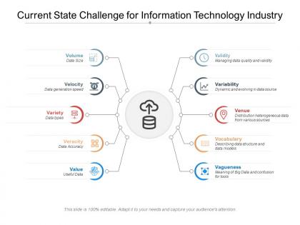
Current state challenge for information technology industry




Try Before you Buy Download Free Sample Product
 Impress Your
 Audience
 100%
100% Editable
 Save Hours
 of Time


You don't have to be a natural communicator to create an impression with your presentations. Let our Current State Challenge For Information Technology Industry do the hard work for you. Don't be surprised at the many feedbacks you receive after the presentation.
People who downloaded this PowerPoint presentation also viewed the following :
Current state challenge for information technology industry with all 2 slides:
How good your presentation looks can give you that air of confidence that is sure to make your audience gain interest in what you present. This level of confidence can only come with professionally created Current State Challenge For Information Technology Industry like what you get at our site.
FAQs for Current state challenge for
Common challenges include content overcrowding, template customization limitations, maintaining visual consistency across slides, ensuring brand alignment, and adapting pre-designed layouts to specific messaging needs. Many presenters find that balancing template efficiency with personalization requires strategic content planning and design modifications, ultimately delivering more impactful presentations when templates complement rather than constrain their communication objectives.
The choice of presentation template significantly impacts audience engagement by establishing visual hierarchy, reinforcing brand credibility, and creating emotional connection through design elements. Well-designed templates enhance message clarity, reduce cognitive load, and maintain attention spans, while poorly chosen templates can distract from content, undermine professional credibility, and ultimately decrease audience retention and comprehension rates.
Cultural differences significantly influence presentation template effectiveness through varying color interpretations, reading patterns, hierarchy expectations, visual preferences, and communication styles. Templates designed for Western audiences may underperform in Asian markets where red symbolizes prosperity rather than danger, or in cultures preferring collective decision-making frameworks over individual achievement metrics, ultimately requiring localized adaptations for maximum engagement.
Ensuring template alignment with corporate branding guidelines requires establishing clear brand standards, including logos, color palettes, typography, and messaging tone, then systematically applying these elements across all template designs. Organizations can streamline this process by creating brand asset libraries, conducting regular compliance audits, and training design teams on brand specifications, ultimately delivering consistent brand experiences while minimizing costly redesigns and maintaining professional credibility.
Best practices for customizing templates include maintaining consistent branding elements, adapting layouts to content hierarchy, preserving visual balance while modifying sections, and ensuring scalability across different presentation lengths. These approaches streamline content creation by reducing design time, enhancing professional consistency, and enabling teams to focus on message delivery rather than formatting, with many organizations finding that strategic template customization significantly improves their presentation efficiency.
Technology issues pose challenges by causing compatibility problems across different software versions, file corruption during transfers, and formatting inconsistencies when sharing templates between platforms. These technical barriers can disrupt presentation workflows, delay project timelines, and compromise visual integrity, with many organizations finding that standardizing software environments and maintaining updated systems helps minimize disruptions while ensuring seamless collaboration.
Visual hierarchy addresses presentation challenges by organizing content through strategic use of size, color, contrast, positioning, and typography to guide audience attention and comprehension. This approach enables presenters to eliminate confusion, reduce cognitive load, and enhance message retention, with many organizations finding that well-structured visual flows significantly improve stakeholder engagement and decision-making outcomes.
Presenters can avoid template overuse pitfalls by customizing designs to match their brand identity, varying layouts across different sections, and strategically modifying color schemes and typography. While templates provide valuable structure, successful presenters balance efficiency with personalization, ensuring their presentations maintain visual interest and authenticity, ultimately delivering more engaging and memorable audience experiences.
**INPUT**: What strategies can enhance the clarity of information presented within a template? **OUTPUT**: Effective clarity strategies include consistent formatting, strategic white space utilization, logical content hierarchy, simplified language, and visual elements like icons or charts. These approaches streamline information flow by reducing cognitive load, enhancing readability, and guiding audience attention, with many organizations finding that well-structured templates significantly improve communication effectiveness and audience engagement. [Word count: 54 words]
Peer feedback can improve template effectiveness by identifying unclear messaging, design inconsistencies, structural weaknesses, and audience alignment gaps through collaborative review sessions. This iterative approach enables organizations to refine visual hierarchy, enhance content clarity, and optimize user experience, with many teams finding that structured peer evaluations ultimately deliver more compelling presentations and stronger stakeholder engagement.
Different industries face unique template challenges through varying compliance requirements, audience expectations, brand guidelines, and content complexity. Healthcare and financial sectors need regulatory-compliant designs, while creative agencies require visually striking templates, and manufacturing companies focus on data-heavy presentations, with many organizations finding that industry-specific templates ultimately deliver better stakeholder engagement and professional credibility.
Presenters maintain authenticity by customizing templates with their unique content, personal stories, and brand elements, while using the structure as a foundation rather than a constraint. Through strategic color adjustments, personalized examples, and individual speaking style integration, professionals transform generic designs into authentic presentations that reflect their expertise, ultimately delivering more engaging experiences while maintaining professional polish.
Accessibility in presentation template design ensures inclusive communication by incorporating high contrast ratios, readable fonts, alternative text for images, keyboard navigation support, and screen reader compatibility. These design considerations enable organizations to reach broader audiences, comply with legal requirements, and demonstrate social responsibility, while ultimately delivering more effective presentations that engage diverse stakeholders and enhance overall user experiences.
Multimedia integration mitigates data representation challenges by enhancing comprehension through visual storytelling, reducing cognitive load with interactive elements, and accommodating diverse learning preferences through multiple sensory channels. These approaches streamline complex information processing, with organizations in healthcare, finance, and education finding that combined text, visuals, and audio ultimately deliver faster decision-making and improved stakeholder engagement.
Effective techniques include visual hierarchy through consistent fonts and colors, strategic white space utilization, complementary imagery that reinforces key points, and balanced slide layouts with clear focal points. These design principles enhance comprehension by guiding audience attention naturally, reducing cognitive load, and creating memorable visual anchors, with many presenters finding that thoughtful aesthetic choices ultimately strengthen message retention and audience engagement.
No Reviews