


Effective Content Strategy For Improving Buyers Journey




Try Before you Buy Download Free Sample Product
 Impress Your
 Audience
 100%
100% Editable
 Save Hours
 of Time


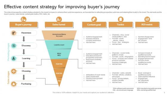
The slide showcases the content strategy adopted by the brand company to enhance their customer experience, as it assists them in attracting prospective customers and retaining their loyalty to the brand. The elements are the buyers journey, sales funnel, content goal, tactics, ROI metric, etc.
People who downloaded this PowerPoint presentation also viewed the following :
Effective Content Strategy For Improving Buyers Journey with all 9 slides:
Use our Effective Content Strategy For Improving Buyers Journey to effectively help you save your valuable time. They are readymade to fit into any presentation structure.








FAQs for Effective Content Strategy For
Honestly, start with figuring out who you're actually talking to - that's everything. Once you know your audience, work backwards from their problems to build content that hits. Your story needs to flow logically, obviously, but don't underestimate how much visuals matter for keeping people awake. Oh, and please don't make it a 2-hour slog when you could've just sent an email - timing is huge. I always map out what's bugging my audience first, then structure everything around solving those specific pain points. Makes the whole thing way more compelling.
Dude, stories are honestly a game-changer for presentations. People's brains are wired for narratives - we'll zone out during bullet points but stay glued when there's conflict and resolution. I saw this speaker once who turned boring sales data into a customer's problem-solving journey, and honestly? Still remember it years later. What works is framing each section like "Here's what happened when..." instead of just dumping facts. Your audience will actually care about the outcome. Random thought - maybe that's why TED talks feel so different from corporate presentations? Anyway, try it and you'll see engagement jump immediately.
Honestly, audience analysis is everything - like having a map instead of driving blind. You can't just create random content and expect people to care. Survey your current customers first, or check your analytics to see what's already hitting. Once you know their actual problems and how they behave online, everything else falls into place. Your topics, tone, where you post it - all of that gets so much easier. I learned this the hard way after spending months creating stuff nobody wanted. Trust me, do the research upfront.
Don't just throw visuals on after you write - plan them from the start. Figure out what emotion you're going for first, then pick visuals that actually hit those feelings. Infographics work great for data stuff, behind-the-scenes shots feel more real, videos tell stories better. Honestly, people scroll so ridiculously fast that your visual is probably what stops them before they even read anything. Make sure everything matches your brand vibe and actually helps your message instead of just taking up space. Oh, and create some templates so you're not reinventing the wheel every single time.
So I'd focus on two main things - what happens during your talk and what comes after. During the presentation, watch for questions, participation, how long people stay engaged with each part. The follow-up stuff is honestly more telling though. Send surveys to see what stuck, check if people actually changed their behavior or did what you asked. Social shares are pretty gold too - shows they found it worth passing along. Oh, and set your benchmarks beforehand or you'll be kicking yourself later trying to figure out what success looks like. Just pick 3-4 things max and actually stick to tracking them.
Quarterly is the bare minimum, but monthly check-ins are way better if you can manage it. Things change so damn fast online that waiting longer means you're just guessing at what works. I usually peek at my metrics monthly - super quick, just to see if anything's totally bombing or surprisingly killing it. Then do the big strategic reviews twice a year when you're launching something new or need to pivot hard. The monthly stuff doesn't have to be fancy, maybe 30 minutes max? Just set a phone reminder or you'll definitely forget like I always do.
Get straight to your point right away - nobody has time for fluff. Pick 3-5 main ideas max because honestly, people zone out after that. Do the classic "preview, present, recap" thing. I know it feels repetitive but trust me, it works. Your slides should be mostly visuals, not walls of text (we've all sat through those painful presentations). Make sure you clearly transition between sections so people don't get lost. Oh and here's something that actually helps - recap each section before jumping to the next one. Sounds obvious but most people skip this step.
Honestly, user-generated content is gold for presentations. Way more convincing than your own marketing stuff. Grab real customer reviews, social media posts, photos of people actually using your product. Screenshots of positive tweets work great as slide backgrounds too. Your customers basically do the selling for you – which sounds lazy but it's actually genius because people trust other customers more than companies. Oh, and definitely ask permission if the posts aren't public already. I'd do like one slide per main point with actual user feedback.
Start with WordPress or HubSpot as your base - that's non-negotiable. Google Analytics is obviously crucial for seeing what content actually hits. Buffer or Hootsuite will literally save your life when it comes to scheduling posts. I swear by Canva for quick graphics when our designer's swamped. For SEO stuff, SEMrush or Ahrefs are solid for keyword hunting. Oh, and Asana keeps my editorial calendar from turning into complete chaos. Pro tip: grab the free versions first. You'll figure out which features you actually need before dropping money on upgrades.
Dude, just watch the room and adapt as you go. If it's Monday morning, acknowledge that everyone looks dead inside before jumping into your slides. Tell stories they'll actually relate to - their struggles, not some generic case study. Most people bomb because they totally ignore the human side of things. Short sentences work when people are zoning out. Notice the glazed-over expressions? Switch to something interactive or throw in a joke. I mean, you're not just dumping info on them. Make them feel like you actually get what they're going through. That's honestly what separates good presenters from boring ones.
Ugh, remote presentations are the worst because you're literally talking to black squares. No clue if people are nodding along or making lunch. Your attention-grabbing content becomes even more critical since everyone's distracted by their dog/kids/whatever. I always frontload my best stuff now before people zone out completely. Also - and this took me way too long to figure out - you've got to build in way more interaction. Ask questions every few minutes. Use bigger, bolder visuals. Those natural pauses where you'd normally read faces? Gone. So you'll need to create artificial checkpoints instead.
Start by looking at your recent presentations - you'll spot the inconsistencies right away. Then make a brand voice guide with actual examples your team can steal from. Key phrases, tone samples, messaging pillars - stuff that works whether you're doing sales decks or conference talks. Most companies way overcomplicate this honestly. Create templates and quick reference sheets so people aren't guessing. Oh, and do regular check-ins because teams drift off-brand faster than you'd think. The whole point is having guidelines that actually get used, not some 50-page document gathering dust.
Honestly, interactive presentations are where it's at now - people want way more than boring static slides. Micro-animations are big too. AI design tools are making it super easy for anyone to create decent-looking decks, which is cool but also means everyone thinks they're a designer now lol. Data storytelling is huge - you can't just throw charts at people anymore, you need actual narratives around your numbers. Oh and mobile-first design matters since half your audience will probably view it on their phone anyway. Try messing around with Figma or Canva's presentation stuff to stay ahead of things.
Ugh, yeah cultural stuff is way trickier than people think. You can't just translate content and hope for the best - everything needs tweaking. White means mourning in some Asian countries but purity here, which is wild. Your visuals, messaging, even the way you format posts has to match local vibes. Don't forget their holidays and business customs too - posting during Ramadan without thinking it through is... not great. Honestly, find local people to work with who can catch your mistakes before you embarrass yourself. The research upfront saves you from so many headaches later.
Oh god, the worst thing you can do is dump everything you know into one presentation. Your audience will check out immediately. I see people mess this up all the time - they jump straight into making pretty slides before figuring out their actual message. Big mistake. Also, don't assume everyone has the same background knowledge you do. That's how you lose people. Stick to 3-5 main points tops. Figure out your transitions so it actually flows. And here's the thing - start with what THEY care about, not whatever you think is coolest about the topic.
-
Appreciate the research and its presentable format.
-
SlideTeam is my one-stop destination for templates. Highly recommended!