

Financial graph for current and quick ratio over the years




Try Before you Buy Download Free Sample Product
 Impress Your
 Audience
 100%
100% Editable
 Save Hours
 of Time


Enable the gullible to avoid being cheated with our Financial Graph For Current And Quick Ratio Over The Years. Caution them in a convincing fashion.
People who downloaded this PowerPoint presentation also viewed the following :
Content of this Powerpoint Presentation
Description:
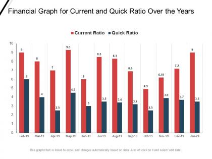
The image shows a bar graph titled "Financial Graph for Current and Quick Ratio Over the Years". This graph presents two sets of data points for each month from February 2019 to January 2020. The red bars represent the Current Ratio and the blue bars represent the Quick Ratio, both of which are important liquidity ratios in financial analysis.
The Current Ratio measures a company's ability to pay short-term obligations with short-term assets, while the Quick Ratio (also known as the Acid-test Ratio) measures a company's ability to pay short-term obligations with its most liquid assets. The higher the ratio, the better the company's liquidity position.
The notation at the bottom indicates that the graph is interactive and can be updated by linking to an Excel spreadsheet. It suggests that clicking on the chart allows the user to edit the underlying data.
Use Cases:
This type of financial analysis slide can be useful in multiple industries:
1. Banking:
Use: Analyzing clients' financial health for lending decisions.
Presenter: Financial Analyst.
Audience: Credit Committee.
2. Investment:
Use: Evaluating potential investment opportunities.
Presenter: Investment Manager.
Audience: Investors, Portfolio Managers.
3. Manufacturing:
Use: Reviewing financial stability and operational efficiency.
Presenter: CFO or Finance Director.
Audience: Board Members, Shareholders.
4. Retail:
Use: Monitoring liquidity for inventory management and operations.
Presenter: Retail Financial Controller.
Audience: Operations Management, Finance Teams.
5. Healthcare:
Use: Managing hospital or clinic liquidity for medical supplies and payroll.
Presenter: Healthcare Administrator.
Audience: Department Heads, Financial Staff.
6. Technology:
Use: Financial performance tracking for fast-moving tech firms.
Presenter: CFO or Finance Team Lead.
Audience: Executive Leadership, Stakeholders.
7. Consulting:
Use: Advising clients on financial performance and improvement strategies.
Presenter: Financial Consultant.
Audience: Client Management Teams, Stakeholders.
Financial graph for current and quick ratio over the years with all 2 slides:
Identify attempts at cheating with our Financial Graph For Current And Quick Ratio Over The Years. Ensure the gullible don't get fooled.
FAQs for Financial graph for current and quick ratio
Look at profitability stuff first - ROE and profit margins are key. Current ratio and quick ratio tell you if they can pay their bills. Debt-to-equity shows how much they owe vs own. P/E and P/B ratios matter too for valuation. Honestly there's like a million different ratios and I got lost in them at first. Focus on those main ones though - they'll show you if a company makes money, stays afloat, and isn't stupidly overpriced. Don't just look at the numbers alone. Compare them to competitors and industry averages, that's where you'll actually learn something useful.
So liquidity ratios are pretty straightforward - they tell you if a company can actually pay its bills on time. Current ratio takes all current assets and divides by current liabilities. Anything over 1.0 means they're good. Quick ratio is way more strict though - it kicks out inventory since that stuff doesn't always turn into cash fast. Honestly, I trust quick ratios more. Look for current ratios around 1.5-2.0 and quick ratios above 1.0. Those are solid benchmarks that won't steer you wrong.
So debt-to-equity ratio is just total debt divided by total equity - shows how a company funds itself. Higher numbers mean they're borrowing more, which can boost profits but gets risky fast. I always look at this when checking out stocks, honestly it tells you a lot about management style. Most companies sit around 0.3-0.6 and that's pretty solid. Tech firms usually stay way lower though. Don't just look at the number alone - compare it to similar companies in the same industry since what's "normal" is totally different between, say, utilities and software companies.
So profitability ratios are basically how you figure out if a company actually makes money or just looks busy. Net profit margin shows what percentage of sales becomes real profit after paying for everything - rent, salaries, that expensive coffee machine in the break room. If it's dropping, management's probably screwing something up. ROE is better though because it shows how well they use shareholder cash to generate returns. Companies with consistently high margins usually have their costs under control and can charge decent prices. Don't just look at one year's numbers - compare to competitors and check the 3-5 year trend.
Think of activity ratios as your business health check - they show how well you're turning assets into actual sales. Inventory turnover? That's how fast you're moving products. A/R turnover tells you if customers are paying up quickly or dragging their feet (which honestly drives me crazy). Higher numbers usually mean you're managing things well - no cash trapped in dead inventory or overdue invoices. Though watch out for ratios that are TOO high, might mean you're being overly aggressive. Check yours against what others in your industry are doing to spot where you could improve.
Look, every industry works totally differently - that's why their numbers are all over the place. Like, a 2% profit margin would be amazing for a grocery store but pretty awful for a software company. Business models just aren't the same. Your debt-to-equity ratio might look scary until you realize everyone in manufacturing carries way more debt than, say, consulting firms do. That's why you've gotta compare apples to apples with your competitors first. Bloomberg's good for this stuff, or check industry associations. Don't make big moves without knowing what "normal" actually looks like in your space.
Look, ratios are just showing you what already went down - they're backwards-looking snapshots. It's like trying to drive while staring at your rearview mirror, which is fine until there's a curve coming up. They miss so much stuff too - how good is management? What about new competitors or tech that could kill the business? Companies can also mess with their numbers to make things look rosier than they actually are. Plus comparing ratios between companies gets weird when they use different accounting tricks. Honestly, ratios are a decent starting point but you've gotta dig way deeper into the actual business before putting your money anywhere.
So DuPont analysis basically splits ROE into three parts: profit margin, asset turnover, and how much debt they're using. Way more useful than just staring at one ROE number. Picture this - two companies both hit 15% ROE. DuPont shows you Company A is crushing it with fat margins, while Company B is just piling on debt to juice returns. Totally different stories, right? You multiply those three ratios together to rebuild the ROE. Makes it obvious which knobs management is actually turning. Honestly saved me from some sketchy investments before.
So solvency ratios are basically how you figure out if a company won't go broke anytime soon. Interest coverage shows how many times they can pay their debt interest with what they're earning - you want at least 2.5x, but honestly higher is way better. I always check these when I'm looking at investments because they show if a company's living paycheck to paycheck or actually has their finances together. Don't just look at how much profit they're making though - pair it with these ratios to see the whole picture. Otherwise you might miss that they're drowning in debt payments.
So basically, trend analysis lets you see how a company's doing over time instead of just one random moment. I always look at stuff like debt ratios and profit margins across like 3-5 years minimum - anything less and you're just seeing noise from seasonal stuff. What's cool is you can actually spot trouble brewing before it hits, or find companies that keep getting better quarter after quarter. Way better than those one-time snapshots everyone obsesses over. You'll catch patterns in current ratios and other metrics that tell the real story about where they're headed financially.
Look out for sudden ratio changes that don't match what the company's actually saying happened. Declining profit margins are huge red flags. Same with debt piling up or current ratios dropping off a cliff. Honestly, if their numbers look way better than competitors, I'd be suspicious - seen too many companies play games before earnings. Inventory sitting around longer than usual? That's trouble. Don't just look at one quarter though. You need at least 3-5 years of data to see the real patterns. Quick changes can be misleading, but consistent trends over time? That's where you'll spot the real problems brewing.
You can't really pick good stocks without checking the financial ratios first. P/E shows if you're overpaying, debt ratios tell you if the company's drowning in loans, and ROE reveals how well management actually uses investor money. Don't just look at one though - that's like judging a restaurant only by its Yelp photos. Build yourself a little checklist and stick to it. Honestly, most people skip this step and wonder why their picks tank. These ratios let you compare companies fairly and catch problems before you throw money at them.
Honestly, Excel's still your best bet for most ratio stuff. Build a template once and just plug in your numbers each time. Bloomberg's amazing if your company has it, but that thing costs a fortune. Yahoo Finance works pretty well too for quick dashboards. Oh, and QuickBooks has some decent ratio tools built in - didn't know that until recently. I'd probably just start with Excel since you already know it, then maybe upgrade later if you're doing tons of analysis. The main thing is actually using whatever you pick consistently instead of jumping around between tools.
Look, financial ratios only tell half the story. You might have killer P/E numbers, but what if customers are pissed off or your top employees keep quitting? Those are huge red flags for future performance. Amazon actually ignored short-term profits for years – they just focused on making customers happy, and look how that worked out. Customer satisfaction, employee turnover, market share trends... this stuff gives you early warnings that numbers can't. I'd probably start with 3-5 non-financial metrics that matter most in your industry.
You can't really compare financial ratios if the company keeps switching up their accounting methods between periods. It's like comparing your running times on different tracks - the data becomes meaningless. Revenue recognition changes or switching depreciation methods will totally mess up your trend analysis. I always check those boring footnotes first (I know, super fun) because they'll tell you about any policy changes. Without consistent accounting treatments, you won't know if performance changes are real operational improvements or just accounting tricks. Same methods = reliable comparisons.
No Reviews