

Financial Management Reporting Dashboard Powerpoint Ppt Template Bundles




Try Before you Buy Download Free Sample Product
 Impress Your
 Audience
 100%
100% Editable
 Save Hours
 of Time


Our Financial Management Reporting Dashboard Powerpoint Ppt Template Bundles are topically designed to provide an attractive backdrop to any subject. Use them to look like a presentation pro.
People who downloaded this PowerPoint presentation also viewed the following :
Financial Management Reporting Dashboard Powerpoint Ppt Template Bundles with all 16 slides:
Use our Financial Management Reporting Dashboard Powerpoint Ppt Template Bundles to effectively help you save your valuable time. They are readymade to fit into any presentation structure.
-
Financial Management Reporting Dashboard
-
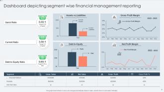
Dashboard depicting segment wise financial management reporting
-
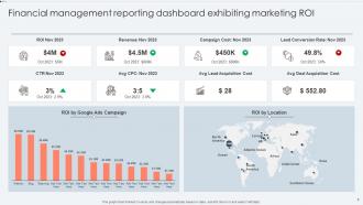
Financial management reporting dashboard exhibiting marketing ROI
-
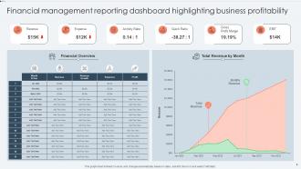
Financial management reporting dashboard highlighting business profitability
-
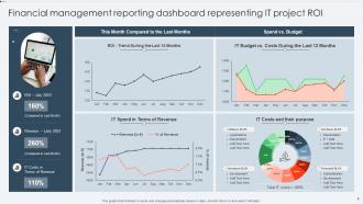
Financial management reporting dashboard representing IT project ROI
-

Financial management reporting dashboard with yearly revenue
-
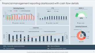
Financial management reporting dashboard with cash flow details
-
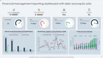
Financial management reporting dashboard with debt and equity ratio
-
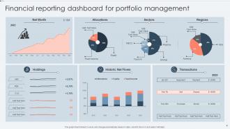
Financial reporting dashboard for portfolio management
-
Icon for financial management reporting dashboard with dollar symbol
-

Thanks for watching
-

-

-

-

-

FAQs for Financial Management Reporting Dashboard Powerpoint
Focus on cash flow tracking first - that's what actually matters. Budget vs actual comparisons and expense categories are must-haves too. Revenue trends and profit margins will give you the big picture, plus you need those receivable/payable summaries. Honestly? I've watched people waste hours building these gorgeous dashboards that look amazing but tell them nothing useful. Real-time updates are nice, daily is fine. Organize it so problems jump out immediately. Oh, and don't get sucked into adding fancy features just because you can - start simple and only add stuff you'll actually use.
So visualization tools basically take those boring spreadsheet numbers and turn them into charts that actually make sense. You can spot patterns instantly instead of staring at endless rows trying to figure out what's happening. Like, are your expenses slowly creeping up? Is revenue always weird in January? Bar charts and line graphs tell completely different stories about your money situation. It's honestly like reading a weather report vs just looking outside - way easier to process visually. The trick is matching the right chart type to whatever you're tracking so you don't get overwhelmed by data.
Cash flow's gotta be your top priority - it's literally what keeps you alive. I'd put current cash, how old your receivables are, and burn rate right up front so you know how much runway you have left. Revenue trends and gross margins are obviously key too. Break down your main expense buckets. Working capital and debt-to-equity ratio should be there as well. The whole point is making quick decisions from one screen. I swear, half the dashboards I see are just fancy charts that tell you nothing useful. If you're still hunting through multiple reports to figure out if you're healthy or not, then honestly you need to start over.
Dude, real-time data integration is basically seeing your money situation as it happens instead of waiting for those ancient monthly reports. Your dashboard connects directly to bank accounts, expense apps, all that stuff - so you're looking at actual current numbers. I've watched teams catch major budget problems before they spiraled into thousands in losses. Honestly way better than playing catch-up with week-old data. You can spot cash flow issues or new opportunities right when they pop up. Start small though - connect your biggest money sources first, then add more later. Total game-changer for making quick decisions.
Honestly? Data integration is gonna be your biggest headache. Finance wants totally different metrics than the C-suite, and good luck getting them to agree on what actually matters. Getting clean data from your ERP, CRM, and accounting systems is a nightmare - everything's in different formats and half of it's probably outdated. Oh, and don't overwhelm people with too much info or they'll just ignore the whole thing. Start small though. Pick your must-have KPIs, nail those first, then add more later. Way less painful that way.
So you get real-time visibility into your spending and revenue, which honestly beats the hell out of those messy spreadsheets we used to rely on. You'll spot variances between actual vs budgeted amounts super fast. The visual charts are a lifesaver when presenting to stakeholders - saves me hours of PowerPoint hell. Plus you can run different scenarios and identify seasonal patterns easily. Oh, and the automated alerts when you're hitting budget limits? Game changer. No more month-end panic attacks. Just make sure you connect your main data sources first, that's like step one.
Honestly, UX can totally make or break a financial dashboard. I've watched so many promising tools turn into expensive dust collectors because the navigation was a nightmare. People need to find their data fast – if key metrics are buried three clicks deep, forget it. Map out what your users actually do most often first, then build around that. Good design feels invisible, you know? Like, users should hit their goals without wrestling with the interface. Oh, and make sure your visual hierarchy makes sense – important alerts need to jump out immediately. Short version: confusing layout equals abandoned dashboard.
Honestly, automation saves you from wanting to throw your computer out the window. Your dashboard pulls data straight from accounting software and updates everything automatically - no more copying and pasting like some kind of data entry robot. I watched my coworker waste 3 hours every Monday doing this manually and it was brutal. Short sentences work better sometimes. The whole thing runs itself, so your numbers stay fresh while you actually get to think about what they mean. Trust me, once you set it up right you'll never go back to the old way.
Honestly, dashboards are game-changers for catching financial problems early. Instead of waiting weeks to spot issues in boring reports, you'll see cash flow weirdness or expense spikes immediately. Everything's in one spot, which beats hunting through endless spreadsheets (trust me on this one). Set up alerts for your danger zones so you're not constantly watching numbers. The key is figuring out your biggest 3-5 risk areas first. Then make sure those metrics are front and center on your main view. Real-time data means you can actually do something about problems before they snowball.
First thing - figure out what metrics your org actually cares about, don't just steal ideas from other companies. Cash flow, budget variance, revenue trends - whatever drives real decisions. I swear half the dashboards I've seen are total eye candy that nobody opens after week one. Group your KPIs logically and keep time periods consistent across charts. Executives will hate you if the screen's cluttered (learned this the hard way). Clean visuals are everything. Test it with real users before you launch - they'll definitely want changes you didn't think of.
So the CFO's gonna want those big-picture KPIs and cash flow stuff for strategy meetings. Department heads? They're all about budget vs actual - trust me, this is where people lose their minds over overspending alerts. Your finance folks need the nitty-gritty transaction details for reporting. Sales managers are obsessed with revenue tracking and commission calcs (obviously). The cool thing is you can set permissions so everyone just sees their slice. No one gets overwhelmed with irrelevant data they don't need. Actually keeps things way cleaner than having everyone access everything.
Tableau and Power BI are your best bets here - both handle financial data really well and create those flashy real-time charts that make executives happy. If your team codes, Python with Plotly Dash gives you way more control over customization. Start by mapping out your data sources first though. That'll help you pick which tool actually works with your systems. I've watched so many teams get stuck debating tools for weeks when they could've just started building! Even Excel with Power Query works fine for basic stuff.
Build validation layers throughout your pipeline first. Set rules to flag outliers and missing values before they hit your dashboard - trust me, I wasted a whole afternoon on a formatting error once. Cross-check totals against source systems daily. Lock down permissions so random people can't mess with your data. Audit trails are boring but necessary. Honestly the manual spot-checks are what saved me most often though. Automation catches the obvious stuff, but you'll still need to eyeball samples regularly. Those weird edge cases? Yeah, only humans catch those.
Honestly, mobile access is a game-changer for finance teams. Your people need to check budget status and cash flow while they're stuck in meetings or traveling - not just when they're at their desks. Being able to pull up key metrics on your phone means you'll catch problems early instead of dealing with fires later. Everyone's used to things working perfectly on mobile anyway, so there's really no excuse. Just make sure the dashboard actually works well on smaller screens and the important stuff is easy to tap. Oh, and test it yourself first - you'd be surprised how many "mobile-friendly" dashboards are basically unusable.
Your dashboard's perfect for catching trends that show where to put money next. Pull your quarterly data first - seriously, you'll be shocked what it reveals about which departments are actually making money vs. just spending it. Cash flow projections and budget variance reports are your best friends here. I'd set up alerts for the big metrics so you're not glued to spreadsheets all day. Profitability by segment tells the real story about priorities. Honestly, once you start digging into this stuff, patterns jump out everywhere.
-
Easily Understandable slides.
-
The best part about SlideTeam is their meticulously prepared presentations (complete-decks and single-slides both), infused with high-quality graphics and easy to edit. All-in-all worthy products.