


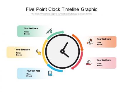
Five point clock timeline graphic




Try Before you Buy Download Free Sample Product
 Impress Your
 Audience
 100%
100% Editable
 Save Hours
 of Time


Toast your views with our Five Point Clock Timeline Graphic. Hear your audience roar their approval.
People who downloaded this PowerPoint presentation also viewed the following :
Five point clock timeline graphic with all 2 slides:
Get down to brass tacks with our Five Point Clock Timeline Graphic. Embed the basics in the minds of your team.
FAQs for Five point
Key elements include clear chronological markers, consistent visual hierarchy, compelling milestone descriptions, strategic color coding, and balanced white space distribution. These design components work together by enhancing readability, guiding audience attention, and creating professional credibility, with many organizations finding that well-structured timelines significantly improve stakeholder comprehension and project buy-in rates.
Timelines enhance storytelling by creating narrative structure, establishing clear progression, highlighting key moments, and providing visual context that guides audience attention. Through interactive elements, milestone markers, and chronological flow, storytellers can deliver more compelling presentations, improve information retention, and create emotional connections, with many organizations finding that timeline-driven narratives significantly increase audience engagement and message comprehension.
**INPUT**: What tools and software are most recommended for creating dynamic timeline presentations? **OUTPUT**: Recommended tools include PowerPoint with advanced animations, Prezi for non-linear storytelling, Timeline JS for web-based projects, Canva for design-focused presentations, and specialized software like Office Timeline. These platforms streamline timeline creation by offering customizable templates, interactive elements, and seamless integration capabilities, with many organizations finding that dynamic timelines enhance audience engagement and deliver more compelling project narratives. **Word count: 59 words**
Industries utilize timelines through Gantt charts for construction phases, milestone tracking in software development, regulatory compliance schedules in healthcare, and product launch roadmaps in manufacturing. These visual tools streamline project management by enhancing stakeholder communication, improving resource allocation, and ensuring deadline adherence, with many organizations finding that structured timeline presentations ultimately deliver greater operational efficiency and competitive advantage.
Timeline design should prioritize visual hierarchy through consistent spacing, clear chronological flow, and strategic use of color coding to distinguish different phases or categories. These principles enhance comprehension by minimizing cognitive load, emphasizing key milestones with visual weight variations, and maintaining clean layouts, with many organizations finding that simplified designs ultimately deliver faster decision-making and improved stakeholder alignment.
Timelines can be adapted by adjusting visual density, interactive elements, color complexity, and text sizing to match format constraints and audience engagement patterns. Digital presentations enable clickable navigation, animated transitions, and layered information reveal, while print formats benefit from simplified color schemes, larger fonts, and condensed content blocks, with many organizations finding that format-specific optimization significantly enhances audience comprehension and retention.
Common timeline presentation mistakes include overcrowding with excessive detail, using inconsistent formatting, neglecting visual hierarchy, choosing poor color schemes, and failing to align with audience needs. These design flaws undermine clarity and engagement, with many presenters finding that streamlined timelines with clear milestones, consistent spacing, and strategic color coding ultimately deliver stronger audience comprehension and more compelling storytelling.
Historical timelines emphasize chronological accuracy, detailed context, and educational narrative flow, while project timelines prioritize task dependencies, milestone tracking, and resource allocation with clear deadlines. Historical presentations focus on storytelling through dates and events, whereas project timelines streamline workflow visualization, enhance team coordination, and deliver actionable progress insights, ultimately enabling better project management and operational efficiency.
Color choices significantly influence audience perception, comprehension, and emotional engagement in timeline presentations, with warm colors creating urgency and energy while cool colors convey stability and trust. Strategic color application enhances information retention by 65%, helps audiences navigate complex chronologies more effectively, and creates stronger emotional connections to content, with many presenters finding that consistent color coding across project phases ultimately delivers clearer communication and improved stakeholder buy-in.
Interactive timelines can be enhanced through clickable elements, hover effects, animated progressions, embedded multimedia content, and audience polling integration. These features enable presenters to navigate dynamically between time periods, reveal detailed information on demand, and gather real-time feedback, while audiences actively explore content rather than passively observe, ultimately delivering more engaging presentations and improved information retention.
Chronological accuracy ensures timeline presentations maintain credibility and deliver reliable insights for strategic decision-making, project planning, and stakeholder communication. This precision enables organizations to identify genuine patterns, assess progress accurately, and make informed forecasts, with many businesses finding that accurate timelines enhance operational efficiency and build trust with clients, investors, and teams.
Timelines enable visual comparison by displaying multiple events or projects on parallel tracks, allowing viewers to identify overlaps, gaps, duration differences, and sequential relationships at a glance. Through color coding, milestone markers, and scaled formatting, organizations can analyze project phases, resource allocation conflicts, and strategic dependencies, ultimately streamlining planning decisions and enhancing operational coordination across departments.
Icons and visuals enhance timeline effectiveness by improving comprehension, creating visual hierarchy, enabling quick scanning, and increasing audience engagement. These design elements streamline complex information by providing instant recognition of events, categorizing different timeline phases, and making presentations more memorable, with many organizations finding that visual timelines deliver significantly better stakeholder understanding and retention.
Timelines assist strategic planning by visualizing project sequences, identifying dependencies, allocating resources efficiently, and establishing realistic milestones for long-term objectives. Through timeline mapping, organizations streamline decision-making processes, anticipate potential bottlenecks, and align cross-functional teams with strategic goals, ultimately enabling better forecasting accuracy and competitive advantage in increasingly complex business environments.
Sourcing historical information requires using primary documents, peer-reviewed academic sources, government archives, reputable historical databases, and cross-referencing multiple perspectives to ensure accuracy. Timeline presentations should include clear citations with author, publication date, and source type, while acknowledging potential biases or conflicting interpretations, ultimately delivering credible narratives that enhance audience trust and educational value.
No Reviews