


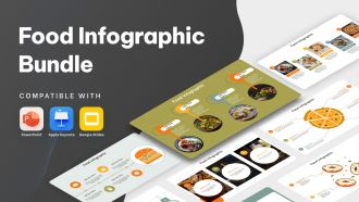
Food Infographic Bundle Powerpoint Ppt Templates And Slides





Try Before you Buy Download Free Sample Product
 Impress Your
 Audience
 100%
100% Editable
 Save Hours
 of Time


Our Food Infographic Bundle Powerpoint Ppt Templates And Slides are topically designed to provide an attractive backdrop to any subject. Use them to look like a presentation pro.
People who downloaded this PowerPoint presentation also viewed the following :
Food Infographic Bundle Powerpoint Ppt Templates And Slides with all 39 slides:
Use our Food Infographic Bundle Powerpoint Ppt Templates And Slides to effectively help you save your valuable time. They are readymade to fit into any presentation structure.










FAQs for Food Infographic Bundle Powerpoint Ppt
Start with serving sizes - seriously, that's where everyone screws up. Then hit the big stuff: calories, protein, carbs, fats. Make it scannable with bars or little icons because honestly? Most nutrition labels are hot garbage to read. Throw in any major vitamins if they're actually worth mentioning. Color coding helps too - green for good, red for "maybe chill on this." Always add those comparison things like "same as 2 slices of bread" or daily percentage stuff. Oh, and people should get the main info in like 5 seconds max or they'll just give up.
Warm colors are your best bet - reds and oranges make food look crazy appetizing and get people to act faster. For healthy stuff, greens are perfect since they scream fresh and natural. But here's the thing about blue: it actually kills your appetite (weird, right?), so only use it if you're talking about weight loss or water-related content. Yellow's amazing for grabbing attention and making everything feel more energetic - great for highlighting important stats. Honestly, just pick 2-3 colors that match your vibe and see how they make your food photos pop. Trust me, it makes a huge difference.
Honestly, the biggest thing is cramming way too much text everywhere - it just looks messy. And those sad, blurry food photos? Total appetite killer. You want people actually craving the food, not wondering what it even is. Color-wise, don't go crazy with neons that clash with your images. Pick colors that actually make the food look good. Oh, and hierarchy matters - if everything's screaming for attention, nothing gets noticed. Make your fonts big enough that people don't need reading glasses to see ingredient lists. Give everything room to breathe! Most people will see this on their phones anyway.
Honestly, food infographics are game-changers for explaining nutrition stuff. People see a colorful chart showing what a balanced plate looks like instead of trying to decode some confusing paragraph about macronutrients. Like, who's gonna stand in the grocery store calculating that 30% of their calories should come from fat? Nobody. Your customers can instantly get portion sizes and see which foods to swap out. I swear, a simple visual comparison beats a wall of text every time. Next time you're giving nutrition advice, just throw in a chart – it'll click way faster.
Oh man, cultural differences make food infographics SO much trickier than most people realize. Reading patterns change everything - some cultures go right-to-left instead of our left-to-right flow. Colors mean totally different things too. Red screams "danger" here but it's lucky in China. You've got dietary restrictions that vary wildly by region, plus some cultures actually prefer information-heavy designs while others need tons of white space. Religious stuff obviously matters a lot. Honestly, I learned this the hard way on a project last year. Just research your audience first, then adapt your colors and layout flow instead of assuming what works here works everywhere.
USDA's FoodData Central is your go-to - it's free and has basically everything. Also check FDA nutrition guidelines for the official standards. Peer-reviewed journals are solid too, plus places like American Heart Association. So many people just grab numbers from random wellness sites and it's honestly annoying because people actually use this stuff for their diets. Cross-check everything with at least two legit sources, especially vitamin content and calories. Those numbers matter way more than people think when you're making real food choices.
Honestly, kids eat this stuff up! Colorful food group charts, fun veggie facts, simple recipes they can actually follow - it's all gold. Visual learners by nature, so why not use that? I'd skip anything that sounds lecture-y though. Maybe try "fuel foods vs junk foods" comparisons or show how protein builds muscles (they love that superhero angle). Oh, and stick to one main idea per graphic or they'll tune out. My nephew's obsessed with the rainbow food chart I made him - keeps asking for "red foods" at dinner now.
Honestly, icons and illustrations are what make food infographics actually work. People scan visuals way faster than reading paragraphs of text - it's just how our brains are wired. You can throw in produce icons for ingredients, little cooking illustrations for prep steps, or basic charts for nutritional stuff. They break down all that complex info into chunks people can actually process without getting overwhelmed. Oh, and definitely keep your icon style consistent throughout - nothing's more distracting than mixing cartoon carrots with realistic pie charts. It sounds obvious but you'd be surprised how often people mess that up!
So Instagram and Pinterest are goldmines for infographics - people actually expect pretty visuals there. Facebook's weird though, you need captions that get people talking or the algorithm buries you. Twitter's honestly the trickiest because everyone's scrolling so fast they won't stop for complex charts. Keep it simple there. TikTok doesn't really work unless you turn your infographic into those swipe-through carousels, which is kinda annoying but whatever. Don't just post the same thing everywhere - each platform wants different stuff. Oh, and timing matters way more than people think it does.
Go with a split layout - recipe gets like 60-70% of the space, nutrition info goes in a sidebar or bottom section. Different background colors help separate them so people aren't squinting at a wall of text. Number your recipe steps and keep them short. For nutrition, a simple table works best. Oh and here's something that actually makes a difference - pick 2-3 standout nutritional points that tie to your main ingredients. Like if you're using spinach, mention the iron content. It connects everything instead of just throwing random nutrition facts at people.
So instead of just throwing nutrition facts at people, tell them a story! Like trace where your ingredients actually come from - "farm to table" stuff works great. Pizza's evolution through different cultures is fascinating too (honestly, people eat that content up). Try following one ingredient's whole journey, or show how traditional recipes shaped what we eat today. Start with something like "Did you know..." to hook them right away. The trick is making data feel personal rather than like you're reading a textbook. People connect way better with stories than boring charts.
Canva Pro is probably your best bet to start - it's got a million food templates and you won't want to pull your hair out learning it. Adobe Illustrator gives you way more freedom if you're already decent with design stuff, but honestly it's overkill for most people. Figma works great too, especially if you're working with other people on projects. Oh and whatever you choose, just make sure it can export high-res images because blurry food pics look terrible. I'd try Canva first before dropping serious cash on Adobe's subscription.
So for customizing those food infographics - it's pretty straightforward actually. Just swap out ingredients and update the labels. Like for gluten-free stuff, ditch the wheat and throw in quinoa or rice instead, then slap some "GF" markers everywhere. Same deal with vegan versions - replace the animal products with plant alternatives. Oh, and definitely call out protein sources because honestly, that's the first thing everyone asks about with vegan food. Don't forget to update your nutritional info too when you change ingredients. Pro tip: make templates for the dietary restrictions you get asked about most. Then you'll just plug in new stuff each time.
Check your engagement first - likes, shares, comments, how long people actually look at them. Download numbers are solid gold if you're offering PDFs. Traffic from the infographic to your site tells you everything. Honestly, the best metric is whether people changed their eating habits afterward. Send out surveys or see if more folks signed up for your nutrition program. People saving your posts? That's huge - means they'll reference it later. You could do quick comprehension quizzes too, but don't go overboard. Pick like 2-3 metrics that match what you're trying to accomplish.
Oh totally! Color palette is huge - warm oranges for fall, bright greens for spring, you get it. Feature whatever's actually in season too because honestly, nobody cares about pumpkin stuff in July lol. Winter foods that boost immunity, light summer dishes, that kind of thing just performs better. People connect more when the timing makes sense. I always plan mine around food seasons and holidays - way more engagement that way. Also random tip but I learned this the hard way - don't overthink the nutrition angle, just keep it simple and seasonal.
-
Loved the fact that SlideTeam provides clean, high-definition, and professional PowerPoint products.
-
Attractive design and informative presentation.