

Food Truck Restaurant Brochure Trifold




Try Before you Buy Download Free Sample Product
 Impress Your
 Audience
 100%
100% Editable
 Save Hours
 of Time


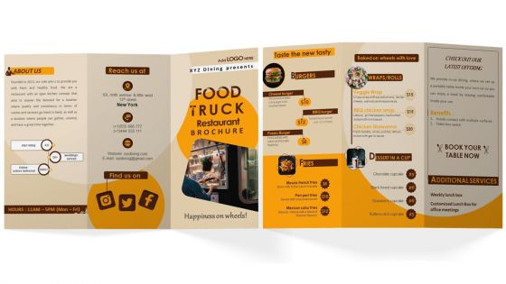
The Food Truck Restaurant Brochure template is the perfect solution to advertise your business to target audience. Use this PPT catalogue to provide the business overview along with the achievements till date. With its visually appealing design, it showcases the menu with wide range of options in burgers, fries, wraps, and desserts. Avail this professionally designed presentation booklet to highlight the latest offerings with respective benefits and additional services provided by your food truck business. Grab yours today to stand out from the competition and build an identity.
People who downloaded this PowerPoint presentation also viewed the following :
Food Truck Restaurant Brochure Trifold with all 1 slides:
Use our Food Truck Restaurant Brochure Trifold to effectively help you save your valuable time. They are readymade to fit into any presentation structure.
FAQs for Food Truck
Definitely put your menu and prices right up front - that's literally what everyone wants to see first. Good photos of your food are huge since people eat with their eyes, you know? Make sure your location schedule is super clear so people can actually find you. Oh, and don't skip the contact info and social handles. I'd throw in a quick story about what makes your truck special too. People eat that personal stuff up. Keep everything looking consistent brand-wise, and maybe run it by some of your regulars before printing a million copies.
Dude, photos are literally make-or-break for food truck brochures. People see a juicy burger pic and suddenly they're walking over with their wallet out. Get some legit shots of your best dishes - none of that fake stock photo garbage. Your actual truck should be in there too, maybe some action shots of you guys cooking. I'd say grab 3-4 money shots of whatever sells best. Oh and match the vibe - if you're the fun taco truck, don't make it look all corporate and boring. Bright colors, playful stuff. Trust me, people eat with their eyes first.
Your menu is literally the whole point of the brochure - that's what people actually care about. Make it super scannable with descriptions that actually sound appetizing, not just "chicken sandwich." I swear, half the food trucks I see use fonts so tiny you need a magnifying glass. Put your best stuff front and center, include prices (nobody likes surprises), and make sure the whole thing matches your truck's personality. Oh, and if you've got good food photos, definitely use them. Quick test - hand it to a random person and see if they can figure out what they'd order in like 10 seconds.
Dude, definitely tell your origin story throughout - like why you even started this thing, what got you into cooking. Maybe there's some family recipe behind your best dish? People are so much more likely to buy when there's an actual story. Instead of just listing "pulled pork sandwich," write something like "our pulled pork starts its 12-hour smoky journey at 4am." Way better, right? Each menu item should have a little story about where it came from or what makes it special. Oh, and end with what drives you every day - your vision or whatever keeps you going. Trust me, stories make you stick in people's heads instead of being just another food truck they forgot about.
Dude, good photos are everything - those blurry phone shots aren't gonna work. Get close-ups that actually make people hungry. I love when restaurants show their signature dish being built step by step, like a mini story. Throw in some real customer pics too because people trust that stuff way more than stock photos. Quick tip: use little icons for spicy, vegan, whatever so people can scan fast. Oh and QR codes linking to cooking videos are pretty cool if you're feeling fancy. Keep your descriptions short and snappy though - nobody wants to read a novel about a sandwich.
Dude, photos are everything - get actual shots of customers with their food, not just random quotes floating around. Make the testimonials super specific too, like "those Korean BBQ tacos are insane!" instead of boring "good food" stuff. Short quotes work way better, maybe 15 words max so people actually read them. I'd put them right by your menu or contact section where folks are already looking. Oh and definitely include first names - makes it feel real. Star ratings help too if you can swing it. Honestly, I've seen food trucks crush it this way.
Honestly, red and orange are gonna be your go-to colors - they literally make people hungrier. Yellow's solid too, especially if you're doing breakfast stuff. Skip blues and purples though, they're weird appetite killers for some reason. Green works but only if you pair it with warmer colors, otherwise it feels too cold. Brown's great for BBQ vibes. Don't go overboard with too many bright colors at once - pick one main warm color and add some accents. I'd just test a few combos and see what makes your food look amazing in photos. That's usually the winner right there.
Yeah, you gotta make that info huge and obvious! People need to know where you'll be and when you're open - otherwise they'll show up to an empty parking lot, which sucks for everyone. Put your regular spots, days, and hours in big text on the front or back where they can't miss it. Food pics are nice but honestly pretty useless if customers can't actually find you. Oh, and throw your social handles on there too since you probably post location updates. Don't bury this stuff in tiny print somewhere - make it the star of the show.
Make your prices super easy to spot - nobody wants to play hide and seek with menu costs. Bold fonts are your friend here. Group similar stuff together so people can actually compare options without getting a headache. Combo deals are huge right now since everyone's watching their wallet. Put your bestsellers front and center too. One thing that saved my cousin's café - she uses QR codes for daily specials instead of constantly reprinting menus. Way cheaper in the long run. You could also just leave blank spaces for those little insert cards if you're not into the whole QR thing.
Make those social media links pop with actual icons - Instagram, TikTok, whatever platforms you use. QR codes are clutch since people can just scan while they're chowing down. Put your handle under each icon too in case someone wants to search manually. Don't bother with full URLs, they look awful and who types those anyway? Stick to 2-3 platforms you actually update regularly. I see so many places with like 6 dead social accounts - honestly looks worse than having none. Keep it near your contact info where people expect to find it.
Hey! So for food truck brochures, you definitely want those mouth-watering close-up shots of your best dishes. Keep the menu layout super clean with easy-to-read prices. Tell your story in just a couple sentences - nobody's reading a novel, you know? Check out how Kogi BBQ mixed Korean and Mexican vibes perfectly, or how The Grilled Cheese Truck nailed that cozy comfort-food look. Pick maybe 2-3 signature items to highlight instead of cramming everything in. Oh, and make your contact info huge! People need to find you when that craving hits.
Okay so basically your brochure needs to actually *feel* like your truck, you know? Pick colors and fonts that match your vibe - street tacos should look gritty and bold, while farm-to-table stuff works better clean and minimal. The way you write matters too. Comfort food can be super casual and fun, but if you're all about sustainability, talk up that local sourcing angle. Honestly though, most trucks just throw together something generic and boring. Don't do that! Tell your actual story, show what makes you different, and use photos that capture the real atmosphere. Every piece should scream "this is us."
Okay so for your food truck brochures - go with 120gsm matte coated paper. Trust me on this one. Gloss looks fancy but it's a nightmare with fingerprints, and people are gonna be eating while they read these things. Matte gives you that nice professional feel without being annoying to handle. Don't cheap out on super thin paper either, these need to survive getting shoved in pockets and purses. Oh, and if you've got extra budget maybe do spot UV on your logo? Looks pretty slick. But yeah, 120gsm matte is your sweet spot.
Honestly? I'd say quarterly updates work for most people, or whenever you make big menu changes. Don't drive yourself nuts chasing every tiny tweak - that's a recipe for going broke on printing costs. Major additions or removals, yeah those need updates. Same with price jumps over 10%. Seasonal stuff is obviously a good time to refresh things too. My buddy learned this the hard way when he kept reprinting every week. Just batch everything together and update when it actually makes sense for your wallet, you know?
Honestly, QR codes are perfect for food truck brochures. People can scan to see your current menu or find where you're parked today - way easier than calling around. I'd link it to your most important stuff first, maybe your location tracker or ordering system. Don't go crazy with multiple codes though, that's just confusing. The cool part is you'll actually know if people are using your brochures instead of just hoping they don't end up in the trash. You can connect it to social media or reviews too without making your design look cluttered. Everyone's got their phone out anyway, so might as well make it work for you.
-
I was confident and well prepared for my presentation for the first time ever. With SlideTeam’s templates, I could deliver one of my best presentations. Will be coming back for more!
-
Wide collection of templates available. SlideTeam has made it easier to create presentations in just a few minutes.