

Four traffic lights for signals flat powerpoint design




Try Before you Buy Download Free Sample Product
 Impress Your
Audience
 100%
Editable
 Save Hours
of Time


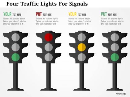
Highlight the importance of following rules and regulations to your audience with four traffic lights for signals flat PowerPoint design. The presentation slide shows the graphic of traffic signals that you can use to show the information related to the guidelines about observing and taking the right move in individual life as well as in business. Our qualified designers has crafted it to display the concept of following traffic rules. But this PPT template is not only limited to this information as you can also share other aspects related to the discipline and patience in today’s environment. The four signals showing different indicators can be used to make your audience understand the concept of time as there is no need to hurry and wait for the right moment as you will get your opportunity. The PowerPoint diagram is useful in showing several aspects. You can download it and then use it to communicate the message in the desired manner. All our PPT designs are completely editable as required. Our Four Traffic Lights For Signals Flat Powerpoint Design contain the best of bygone eras. They evoke the charm of days gone by.
People who downloaded this PowerPoint presentation also viewed the following :
Four traffic lights for signals flat powerpoint design with all 5 slides:
Solve the most intricate puzzles with your logic. Clue in with our Four Traffic Lights For Signals Flat Powerpoint Design.


FAQs for Four traffic lights for signals
Key elements include clear color coding with standard red, yellow, and green meanings, consistent icon sizing and placement, logical flow progression, and accessible contrast ratios for visibility. These design principles enhance audience comprehension by creating intuitive navigation, reducing cognitive load, and ensuring professional consistency, with many presenters finding that standardized traffic light systems streamline decision-making processes and improve stakeholder engagement.
**INPUT**: How can the color scheme in traffic light designs enhance the understanding of the presented information? **OUTPUT**: Color schemes in traffic light designs enhance understanding by creating immediate visual hierarchy, establishing intuitive status indicators, and leveraging universal color associations that audiences recognize instantly. These strategic color combinations streamline information processing by reducing cognitive load, enabling faster decision-making, and delivering clearer communication flow, with many organizations finding that consistent color logic significantly improves audience engagement and comprehension rates. [Word count: 60 words]
Traffic light signal designs effectively represent performance metrics, project status indicators, risk assessment levels, quality control measurements, and compliance tracking data. These visual systems streamline decision-making by instantly communicating red-yellow-green status across departments, with many organizations finding that traffic light dashboards enhance operational efficiency, accelerate response times, and deliver clearer strategic oversight.
Traffic light metaphors are particularly effective for status updates, risk assessments, project milestones, performance dashboards, and decision-making frameworks where clear categorization is essential. These visual systems streamline complex information by providing immediate visual cues, with many organizations finding that audiences quickly grasp red-yellow-green classifications, ultimately enhancing comprehension and accelerating decision-making processes.
The traffic light concept enhances corporate decision-making by providing intuitive visual cues that instantly communicate project status, risk levels, priority rankings, and performance metrics through universally understood red, yellow, and green indicators. This visual framework streamlines executive reviews and stakeholder communications, enabling faster consensus-building and clearer resource allocation decisions, with many organizations finding that color-coded presentations significantly reduce meeting times while improving strategic clarity.
**INPUT**: What best practices should be followed to maintain clarity in a flat PowerPoint design for traffic lights? **OUTPUT**: Maintaining clarity in flat traffic light designs requires using high contrast colors, consistent sizing, clear spacing between elements, and intuitive color coding that aligns with universal standards. These design principles enhance audience comprehension by eliminating visual distractions, ensuring scalability across different screen sizes, and delivering immediate recognition, with many presenters finding that simplified iconography ultimately streamlines communication and strengthens message retention. [Word count: 60 words]
Different industries utilize traffic light signals to communicate project status, risk levels, performance metrics, and operational health across various contexts. Healthcare organizations use red-yellow-green indicators for patient safety protocols, financial services apply them for risk assessments and compliance monitoring, while manufacturing companies leverage these visual cues for quality control dashboards and production line efficiency, ultimately delivering clear communication and faster decision-making processes.
Flat design eliminates three-dimensional elements like shadows, gradients, and bevels that characterize traditional traffic light visuals, instead emphasizing clean lines, solid colors, and minimalist aesthetics. This approach streamlines visual communication by reducing cognitive load and enhancing readability, with many presentation designers finding that flat traffic light graphics deliver clearer messaging and improved audience focus across digital platforms.
Common mistakes include using inconsistent color schemes, overcrowding slides with too many traffic light elements, poor contrast between text and colored backgrounds, and mixing metaphors that confuse the traffic light symbolism. These design pitfalls undermine message clarity and audience engagement, with many presenters finding that strategic restraint and consistent visual hierarchy ultimately deliver more impactful presentations.
Animations and transitions enhance traffic light signal designs by creating dynamic visual flow, emphasizing sequential progression, and drawing attention to critical decision points or status changes. Through subtle fade-ins, pulsing effects, and smooth color transitions, presentations become more engaging and memorable, with many organizations finding that animated signal elements effectively guide audience focus while reinforcing key messages and improving information retention.
**INPUT**: What tools or software can complement PowerPoint designs for creating engaging traffic light signals? **OUTPUT**: Complementary tools include Adobe Illustrator for custom vector graphics, Canva for pre-designed elements, Figma for collaborative design workflows, and animation software like After Effects for dynamic transitions. These applications enhance PowerPoint's capabilities by delivering professional iconography, seamless color consistency, and interactive elements, with many presenters finding that strategic tool combinations ultimately streamline design processes while elevating audience engagement.
Traffic lights leverage universally understood color psychology where red signals urgency or stop actions, yellow indicates caution or transition phases, and green represents go-ahead or positive outcomes. In business presentations, these symbolic meanings enhance audience comprehension by intuitively communicating project status, risk levels, and decision points, with many organizations finding that color-coded systems streamline communication and accelerate decision-making processes.
Audience engagement strategies alongside traffic light designs include interactive polling, real-time feedback sessions, guided decision-making exercises, status update discussions, and collaborative priority ranking activities. These approaches enhance presentations by encouraging active participation, facilitating immediate responses to visual cues, and enabling dynamic conversations around project phases, with many organizations finding that combining visual clarity with interactive elements significantly improves meeting outcomes and stakeholder buy-in.
Traffic light designs adapt for virtual presentations through enlarged visibility formats, interactive polling integration, enhanced color contrast for screen clarity, and animated transitions that capture audience attention. These digital adaptations enable presenters to effectively signal progress, gather real-time feedback, and maintain engagement during webinars, with many organizations finding that visual cues significantly improve online audience participation and comprehension rates.
Feedback enables presenters to identify clarity issues, timing problems, and audience comprehension gaps in traffic light signal designs, allowing for strategic refinements in color choices, positioning, and visual hierarchy. Through iterative feedback cycles, organizations enhance presentation effectiveness by optimizing signal visibility, reducing cognitive load, and ensuring consistent message delivery, ultimately creating more impactful communications that drive better decision-making outcomes.
-
I discovered this website through a google search, the services matched my needs perfectly and the pricing was very reasonable. I was thrilled with the product and the customer service. I will definitely use their slides again for my presentations and recommend them to other colleagues.
-
Very well designed and informative templates.