

Growth Graph Powerpoint PPT Template Bundles




Try Before you Buy Download Free Sample Product
 Impress Your
 Audience
 100%
100% Editable
 Save Hours
 of Time


Our Growth Graph Powerpoint PPT Template Bundles are topically designed to provide an attractive backdrop to any subject. Use them to look like a presentation pro.
People who downloaded this PowerPoint presentation also viewed the following :
Growth Graph Powerpoint PPT Template Bundles with all 17 slides:
Use our Growth Graph Powerpoint PPT Template Bundles to effectively help you save your valuable time. They are readymade to fit into any presentation structure.
-
Growth Graph
-
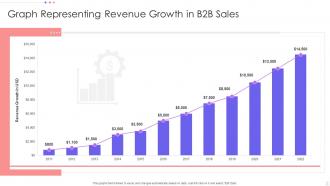
Graph Representing Revenue Growth in B2B Sales
-
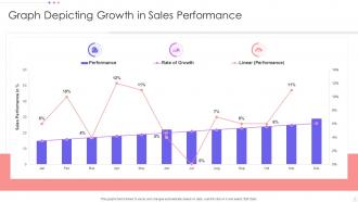
Graph Depicting Growth in Sales Performance
-
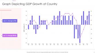
Graph Depicting GDP Growth of Country
-
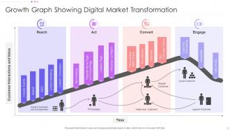
Growth Graph Showing Digital Market Transformation
-
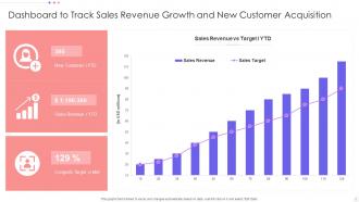
Dashboard to Track Sales Revenue Growth and New Customer Acquisition
-
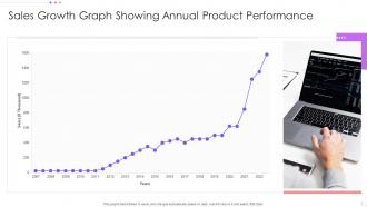
Sales Growth Graph Showing Annual Product Performance
-
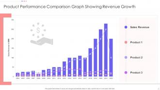
Product Performance Comparison Graph Showing Revenue Growth
-
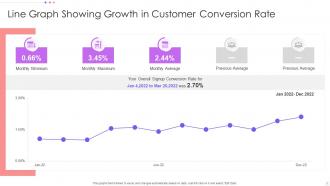
Line Graph Showing Growth in Customer Conversion Rate
-
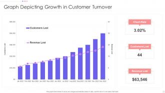
Graph Depicting Growth in Customer Turnover
-
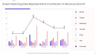
Graph Depicting Sales Representative Contribution to Revenue Growth
-

Growth Graph
-

-

-

-

-

FAQs for Growth Graph Powerpoint
Start with clear labels and a title that actually tells people what they're looking at. Make your time periods consistent - like monthly or quarterly, not random chunks. Define what you're measuring upfront (revenue, users, whatever). Green arrows are your friend here, honestly makes everything look more impressive. Short sentences work better than long ones. Also throw in some benchmarks so people know if your numbers are actually good or just... numbers. Oh and skip those flashy animations - they're distracting as hell. Simple charts tell the story way better.
Honestly, a good growth graph is like telling a story that actually keeps people awake. Use colors and little notes to highlight the big moments - those crazy spikes or sudden drops that matter. People get way more interested when they can see what's happening instead of just staring at boring spreadsheet numbers. Make sure there's a clear flow from start to finish that backs up your main point. Oh, and definitely add those little explanation boxes for the major changes - trust me, your audience will appreciate you connecting the dots for them instead of making them guess.
Tech startups are probably the biggest users - they're always showing revenue growth and user numbers to investors. Finance and SaaS companies are right behind them with all their KPIs and performance tracking. Sales teams eat this stuff up too. Healthcare uses growth charts for patient outcomes, e-commerce tracks conversion rates... honestly, most industries need them if they're measuring anything important. Though I'd say those tech companies practically worship their growth charts lol. Just pick something that fits your data - simple line graphs work great for basic metrics, but you'll want something fancier if you're dealing with multiple variables.
So basically, linear graphs look steady and reliable but kinda boring tbh. Exponential ones are way more exciting - they scream "we're blowing up!" But here's the thing: people get suspicious if that hockey stick curve looks too crazy. I'd match whatever graph you pick to your actual story. Want to show you're consistent? Go linear. Need to hype up momentum? Exponential all the way. Just don't oversell it or you'll lose credibility fast.
Definitely go with greens and blues for growth stuff - people just naturally think "good" when they see those colors. I made the mistake of using red once and it was awkward explaining why my "growth" chart looked like everything was crashing. Don't go crazy with colors though, like 3-4 max or it'll look like a rainbow threw up on your data. Oh, and make sure there's enough contrast so people can actually read the damn thing. If you're doing this for work, maybe throw in your company colors somewhere. One random thing - always test on a projector first because colors look totally different projected vs on your laptop screen.
Dude, animated charts are a game changer for presenting growth data. Instead of overwhelming people with everything at once, you reveal stuff progressively - like telling a story vs just dumping numbers on them. Bars can rise up, lines draw themselves across the screen, or you can have numbers count up to their final values. Keeps everyone focused on your current point rather than scanning ahead. I always use entrance animations with slight delays between data series. Creates this nice build-up that makes your whole growth narrative way stickier. Trust me, it's so much more engaging than static charts.
For live data feeds with your Growth Graph templates, I'd go with Excel or Google Sheets first - PowerPoint connects to both pretty easily. Power BI and Tableau work great too if you're already in that ecosystem. Zapier's another option but honestly feels like overkill unless you've got some weird data source situation. The trick is setting up your data to auto-update, then your charts refresh whenever you open the deck. Excel's probably your best bet to start with since troubleshooting is way less painful when things inevitably break.
So basically you just swap out the colors for your brand ones and change the fonts to whatever your company uses. Replace those generic logos with your actual ones too. The data labels and axis titles need updating to match your metrics obviously. Charts are pretty flexible - you can tweak colors, data points, all that stuff. Pro tip: save a master version once you get it looking good because redoing it every time is such a pain. Oh and honestly? The colors looking different on various screens always throws me off, but maybe that's just me being picky.
Don't cram too much data on one slide - nobody can process all that info at once. Your Y-axis should start at zero, not some random number that makes your growth look better than it actually is (seriously, people catch this and it's embarrassing). Keep colors consistent and make fonts big enough so people in the back can actually read them. Honestly, skip the fancy animations - they're more distracting than impressive. Context is huge too. If your sales jumped 40%, explain why it happened. Oh, and definitely test everything beforehand because formatting always breaks at the worst possible moment.
Honestly, growth graphs are clutch for market trends because people just get visuals way better than boring spreadsheets. Line charts work great for showing changes over time. Bar graphs are solid for comparing different segments. I'd stick with the obvious color coding - red for bad stuff, green for good growth (yeah, it's basic but it works). You can get creative with combo charts if you're dealing with multiple data sets. Just don't forget clear labels and maybe throw in a little explanation box about what it actually means for your strategy. Makes the whole thing way more digestible.
Dude, clean fonts are everything for growth graphs - stick with Helvetica or Arial since they're readable even tiny. I made this mistake once using some fancy script font and literally nobody could see the numbers lol. Make sure your font sizes match across similar stuff, and honestly? Step back from your screen to test it. Your axis labels need to be big enough for people in the back row. Oh and contrast matters too - don't put light gray text on white backgrounds. Sans-serif fonts just work better for data stuff, trust me on this one.
One insight per slide, that's it. Strip out anything else that doesn't back up your main point. Make those data points huge - I can't tell you how many presentations I've sat through squinting at microscopic charts. Use colors that actually contrast so people can see what you're showing them. Keep axis labels simple and throw in quick annotations to call out the important stuff. Oh, and here's a good test: try explaining each slide to someone in 30 seconds. If you can't do it that fast, you've probably crammed too much onto one slide. Break it up instead.
Ask specific questions while you're presenting - like "does this match what you're seeing on your end?" Body language tells you everything too. If people look lost at certain data points, take note. Always do Q&A (sounds obvious but people skip this!). Send a quick survey after asking what hit home and what missed. The real test though? Whether anyone actually does something with your insights later. That's honestly the only metric that matters. Oh and don't just collect feedback - you've gotta actually use it to improve next time.
Honestly, the chart you pick changes everything about how people see your data. Line charts show smooth trends - perfect for momentum stories. Bars make each period pop individually, so growth jumps look way more dramatic. Area charts? They'll make any increase look huge (maybe too huge if you're not careful). And please, for the love of all that's holy, skip pie charts for growth data. Your audience will just stare blankly. Same numbers, totally different stories. Use lines when you want that "we're climbing steadily" vibe. Bars work great for "look how much we crushed Q3" moments.
Honestly, templates are a lifesaver. You'll have something polished in like 20 minutes instead of wrestling with colors and layouts for hours. Most of us suck at design anyway, so why reinvent the wheel? The layouts come with proper charts and color schemes that actually look professional. Sure, you can't customize everything, but who has time for that? Just grab one that sorta matches your company colors and call it a day. Oh, and they usually work across different PowerPoint versions too, which saves you from those random formatting disasters.
-
SlideTeam is a great place for PPT templates. They have many templates on a single topic. It has made my life a lot easier.
-
What a stunning collection of customizable templates! Really a time-saver..