

Incident Management Dashboard Powerpoint PPT Template Bundles




Try Before you Buy Download Free Sample Product
 Impress Your
 Audience
 100%
100% Editable
 Save Hours
 of Time


Our Incident Management Dashboard Powerpoint PPT Template Bundles are topically designed to provide an attractive backdrop to any subject. Use them to look like a presentation pro.
People who downloaded this PowerPoint presentation also viewed the following :
Incident Management Dashboard Powerpoint PPT Template Bundles with all 14 slides:
Use our Incident Management Dashboard Powerpoint PPT Template Bundles to effectively help you save your valuable time. They are readymade to fit into any presentation structure.





FAQs for Incident Management Dashboard Powerpoint
Track your main incident metrics first - MTTD, MTTR, incident volume, and how severe stuff gets. SLA breaches and response times are crucial too. I always add week-over-week comparisons because spotting trends early saves you so much headache later. Customer impact metrics matter more than people think - they show real damage, not just internal chaos. Escalation rates tell a similar story. Honestly, start simple with these basics then build custom metrics around whatever your team keeps screwing up. Your dashboard should instantly answer "are we actually improving?"
Look, real-time dashboards are honestly game-changers for incident management. Instead of waiting around for reports or digging through endless logs, you'll spot patterns immediately. Visual dashboards show you severity levels, response times, and which systems are getting hammered - all at a glance. It's way easier to prioritize when you can actually see the chaos unfolding. Your team can focus on what matters most instead of constantly asking "wait, what's the status again?" Though I'd probably start small and set up alerts for your most critical stuff first. Makes decisions so much faster.
UX is huge for incident response - when your team's freaking out over an outage, they need info that's dead simple to parse. Bad design means people miss critical stuff or waste time hunting through menus (I've seen some truly terrible dashboards that look fancy but are useless when things hit the fan). Put your most urgent alerts right up front. Make the visual hierarchy super clear. Don't bury important actions behind a bunch of clicks. Also, test this stuff during actual incidents, not just when you're showing it off to stakeholders.
Honestly, automation tools are a game changer for incident dashboards. Your response times drop like crazy when you set up auto-ticketing and smart alert routing. The cool part? Alerts can automatically kick off actions - like creating war rooms or pinging the right people based on how bad things are. Way less manual clicking around, which is annoying anyway. I'd start with whatever repetitive stuff drives you nuts first, then expand from there. Your dashboard stops being just something pretty to look at and actually becomes useful for fixing problems fast.
Honestly, custom dashboards for each team are the way to go. Ops needs real-time alerts and escalation stuff, but executives just want the high-level SLA numbers. I've watched so many companies build these monster dashboards that show everything - complete disaster. Role-based permissions help too, so people aren't drowning in irrelevant incidents. But here's the thing: actually ask each team what they want instead of guessing. Start with maybe 3-4 widgets per group and build from there. Way less painful than trying to redesign some bloated mess later.
So pull like 6-12 months of your incident data first. Look for the obvious stuff - when things break most, which systems are always acting up, seasonal weirdness. The patterns are usually right there if you actually dig into it. Set up alerts when metrics hit those danger zones that caused problems before. Oh and track the early warning signs, not just the "everything's on fire" stuff. I'd group incidents by type and timing - honestly, most outages follow pretty predictable patterns once you map them out. Your dashboard becomes way more useful when it's predicting issues instead of just showing you what already broke.
You definitely need alerting set up - it's like having someone watching your stuff 24/7 so problems don't turn into disasters. The whole point is catching issues before angry users start blowing up your inbox. Your dashboard monitors the important metrics and pings you when things go sideways, giving your team a chance to fix stuff while it's still small. Honestly, I've seen too many teams get burned because they found out about outages from Twitter instead of their own systems. Just make sure you tune the alerts properly - nobody wants to get woken up at 3am for every tiny blip.
Honestly, mobile access can make or break your incident response. I've watched teams fumble critical alerts just because their dashboard was impossible to use on a phone – super frustrating when you're dealing with downtime. Your team needs to jump on issues from anywhere, whether they're grabbing coffee or stuck in traffic. The trick isn't just cramming your desktop version onto a smaller screen though. You want the most urgent stuff right there when they open it. Quick status updates, alert acknowledgments, that kind of thing. When something's on fire, you don't have time to hunt through menus.
Start with your ticketing system - that's where everything gets logged and tracked. Monitoring tools are huge too since they push real-time alerts and performance data. Log aggregators and APM tools give you the technical stuff you need. More data sources = better picture of what's going on, honestly. Oh and don't sleep on communication platforms like Slack or Teams - they actually show how your team responds to incidents, which is pretty useful context. These should cover your basics and give you something solid to work from.
Honestly, data integration will make you want to pull your hair out. You're dealing with monitoring tools, tickets, Slack channels - none of them talk to each other properly. People hate changing how they work too, especially when everything's on fire and they just want their familiar chaos. Defining useful metrics is tricky since half the stuff that looks impressive is basically useless fluff. Oh, and don't try to boil the ocean right away. Pick one data source, work with your most cooperative team first, then expand once you've got something that actually works.
So basically dashboards stop all that chaos where everyone's running around with different info during incidents. Your support team sees the same real-time data as engineering and management - no more outdated screenshots or guessing games. Honestly, it's kind of amazing how much smoother things run when people aren't constantly asking "wait, what's happening?" in Slack. You'll spot who's handling what without the usual phone tag mess. Everyone can see gaps or duplicate work right away. Set different access levels so teams get what they need, but keep the main incident stuff in one place where everyone can find it.
Track MTTR, first call resolution, and escalation rates - those three are your bread and butter. MTTR shows how fast you're closing stuff out. First call resolution tells you if people are actually fixing things or just passing the buck (which honestly happens way too often). Escalation percentage? That reveals whether your frontline folks have what they need or they're drowning. Don't forget customer satisfaction and repeat incidents either. Oh, and look at trends over weeks/months, not daily numbers. Daily stuff just makes you crazy for no reason.
Honestly, start thinking about scale from day one or you'll hate yourself later. Pick a platform that won't crash when data gets heavy - and it will get heavy fast. I'd build everything modular so you can bolt on new stuff without starting over (learned that the hard way). Your data setup needs to grow sideways, not just up, especially when your team inevitably doubles. Oh, and definitely stress-test with fake high-volume scenarios now. Way better to find those breaking points in testing than during an actual incident when everyone's freaking out.
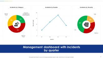
Heat maps are perfect for this - they'll show severity vs impact patterns instantly. Color code them (red for critical, yellow for medium, green for low) so your team can spot problem areas right away. I swear, I've watched people overcomplicate dashboards with weird fancy charts when simple stuff works way better. Add some trend lines showing incident volume over time, plus basic bar charts for category breakdowns. The whole point is that anyone should be able to look at your dashboard and get what's happening in like 10 seconds max.
Your dashboard is super useful for filtering incidents by type, system, or timeframe. I'd start there to spot patterns you wouldn't notice otherwise. Clusters of similar problems usually jump out pretty quickly. Same components failing repeatedly? That's your goldmine right there. Honestly, the visual trends can be shocking once you dig deeper. Rank which root causes to fix first based on how often they happen and their impact. Oh, and set up monthly automated reports for your top recurring categories - way better than constantly fighting the same fires over and over.
-
No second thoughts when I’m looking for excellent templates. SlideTeam is definitely my go-to website for well-designed slides.
-
Use of icon with content is very relateable, informative and appealing.