


Insurance Company Powerpoint Ppt Template Bundles





Try Before you Buy Download Free Sample Product
 Impress Your
 Audience
 100%
100% Editable
 Save Hours
 of Time


Our Insurance Company Powerpoint Ppt Template Bundles are topically designed to provide an attractive backdrop to any subject. Use them to look like a presentation pro.
People who downloaded this PowerPoint presentation also viewed the following :
Insurance Company Powerpoint Ppt Template Bundles with all 17 slides:
Use our Insurance Company Powerpoint Ppt Template Bundles to effectively help you save your valuable time. They are readymade to fit into any presentation structure.

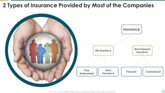
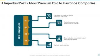
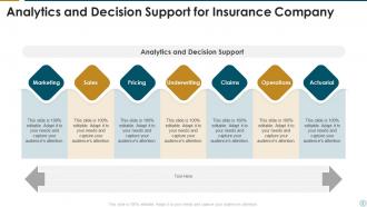
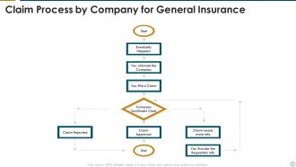
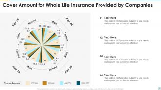
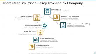
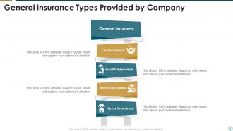
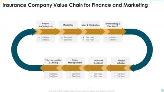






FAQs for Insurance Company Powerpoint
Honestly, just keep it clean and simple - white space is your best friend here. I'd go with blues or greens for the color scheme since they scream "trustworthy." Don't overcrowd your slides or you'll lose people instantly. Make sure there's room for all those charts and stats you'll need to show. Oh, and definitely include sections for risk stuff, coverage comparisons, and client testimonials. Readable fonts only - none of that fancy script nonsense. Start with a basic template and tweak the colors to match your company branding. Simple but professional beats flashy every time.
Dude, colors seriously matter more than you'd think for insurance stuff. Blue's your best friend - builds trust and makes you look stable (there's a reason every bank uses it). Green works great too for that growth/security vibe. I'd avoid going crazy with red unless it's like a "call now" button or something, since it can feel alarming. This one guy I know went nuts with bright orange slides and honestly looked like he was selling used cars instead of life insurance. Stick with cooler colors as your base, then throw in some warmer accents here and there. You want "trusted advisor," not "circus tent."
Hey! So for insurance presentations, bar charts are your best bet when comparing claim frequencies between categories. Line graphs work perfectly for time-based stuff - premium trends, loss ratios, that kind of thing. Pie charts are decent for market share but seriously, keep the slices under control or it looks like a rainbow explosion. Heat maps are clutch if you're dealing with regional data. Oh, and here's what I learned the hard way - stick to maybe 2-3 chart types per presentation. More than that and people's eyes just glaze over. Simple is better when you need quick understanding.
Stick with boring fonts like Arial, Calibri, or Helvetica - trust me on this one. Insurance isn't the place to get creative since people are literally trusting you with their financial future. Times New Roman works but feels kinda old-school now. Skip anything decorative or fun. You'll want at least 24pt so folks in back can actually read it. Oh, and don't mix more than two fonts or it gets messy fast. I know it sounds super basic, but readable beats pretty every time when you're talking about someone's coverage.
Honestly, those themed templates are a game-changer. You'll save so much time instead of building slides from nothing, plus they actually look professional. The layouts are already set up for insurance stuff - charts, data comparisons, all that numbers-heavy content we always need to show. And thank god, no more weird stock photos of people in suits pointing at nothing! Your coworkers will probably wonder when you got so good at design. I always grab a solid template first, then just worry about the actual content. Way less stressful that way.
Honestly, visuals are a game changer for insurance stuff. Bar charts make deductibles way clearer than just rattling off numbers. Flowcharts work great for claim processes too. I'd use infographics to break down coverage types - people actually read those. Icons help with policy features, and visual metaphors are solid (like an umbrella protecting a house for umbrella coverage). Just don't use those generic stock photos that scream "we sell insurance!" Pick visuals that actually connect to what you're explaining. It's wild how much easier complex concepts become when people can see them instead of trying to imagine abstract ideas.
Comparison tables are your best friend here - grid layouts make it super easy to show coverage and premiums side by side. Icons work really well when you're breaking down different categories like auto, home, life insurance. People get overwhelmed with too much text (and honestly, insurance is confusing enough already). Timeline slides are perfect if you need to walk through claims processes or how policies develop over time. I'd skip the bullet point heavy slides completely. White space is clutch - don't cram everything together. Oh, and start simple then add complexity as you go through the deck.
Always lead with the problem, not your brilliant solution - people need to care first. Real numbers beat vague "we improved things significantly" every single time. Honestly, most case studies I see are dry as toast. Keep it simple: Problem → Solution → Results, one slide max. Before/after visuals or customer pics work way better than walls of text. Oh, and don't forget to tie each story back to whatever you're actually trying to sell them on. That connection's what makes the whole thing worth their time.
Honestly, skip the flashy stuff and focus on making confusing insurance topics actually make sense. Client video testimonials work great - real people talking beats corporate speak every time. Simple animated charts help when you're comparing different coverage options, and infographics are perfect for breaking down policy details without overwhelming people. For claims processes, try pairing audio explanations with visual step-by-step guides. People remember way more when they're seeing AND hearing it simultaneously. Don't overdo the fancy transitions though - nobody wants to sit through another one of those awkward presentations. Always test your tech beforehand and keep backup slides ready because Murphy's Law is real.
Ditch the boring stats and open with real client stories instead. Something like "Here's what happened to Sarah when..." works way better than bullet points. I picked this up from watching our best salespeople - they always go human-first, then get into the technical stuff. Your slides should back up these stories with timelines or before/after shots, not replace them. Makes all that abstract insurance jargon actually mean something to people. Honestly, once you start doing this you'll never go back to those awful bullet-heavy presentations. Try swapping out 3 slides with actual scenarios next time.
Dude, don't cram paragraphs of text on your slides - insurance is already confusing enough. Those cheesy stock photos are the worst too, you know the ones with the awkward handshakes? Skip those. Pick a simple color scheme and stick with it. Honestly, half the presentations I see go crazy with animations that just distract everyone. Make your fonts big enough so people in back can actually read the policy numbers. One main point per slide works way better. Oh, and use visuals that actually connect to your specific products instead of random business imagery.
Honestly, it's pretty straightforward once you get started. Focus on the slides that matter most - your services, benefits, case studies - since those need to actually reflect what you do. Swap out all that generic placeholder text with proper life or health insurance terms. Colors should match your brand or whatever's standard in your sector. For imagery, think stethoscopes if you're doing health insurance, family photos for life stuff. Most templates bend pretty easily when you mess around with them. I'd start with whichever slides look the most off-brand first. Those usually jump out at you right away. The terminology switch makes a huge difference - way more than you'd think.
Dude, proper alignment and spacing will save your insurance presentation from looking like garbage. I've watched so many colleagues bomb because their slides were all over the place - text floating randomly, charts that don't line up, just chaos. When everything's aligned right, people actually focus on your data instead of getting distracted by the mess. Plus consistent spacing makes all those boring insurance numbers way easier to read. Oh, and use PowerPoint's alignment guides! They're a lifesaver. Stick to the same margins on every slide too.
Honestly, those insurance PowerPoint templates are a game-changer for training new agents. You don't have to build everything from scratch, which saves you so much time upfront. The structure's already there with all the key concepts mapped out professionally. What I really like is that every new hire gets the exact same info - no more forgetting to tell one person something important while covering it with someone else. Most templates come with industry scenarios and compliance stuff baked in too, which is helpful since that's always changing. Just swap in your company's specific policies and you're set. Way easier than starting with a blank slide deck, trust me.
Oh nice! PowerPoint actually has some solid built-in stuff for this. Action buttons and hyperlinks work great for jumping between slides. The Morph transition is clutch for smooth animations too. Trigger animations are super useful - click on something and boom, details appear. Most people have no clue these features even exist lol. You can embed Microsoft Forms or add interactive charts that respond to clicks. For insurance stuff specifically, I'd do hyperlinked comparison tables and clickable flowcharts. Makes all that complicated policy jargon actually make sense to people.
-
Visually stunning presentation, love the content.
-
Illustrative design with editable content. Exceptional value for money. Highly pleased with the product.