


KPI Dashboard To Evaluate Customer Service Client Assistance Plan To Solve Issues Strategy SS V




Try Before you Buy Download Free Sample Product
 Impress Your
 Audience
 100%
100% Editable
 Save Hours
 of Time


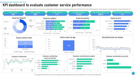
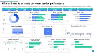
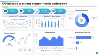
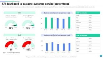
This slide shows dashboard including various metrics which can be used by organizations to track customer support performance. It includes KPIs such as total requests, active requests, solved requests, cases by channels, etc.
People who downloaded this PowerPoint presentation also viewed the following :
KPI Dashboard To Evaluate Customer Service Client Assistance Plan To Solve Issues Strategy SS V with all 12 slides:
Use our KPI Dashboard To Evaluate Customer Service Client Assistance Plan To Solve Issues Strategy SS V to effectively help you save your valuable time. They are readymade to fit into any presentation structure.








FAQs for KPI Dashboard To Evaluate Customer Service Client Assistance Plan To Solve Issues
Effective KPI dashboard components include clear visual indicators, real-time data integration, customizable metrics displays, intuitive navigation interfaces, and automated reporting features. These elements streamline performance monitoring by delivering actionable insights, reducing analysis time, and enabling data-driven decisions, with many organizations finding that well-designed dashboards enhance operational efficiency and strategic alignment across teams.
Businesses can tailor KPI dashboards by conducting department-specific needs assessments, involving stakeholders in metric selection, and customizing visualizations for different user roles and responsibilities. Through collaborative design processes, organizations enable sales teams to focus on conversion metrics while HR departments track retention rates, ultimately delivering targeted insights that enhance departmental decision-making and operational efficiency.
Tools for creating visually appealing KPI dashboards include Tableau, Power BI, Google Data Studio, Qlik Sense, and Looker, each offering unique visualization capabilities and integration options. These platforms streamline dashboard development by providing drag-and-drop interfaces, real-time data connectivity, and customizable templates, with many organizations finding that Power BI and Tableau deliver exceptional visual flexibility while enabling seamless data integration across departments.
KPI dashboards should be reviewed daily for operational metrics, weekly for tactical performance indicators, and monthly for strategic objectives, with updates made quarterly or when business priorities shift. This tiered approach enables organizations to maintain real-time operational awareness while ensuring long-term strategic alignment, ultimately delivering responsive decision-making and sustained competitive advantage.
Common pitfalls include overcrowding dashboards with too many metrics, selecting vanity metrics over actionable KPIs, poor visual hierarchy, and lacking real-time data integration. These design mistakes often result in decision paralysis and reduced user adoption, with many organizations finding that streamlined, role-specific dashboards deliver better business insights and faster strategic responses.
Data visualization techniques enhance KPI understanding by transforming complex metrics into intuitive charts, graphs, heat maps, and trend lines that reveal patterns instantly. Through interactive dashboards, organizations streamline decision-making processes, identify performance bottlenecks more quickly, and enable stakeholders to grasp critical insights at a glance, ultimately delivering faster strategic responses and improved operational efficiency.
Stakeholder input drives KPI dashboard effectiveness by identifying critical metrics, defining relevant benchmarks, ensuring data accessibility, and aligning measurement frameworks with strategic objectives. Through collaborative development processes, organizations create dashboards that deliver actionable insights across departments like sales, operations, and finance, ultimately enhancing decision-making transparency and organizational alignment.
A KPI dashboard facilitates better decision-making by providing real-time visibility into performance metrics, consolidating data from multiple sources, and highlighting trends that require immediate attention. Through centralized analytics, organizations streamline strategic planning, accelerate response times to market changes, and enable data-driven choices across departments, ultimately delivering improved operational efficiency and competitive advantage.
Marketing KPI dashboards should prioritize conversion rates, customer acquisition cost, return on ad spend, lead quality scores, and customer lifetime value. These metrics enable marketing teams to optimize campaign performance, allocate budgets strategically, and demonstrate ROI, with many organizations finding that tracking these core indicators streamlines decision-making and enhances overall marketing effectiveness.
Real-time data integration enhances KPI dashboard functionality by delivering instant performance visibility, enabling immediate decision-making, and eliminating data lag that can compromise strategic responses. Through continuous data streams, organizations streamline monitoring processes, accelerate issue identification, and enhance operational agility, with many financial services and manufacturing companies finding that real-time insights ultimately deliver significant competitive advantages and improved business outcomes.
User accessibility and experience are crucial in KPI dashboard design because they directly impact decision-making speed, data comprehension, and organizational adoption across all user skill levels. Well-designed dashboards with intuitive navigation, clear visualizations, and mobile responsiveness enable executives, managers, and analysts to quickly interpret critical metrics, ultimately delivering faster strategic responses and enhanced operational efficiency.
Businesses measure KPI dashboard ROI by comparing implementation costs against quantifiable benefits like reduced reporting time, faster decision-making, and improved operational efficiency. Through tracking metrics such as decreased manual report generation, enhanced data accuracy, and accelerated response times to performance issues, organizations typically find 200-400% ROI within the first year of deployment.
Data accuracy strategies include implementing automated data validation rules, establishing regular data auditing schedules, creating standardized data collection processes, setting up real-time monitoring alerts, and maintaining clear data governance protocols. Through these approaches, organizations streamline data quality management while minimizing human error, with many financial services and healthcare institutions finding that automated validation systems ultimately deliver more reliable insights and faster decision-making capabilities.
Mobile access to KPI dashboards enhances team productivity by enabling real-time decision-making, facilitating remote collaboration, and providing instant visibility into performance metrics regardless of location. With mobile capabilities, teams can respond quickly to emerging trends, address issues immediately, and maintain operational momentum while traveling or working remotely, ultimately delivering faster responses and improved business agility.
KPI dashboards foster accountability by providing transparent, real-time visibility into individual and team performance metrics, enabling clear goal tracking and outcome measurement. Through automated reporting and visual performance indicators, organizations streamline responsibility assignment, enhance decision-making processes, and deliver consistent feedback loops, with many companies finding that this transparency ultimately drives improved performance and strategic alignment across departments.
-
“You have the structure in place that are easy to explore new opportunities.I will be recommending your services to other people.”
-
Making a presentation has never been this easy for me. Thank you SlideTeam for offering a splendid template library.