

Law justice powerpoint templates and powerpoint backgrounds 0511




Try Before you Buy Download Free Sample Product
 Impress Your
 Audience
 100%
100% Editable
 Save Hours
 of Time


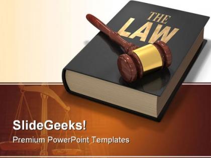
Let the subjects of law come in picture with our effective law justice PowerPoint templates and PowerPoint backgrounds 0511 PPT design. It is the genuine political anxiety that keep most of the population awake at night. And people are actually interested in the rule of law as they fear that society is no longer just and equal. However to enhance the interest of your audience in the subject, it is important that you deliver the lesson which is fascinating enough. The law is actually something that has been created by the human to modulate or to modify the society while introducing justice. A user can showcase the policing, bureaucratic power over the ordinary civilians for the accountability. The practice of the legal profession is elementary part of the people to access justice. The presentation is best to make your audience recognize the importance of the laws played in our society that this PPT can demonstrate apparently.Our thousands of Law Justice PowerPoint Templates And PowerPoint Backgrounds 0511 are not only through our hard work but also through customer feedback. We value the satisfaction of our customers that's why we take every suggestion seriously.
People who downloaded this PowerPoint presentation also viewed the following :
Law justice powerpoint templates and powerpoint backgrounds 0511 with all 3 slides:
Your self-esteem is invaluable. Our Law Justice PowerPoint Templates And PowerPoint Backgrounds 0511 pay their due respects.
FAQs for Law justice powerpoint templates and
Go with deep blues or grays for colors - looks way more professional than bright stuff. For fonts, stick to Times New Roman or something similar that screams "I know what I'm doing." Scales of justice are good, maybe some courthouse imagery, but don't go crazy with the gavel graphics (seriously, some templates look like clip art threw up). Structure-wise, you need sections for case facts, precedents, your arguments, and conclusions. Oh and definitely leave room for citations - professors are sticklers about those. Find a template with consistent formatting so you're not fixing wonky alignments at 2am. Trust me on that one.
Legal stuff gets so much clearer with the right visuals. Flowcharts work great for processes, timelines help track case progression, and comparison tables are perfect when you're looking at different laws. I swear statutory interpretation becomes way less painful when you break it down with a simple infographic - it just clicks. Pie charts show case outcomes nicely, bar graphs work for sentencing trends. Don't just slap random charts everywhere though. Pick what actually fits your content's logic. Start with whatever concept is most confusing and think "how would I explain this on a whiteboard?"
Stick with navy blue and white - can't go wrong there. Deep burgundy with cream gives you that serious courtroom vibe too. Charcoal gray with gold accents looks pretty sophisticated if you want something a bit different. Black and white is clean but honestly feels kinda sterile to me. Whatever you pick, don't go bright or flashy - you'll lose credibility instantly. Oh, and definitely test your colors on the actual projector first! They always look weird on screen compared to your laptop.
Okay so for case studies, timeline slides work really well - legal templates have solid layouts for this stuff. Don't go crazy with the gavel graphics though, they look tacky pretty fast. Break everything into chunks: background, main issues, both sides' arguments, final ruling. Those templates usually have decent citation formats already built in which saves time. Clean color schemes are where these templates actually shine. Oh and definitely do a "lessons learned" slide at the end - honestly that's the only part people remember anyway. The practical takeaways matter way more than all the technical details you'll spend forever organizing.
Stick with Times New Roman or Georgia for your main text - they look professional and judges/lawyers expect that kind of thing. Arial works well for headings. Make your text at least 24pt so people can actually see it from the back. I'd mix a serif font for body text with sans-serif for headers, gives it some structure without looking messy. Oh, and obviously avoid Comic Sans unless you want everyone questioning your judgment before you even start talking. Actually learned that one the hard way in law school!
Dude, less is definitely more with law presentation animations. Simple fade-ins work great for bullet points. Maybe use basic transitions like "fade" or "push" between slides. I've watched way too many attorneys kill their credibility with spinning graphics - it's honestly painful to watch. Your animations should guide attention to important stuff, like highlighting key evidence or revealing timeline pieces step by step. Nobody wants to see dancing gavels while you're making serious arguments. Oh, and definitely test everything beforehand because tech always fails when you need it most. Have a no-animation backup ready.
Okay so it really depends who you're talking to. Judges want formal stuff - stick to facts, precedents, minimal graphics. But with clients? Drop the legal jargon completely. Use normal words they actually get. I swear, lawyers kill me sometimes with these overcomplicated slides that just confuse everyone. For colleagues you can be somewhere in between. Oh and colors matter too - bright stuff might work for clients but definitely not in court. Test everything beforehand though, and always have backup slides ready because tech fails at the worst moments.
Okay so this is actually pretty interesting - the type of law you're dealing with totally changes how your templates should look. Criminal stuff needs those serious, dark colors like deep blues and grays. Makes sense, right? Corporate law can be way more modern and sleek with clean lines. Family law though? Go softer and more approachable - you don't want to stress people out more than they already are. International law gets tricky because you can't accidentally pick colors that might piss off delegates from different countries (learned that one the hard way). Bottom line: match what your audience expects to see.
Honestly, branding makes a massive difference in legal presentations. Clients and judges notice when your slides look polished and professional. Stick to your firm's colors and fonts consistently - just don't go crazy with it. I've watched some lawyers totally bomb with over-the-top designs that felt more like carnival ads than courtroom material. Clean is better. Drop your logo in headers or footers, maybe subtle background elements. You don't want it screaming from every corner though. The whole point is people should instantly know it's your work without feeling like they're being sold a timeshare. Start with 2-3 solid templates that actually match your firm's vibe.
Dude, consistency is HUGE for legal presentations. Your credibility tanks if slides look sloppy or fonts are all over the place. I've watched lawyers with solid arguments completely lose their audience because their slides were chaotic. Pick one clean template and stick with it - same fonts, colors, spacing throughout. Don't get tempted to switch things up midway (I know it's boring but trust me). Your design needs to match the precision expected in legal work. Honestly, it's such an easy win. Consistent slides keep focus on your arguments instead of making people wonder why slide 12 suddenly looks different.
Tell stories! Actual courtroom cases work way better than boring theory stuff. People remember stories, not bullet points. Your slides should be clean - don't cram text everywhere. Throw in some polls or quick Q&As every 10-15 minutes so they don't zone out. Practice your transitions beforehand (trust me on this one). The big thing is making it relevant to them personally. Like, how does this case change what they'll do tomorrow? Oh and end each section with something concrete they can actually use. Interactive stuff keeps people awake way better than just talking at them for an hour straight.
Honestly, throw those legal numbers into charts instead of just reading them off. Your audience will actually *get* what you're saying instead of zoning out. Bar graphs showing conviction rates or settlement amounts? Way more powerful than rattling off percentages. People's brains are visual - they'll remember a compelling chart but forget spoken stats like five minutes later. When you show a success rate visually vs saying "we win 78% of cases," it just lands better. More credible too. Start with your strongest stat as a hook, then let the data tell the story from there.
Don't go crazy with flashy templates - you're not hosting a game show. Clean and professional wins every time. Way too many people dump their entire brief onto slides word for word, which is basically torture for everyone listening. Short bullets work better than walls of text. Oh, and test your colors beforehand! I've seen presentations completely tank because someone used light gray text that disappeared under courtroom lighting. Practice it once through - you'll catch weird formatting stuff that always pops up. Keep it simple and you'll be fine.
Okay so this totally depends on who you're presenting to. Courtroom stuff? Stick with boring colors - blues, grays, white. Judges hate flashy graphics, trust me. Keep text super minimal and just focus on showing your evidence clearly. Academic presentations are way more chill though. You can actually use more colors and get detailed since you're teaching instead of trying to convince someone. Throw in data visualizations, longer explanations, maybe even some creative stuff that would bomb in court. Just figure out if you need to convince, inform, or teach first. That'll tell you everything about tone.
Honestly, multimedia can totally change how your legal presentations land with juries. Start with video clips - they're perfect for evidence or witness stuff. Audio recordings make depositions way more engaging than just reading transcripts (which let's be real, put people to sleep). Interactive timelines are clutch for complex cases where timing matters. Infographics help break down confusing legal concepts. Photos and diagrams are no-brainers for crime scenes. Charts make financial data actually make sense instead of drowning people in numbers. Pick your strongest multimedia piece first, then build everything else around it. Don't go overboard though - you want to support your story, not distract from it.
-
Awesome use of colors and designs in product templates.
-
Designs have enough space to add content.