

Lean Manufacturing Dashboard Showcasing Production Progress Implementing Lean Production




Try Before you Buy Download Free Sample Product
 Impress Your
 Audience
 100%
100% Editable
 Save Hours
 of Time


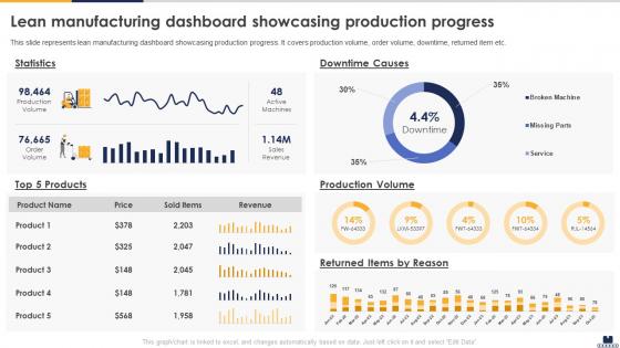
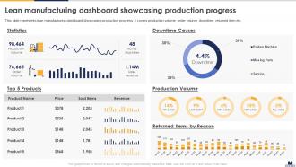
This slide represents lean manufacturing dashboard showcasing production progress. It covers production volume, order volume, downtime, returned item etc.
People who downloaded this PowerPoint presentation also viewed the following :
Lean Manufacturing Dashboard Showcasing Production Progress Implementing Lean Production with all 7 slides:
Use our Lean Manufacturing Dashboard Showcasing Production Progress Implementing Lean Production to effectively help you save your valuable time. They are readymade to fit into any presentation structure.





FAQs for Lean Manufacturing Dashboard Showcasing Production Progress
OEE, cycle time, and takt time are your bread and butter - they'll show you if things are actually running right. Lead time and defect rates matter too since they hit your profits directly. Inventory turns is another good one. Honestly, I'd also track where your bottlenecks are happening because those things will drive you crazy if you can't see them coming. Just don't go overboard - maybe 6 or 7 metrics tops? Any more and you won't catch the patterns when you're quickly checking the dashboard. Pick stuff that matches what you're trying to fix though.
Look, having real-time data on your operations is huge - you catch issues before they blow up your budget. No more waiting around for weekly reports or going with your gut. You'll actually see where waste is happening and which bottlenecks are killing your cycle times. Honestly, I think most companies set up way too many metrics at first, but if you focus on the KPIs that actually move the needle, you can make quick decisions about where to spend your improvement efforts. It's pretty much changed how fast teams can pivot when something's off.
You really need real-time data for your Lean dashboard - trust me on this one. Spotting problems as they happen beats finding out hours later when it's too late to fix anything. Live production metrics and quality alerts let your team jump on issues fast. Otherwise you're just guessing at what's going wrong. Continuous improvement only works when you can actually see what needs improving, right? Your dashboard should pull data automatically and refresh often. I've seen too many companies build these fancy displays that show yesterday's problems instead of today's opportunities.
Your dashboard becomes way more useful when you can actually see what's happening. Heat maps show you bottlenecks instantly - no more hunting through rows of numbers. Line charts work great for tracking OEE trends, and those red/yellow/green status lights? Total game changer for quick checks. Progress bars help with cycle times too. I'd honestly rather stare at paint drying than scroll through spreadsheets when we're behind schedule. Try swapping out your three most-used data tables for visual charts first. The kanban cards are pretty slick for workflow stuff, and your team will thank you for faster decisions.
Data quality will probably bite you first - messy systems make for useless dashboards. People on the floor hate this stuff because they think you're watching them like a hawk (and let's be real, some companies totally do that). Picking the right metrics is harder than it sounds too. Don't track everything or you'll drown in numbers that don't matter. Leadership might push back on the cost upfront. Oh, and getting everyone actually using it? That's its own battle. Start with just one department, show it works, then roll it out wider. Way less painful that way.
So basically, these dashboards show you what's actually happening with your lean stuff in real time. No more waiting around for weekly reports to figure out if you're screwing up. Track your cycle times, waste, defects - whatever metrics matter most right now. Honestly, the best part is how it makes problems super obvious immediately. Your team can see exactly where they stand against targets, and having that data visible keeps everyone honest. I'd say start small though - maybe 3-5 key metrics that match what you're trying to fix. Makes the whole kaizen thing way less abstract.
Power BI and Tableau are your best bets - super user-friendly with drag and drop stuff. Excel's fine if you're not doing anything too crazy, though it gets messy fast with big datasets. QlikView and Sisense are solid for manufacturing since they handle real-time production data well. Google Data Studio is free and honestly pretty decent (my old team used it for everything). I'd probably just start with whatever your team already knows how to use - you can always switch later once you figure out what metrics actually matter. Way easier than trying to learn a whole new system while you're still figuring out what you need.
Honestly, I'd start by just asking users what they actually look at versus what looks cool but never gets used. Focus on the stuff teams check every day - not every single data point you could cram in there. Test it with different people too. If someone who's new to lean can't figure it out in 30 seconds, you've overcomplicated things. Clear labels help way more than you'd think, and ditch the jargon. Oh, and make sure it works on phones since people are always checking these while they're walking around the floor. Set up monthly feedback sessions where people can tell you what's confusing or suggest tweaks.
Stick to metrics that actually matter - waste reduction, cycle times, OEE, quality stuff. Real-time data your operators can quickly scan and instantly know something's wrong. Color coding saves everyone time (red/yellow/green is foolproof). Don't jam everything onto one screen though - learned that the hard way. Data should refresh often enough to be helpful without being annoying. Honestly, the whole thing only works if floor workers can make fast decisions with it. Test everything with your actual team first. They'll catch issues you'd never think of.
Yeah, most lean dashboards play nice with your current ERP and MES systems through APIs - saves you from rebuilding everything. The dashboard basically becomes your central spot for all production metrics, inventory, performance stuff. Real-time data flows from multiple sources automatically once your IT folks map it out initially (that setup part's always fun, right?). Honestly the automated reporting is pretty solid once you get past that first hurdle. I'd start by figuring out which systems have your most critical lean data first.
Honestly, start with defect rates and inventory turnover - those are gonna give you the biggest bang for your buck. Cycle time vs. takt time is huge too, plus first-pass yield. Setup times and scrap costs will murder your margins if you're not watching them. For overproduction (which kills so many companies), track your WIP levels and how many days of finished goods you're sitting on. Motion waste shows up in labor efficiency ratios. Transportation waste? Check your material handling costs. I'd pick maybe 3-4 metrics that match your worst problems first, then build from there once you've got those running smooth.
Just ask your team what they actually want to see! Run some feedback sessions about which metrics help them do their job and how they like data presented. Honestly, most dashboards look great but sit there unused because they don't match how people work. Survey them on KPIs, visual formats, what's annoying about current data access - stuff like that. Get a few power users involved in designing it too. They'll spot problems you'd miss completely. Test with a small group first, tweak based on their feedback, then roll it out. Way better than building something nobody ends up using.
So that dashboard thing actually works pretty well for breaking down department walls. Everyone's looking at the same live data, which is huge. You'll start seeing how your team's stuff ripples out - production hiccups mess with shipping, quality problems create chaos for customer service. Honestly blew my mind when I first saw it all mapped out like that. Teams naturally start talking more because they can actually spot where things get stuck together instead of just blaming each other. Oh, and try doing weekly check-ins with other departments using the dashboard - keeps people actually working together instead of retreating back to their corners.
Real-time updates are your best bet, honestly. Hourly at minimum during shifts. The whole idea is catching problems before they blow up into bigger headaches. Daily? Way too slow - you've already missed your chance to fix things by then. Critical stuff like downtime and quality issues need constant monitoring. Other metrics can update every few hours, no big deal. Actually had a client who learned this the hard way last year. Start by figuring out what needs your immediate attention versus what can wait, then set your refresh rates from there.
Lean dashboards are honestly game-changers - I've watched companies cut waste by 30-40% just from seeing their processes in real-time. Toyota's whole thing is built on visual dashboards tracking cycle times and defect rates. Helps them catch bottlenecks immediately. Ford does something similar with equipment monitoring and cut unplanned maintenance by 25%. Pretty smart, right? Thing is, you need metrics that actually make people do something different. Not just fancy graphs that impress executives but don't change anything on the floor.
-
Kudos to SlideTeam for achieving the high success rate in delivering the top-notch slides.
-
“Detailed and great to save your time.”