


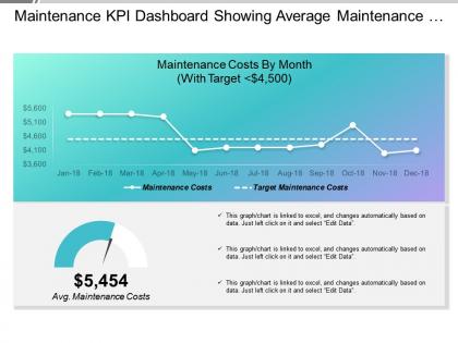
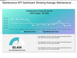
Maintenance kpi dashboard showing average maintenance costs




Try Before you Buy Download Free Sample Product
 Impress Your
 Audience
 100%
100% Editable
 Save Hours
 of Time


Orientate yourself with our Maintenance Kpi Dashboard Showing Average Maintenance Costs. They will define the right path in the maze of options.
People who downloaded this PowerPoint presentation also viewed the following :
Maintenance kpi dashboard showing average maintenance costs with all 6 slides:
You will discover our Maintenance Kpi Dashboard Showing Average Maintenance Costs to be a lucrative deal. They guarantee greater gains.


FAQs for Maintenance kpi dashboard showing
Start with the big three: OEE, MTBF, and MTTR - they'll show you how your equipment's actually performing. Then add planned vs unplanned maintenance ratios and work order completion rates. Maintenance costs as a percentage of asset value is huge too. Downtime tracking and first-time fix rates round it out nicely. Look, there's probably 50+ metrics you could obsess over, but that's just analysis paralysis waiting to happen. Pick maybe 6-8 that actually address whatever's keeping you up at night. Build your dashboard around your team's biggest headaches first, then expand later.
Look, tracking the right maintenance KPIs will totally change how your operation runs. You get real-time data on equipment performance and can actually see downtime patterns forming. MTTR, planned vs unplanned maintenance ratios, asset availability - these metrics help you catch issues before they turn into expensive disasters. My buddy's plant started doing this last year and their emergency repairs dropped like crazy. Pick maybe 3-5 KPIs that actually make sense for your setup. Review them weekly with your team and you'll start optimizing schedules naturally while keeping production smooth.
Dude, real-time data is what separates useful dashboards from those fancy wallpaper screens nobody actually checks. Your equipment sensors and work orders feed you live info, so you catch problems right when they start brewing instead of three days later. Think security camera vs. walking around looking for damage once a month - totally different worlds. Oh, and definitely set up alerts for your critical stuff. That way your dashboard actually prevents disasters instead of just... documenting them after everything's already gone to hell. Makes all the difference, trust me.
First thing - figure out what regulations actually matter for your space. NERC for utilities, FDA for pharma, that kind of stuff. Trade associations usually publish benchmarking data too, which helps you see what competitors track (though good luck getting the juicy details). Start with maybe 3-5 industry-specific KPIs that matter for compliance. Then add operational ones that actually impact your bottom line. Honestly, most generic maintenance dashboards are pretty useless - you need thresholds that make sense for your industry's performance ranges. Build from there once you've got the foundation down.
So basically, these dashboards take all your messy maintenance data and make it actually readable. Trends jump out at you right away. Equipment problems? You'll catch them before they cost you a fortune. Your boss will love the clean charts instead of those awful spreadsheets nobody opens anyway. The coolest part is spotting patterns super fast - like which machines are total headaches or when your crew hits their stride. I'd probably throw in some downtime tracking too, but that's just me. Start with maybe 3 metrics and add more as you go.
Yeah, seasonal stuff totally screws with maintenance metrics. Your HVAC's gonna work overtime in summer and winter, equipment breaks down faster when weather sucks. Skip the month-to-month comparisons - they're basically useless. Do year-over-year instead, and set seasonal baselines so you don't freak out when things spike every July. Weather overlays are clutch if you can swing it. Temperature and humidity explain most of those weird patterns anyway. Oh, and make your alerts smarter - 20% more failures in winter? Probably fine. Same spike in April? Now you've got real problems.
Hook your dashboard straight into your CMMS - cuts down on manual entry mistakes big time. The biggest headache I've seen? Everyone defines "downtime" differently, so nail down those definitions first. Set up dropdown menus instead of letting people type whatever they want (trust me on this one). You'll want someone checking for weird data weekly. Also train your crew on consistent entry methods. Honestly, if you make the right way the easy way, your techs will actually follow it. Automate what you can and your data stays clean.
Check your KPIs monthly for quick trend spotting and threshold tweaks. Every quarter, dig deeper and question if you're even tracking the right stuff - honestly, so many teams just let their dashboards collect digital dust. Annual overhauls work well, or whenever you get new equipment or priorities shift. The monthly thing is key though. I'd literally put those check-ins on your calendar right now before you forget. Your metrics need to grow with your operation, not just sit there being ignored. Otherwise you'll end up making decisions off stale data.
Honestly, the data mess is your biggest headache - your CMMS is probably half-empty or straight-up wrong, making everything look sketchy. People hate changing how they work too (I mean, fair enough). Don't go crazy with metrics either - pick like 3-4 that actually matter instead of pretty numbers that impress nobody. Oh, and clean up your data first or you're building on quicksand. Start small, show some quick wins to get people on board. Nobody wants another dashboard they'll never look at anyway.
Start tracking stuff like vibration patterns and temp changes on your most critical equipment - that's where the real money is. Your dashboard should pull this data in real-time so you can spot trends before things actually break. Honestly, it's pretty satisfying when you nail the timing on this. Set up alerts for when those predictive indicators cross certain thresholds. Then you can schedule maintenance during downtime instead of scrambling when something dies unexpectedly. Usage cycles are another good metric to watch. Once you get the hang of it with your key assets, expand to other equipment gradually.
Line charts are your best bet for tracking stuff like MTBF and downtime trends. Bar charts work really well when you're comparing different equipment or teams side by side. I know everyone's obsessed with gauge charts these days, but they're actually pretty decent for showing where you stand vs targets. Heat maps though? Those are amazing for equipment health across your whole facility - problem spots just jump out at you. Don't overthink it or cram everything on one dashboard. Pick your top 3-4 metrics first, then expand from there once you get the hang of it.
User feedback is your roadmap to building something people actually want to use. Your maintenance team might tell you they can't find critical alerts fast enough - that stings but it's pure gold. You'll figure out which KPIs they really care about vs what their boss thinks matters. Regular check-ins help tons, whether it's surveys or just grabbing coffee. I'd honestly start with your power users since they'll roast you the hardest but give the best insights. Layout problems, confusing charts, missing features - they'll catch everything you missed.
MTTR and MTBF are your best bets - they show how fast you recover and how often stuff breaks down. OEE is solid too since it rolls everything into one number (executives eat that up). Track your planned vs unplanned downtime ratio - honestly, this one's huge because it tells you if you're staying ahead of problems or just reacting to fires all day. Those four metrics will paint a pretty clear picture of what's actually killing your uptime. My old boss used to obsess over these numbers, but for good reason.
Honestly, these shared dashboards are game-changers for maintenance teams. Everyone sees the same real-time data - who's buried in work, which equipment needs attention, where things are getting backed up. No more guessing games. Your team starts actually talking to each other about what they're seeing, helping out when someone's drowning, making calls based on actual numbers instead of hunches. The whole collaboration thing just happens naturally once people can see what's going on. Set it up so each role sees their relevant stuff. Trust me, it works way better than you'd think.
Dude, automated reporting is seriously worth it. Instead of waiting days for manual reports, you get real-time data that lets you catch problems early - like equipment acting up or costs going crazy. Those dashboards pull out the important stuff automatically so you're not buried in spreadsheets (which honestly sucks). Set up alerts for whatever thresholds matter to you. I'd start with whatever report takes you the longest to do manually - that's where you'll feel the difference first. The whole thing just makes spotting trends way easier.
-
Wonderful templates design to use in business meetings.
-
Very unique, user-friendly presentation interface.