

Management consultant visualization of interpretation data powerpoint templates 0528




Try Before you Buy Download Free Sample Product
 Impress Your
 Audience
 100%
100% Editable
 Save Hours
 of Time


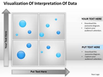
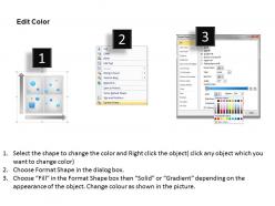
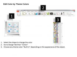
Searching for readymade management consultant visualization of interpretation data PowerPoint presentation template slides? Create dynamic Microsoft office PPT Presentations with our professional management consultant visualization of interpretation data PPT templates designed by professional graphics designers. Display the strategic management of your company with a BCG Matrix. The Matrix shows the coherence between the product life cycle and the cost experience curve. Customize the template layout and design as per the business presentation needs. We provide additional instructional slides to help you in editing the slides. With the implementation of this template in your presentation, you can easily grab the attention of your onlooker. Our template will help your audience to better understand the data represented in the template slides of the presentation. So hurry and download this amazing template with just a click. There is very little our Management Consultant Visualization Of Interpretation Data Powerpoint Templates 0528 cannot do. Just let your imagimation run riot and see them respond.
People who downloaded this PowerPoint presentation also viewed the following :
Management consultant visualization of interpretation data powerpoint templates 0528 with all 5 slides:
Prescribe your diet on our Management Consultant Visualization Of Interpretation Data Powerpoint Templates 0528. Explain to your audience what is good for them.
FAQs for Management consultant visualization of interpretation data
Honestly, less is more with executive dashboards. Strip out anything that doesn't directly support your main point - these people are swamped and won't decode messy charts. One insight per slide works best. Keep your colors and fonts consistent, and make sure labels are super clear. Here's the thing though - always lead with your conclusion at the top, then show the data that backs it up. They shouldn't have to hunt for the "so what." Test it on a colleague first if you can swing it. Oh, and maybe this is obvious, but don't make them guess what they're looking at.
Honestly, visuals are a game changer for presentations. Charts and dashboards help people actually understand your complex stuff instead of drowning in spreadsheets. Executives eat this up - makes them look good in meetings. Your sessions become way more interactive too since people have something to actually discuss instead of just nodding while you talk for an hour straight. I always tell people to swap out half their bullet points for visuals in their next deck. Trust me, even simple bar charts work better than walls of text. Oh and process flows are clutch for showing how things connect.
Honestly, just start with PowerPoint - I know it sounds boring but clients still live and breathe by it, plus the charting is way better than people think. Excel's your bread and butter for quick data stuff, though the default charts look pretty dated. Tableau will blow people's minds with interactive dashboards if you want that wow factor. R and Python are solid if you're doing heavy stats work - ggplot2 especially makes beautiful visuals. But real talk? Master PowerPoint first since that's what everyone expects, then maybe pick up Tableau later.
Yeah totally - your charts should match whatever approach you're using. Strategy work? Go with 2x2 matrices and pyramid charts for positioning stuff. Process improvement people are obsessed with swimlane diagrams and value stream maps. Financial consultants basically worship waterfall charts and variance analysis (seriously, they get way too excited about P&L visuals). Change management is all about journey maps and stakeholder matrices. Oh, and don't just pick something because it looks cool - choose what actually makes sense for how your audience thinks about the problem.
Start with the problem, walk through your data, then hit them with clear next steps. Most people just throw charts at executives and wonder why nothing happens - drives me crazy. Structure it like telling a story: here's what's broken, here's what we found, here's how to fix it. Put your biggest insight right up front, then back it up with details. Use callouts so they know what actually matters in all those graphs. Make your dashboards feel more like chapters than random slides. Oh, and let people dig deeper if they want to - some folks love the weeds.
First thing - check your data twice before you even open the design software. I learned this the hard way once. When you're building it, ditch all the fancy stuff that looks "professional" but actually confuses people. Simple bar charts work better than you think. One accent color, clean lines, that's it. Don't get tempted to show off your Excel wizardry - seriously, nobody cares how many features you can cram in. Test it on someone fresh. If they're squinting or going "huh?" in the first few seconds, you've got more work to do.
Dude, color psychology is everything when you're presenting to execs. Red screams urgency - great for highlighting problems that need fixing ASAP. Blue makes you look trustworthy and credible, so use it for your main points. Green obviously means "good news" or go-ahead decisions. I totally bombed a presentation once using bright orange everywhere. The CEO literally said it felt "too in-your-face" - lesson learned! Warm colors push people toward action. Cool colors feel more analytical and stable. Bottom line: pick colors based on how you want people to *feel* about your data, not what looks nice.
Honestly, data viz is a game changer for making sense of messy spreadsheets. Your brain processes visual patterns way better than scanning endless rows of numbers. Those seasonal spikes or weird outliers that signal problems? They'll pop right out in a chart when you'd never catch them otherwise. I learned this the hard way after spending way too many late nights squinting at Excel sheets. Start simple - scatter plots, bar charts, nothing fancy. Once you see what story your data's actually telling, then you can get creative with the visuals. But seriously, if you can't turn your data into a clear chart, you probably don't understand it yet.
Don't overload your charts with too much info - execs will check out immediately. Those 3D effects and random colors? Total rookie mistake. Think about the actual story first, then build the chart around that. Start your axis at zero (unless there's a good reason not to), and label everything so it's crystal clear. Oh, and definitely run it by someone else before you present. I learned this the hard way - after you've been buried in spreadsheets for hours, what seems obvious to you might look like complete gibberish to everyone else. Skip the basic Excel templates too.
Dude, you've gotta let clients actually mess around with the data instead of just showing them boring static charts. Click-through stuff, filters, scenarios they can test themselves - that's where the magic happens. People remember way more when they're hands-on versus just sitting there listening to you talk. It's honestly like reading about riding a bike versus actually doing it, if that makes sense? Those "oh shit, now I get it" moments only come when they're exploring on their own. Build some simple interactive elements into your next pitch. Trust me on this one.
Here's what I'd track: how fast people actually get your main point, whether it changes their decisions, and if they remember anything the next day. Seriously, I've sat through so many meetings with gorgeous charts that everyone forgot by lunch. Watch for real engagement too - are they asking good questions or just being polite? Oh, and test if they understood correctly by having them explain it back. Nothing worse than a slick visualization that confuses everyone. Try measuring these in your next presentation and see what happens.
Oh man, this is HUGE and so many people mess it up. Colors mean totally different things - red screams danger here but it's lucky in China. Reading patterns matter too since some cultures scan right-to-left, which throws off your whole chart flow. Japan wants tons of context in their visuals while Americans just want the highlights. I learned this the hard way when a client presentation bombed because I used way too much white space (apparently looked "empty" to them). Tables vs graphics preferences are cultural too. Always run stuff by local teammates first - saves you from looking clueless later.
Put your main point right at the top - what's the ONE thing they need to remember? Then build everything else under that using the pyramid structure. Charts should be clean (2-3 colors tops) with clear labels. I swear, half the dashboards I see are gorgeous but totally miss the point. You're telling a story, not just dumping data on people. Walk them through it logically. Callout boxes work great for big insights. Cut anything that doesn't help your story - all that extra stuff just distracts. Oh, and definitely test it on someone who doesn't know the topic first.
Try breaking down complex data with animations instead of dumping everything at once. Progressive reveals work great - like building charts layer by layer or showing process flows step by step. Way more engaging than static slides that put people to sleep. Timeline stuff and before/after comparisons are perfect for this approach. PowerPoint's basic animations are fine to start with (honestly, most people overthink the tech). If you want to get more creative later, Tableau has some cool options. The key thing is guiding people through your logic instead of making them figure it out themselves.
Dude, you gotta match your slides to whoever's watching. C-suite wants the big picture stuff - like what's the bottom line impact, zero fluff. Middle managers need way more detail about processes since they're the ones actually doing the work. Tech people? They can handle your crazy complex charts and methodology breakdowns. I've literally watched perfect presentations bomb because someone showed engineers those super simplified executive slides - it was painful. Switch up your colors, chart styles, even the words you use. Oh and pro tip: make 2-3 versions of your main slides so you can switch gears if people look confused.
-
Innovative and Colorful designs.
-
Helpful product design for delivering presentation.