Marketing pitch deck ppt template

Rating:
100%
Marketing pitch deck ppt template
Slide 1 of 27
Favourites Favourites

Try Before you Buy Download Free Sample Product

Audience Impress Your
Audience
Editable 100%
Editable
Time Save Hours
of Time
The Biggest Sale is ending soon in
0
0
:
0
0
:
0
0
Rating:
100%
Provide your investors essential insights into your project and company with this influential Marketing Pitch Deck PPT Template. This is an in-depth pitch deck PPT template that covers all the extensive information and statistics of your organization. From revenue models to basic statistics, there are unique charts and graphs added to make your presentation more informative and strategically advanced. This gives you a competitive edge and ample amount of space to showcase your brands USP. Apart from this, all the twenty seven slides added to this deck, helps provide a breakdown of various facets and key fundamentals. Including the history of your company, marketing strategies, traction, etc. The biggest advantage of this template is that it is pliable to any business domain be it e-commerce, IT revolution, etc, to introduce a new product or bring changes to the existing one. Therefore, download this complete deck now in the form of PNG, JPG, or PDF.

Content of this Powerpoint Presentation


Slide 1: This is a slide that represents the topic Marketing Pitch Deck.
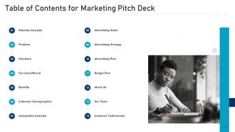
Slide 2: This is a Table of Contents slide that represents Marketing Pitch Deck, Situation Analysis, Problem, Solutions, Services Offered, Benefits, and more.
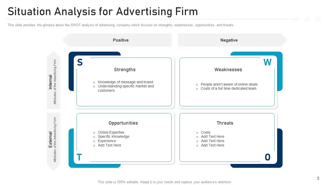
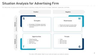
Slide 3: This slide provides a glimpse of the SWOT analysis of an advertising company which focuses on strengths, weaknesses, opportunities, and threats.
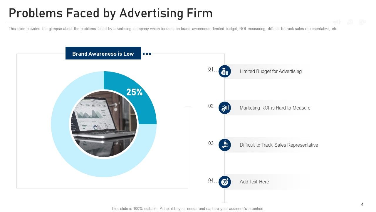
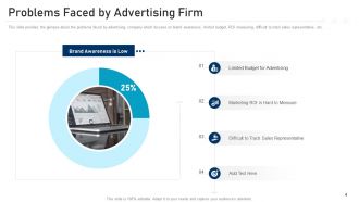
Slide 4: This slide provides a glimpse of the problems faced by an advertising company that focuses on brand awareness, limited budget, ROI measuring, difficulty to track sales representatives, etc.
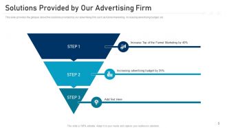
Slide 5: This slide provides a glimpse of the solutions provided by our advertising firm, such as funnel marketing, increasing advertising budget, etc.
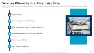
Slide 6: This slide provides a glimpse of the services offered by the advertising firm, such as content marketing, mobile messaging, social media marketing, SEO, SEM, website designing, online reputation management, etc.
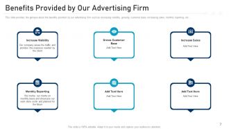
Slide 7: This slide provides a glimpse of the benefits provided by our advertising firm, such as increasing visibility, growing customer base, increasing sales, monthly reporting, etc.
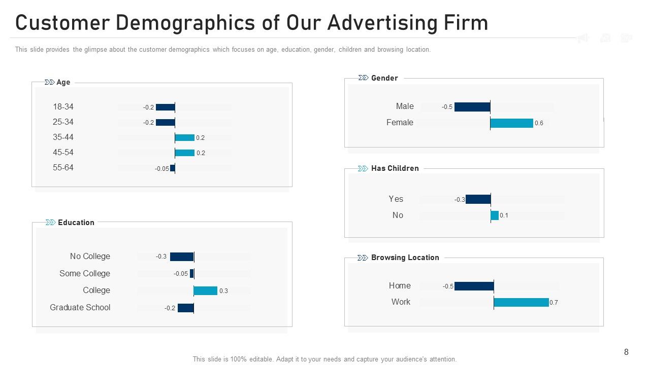
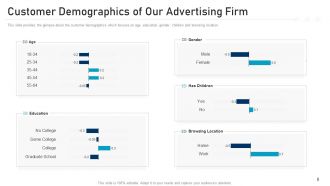
Slide 8: This slide provides a glimpse of the customer demographics focusing on age, education, gender, children, and browsing location.
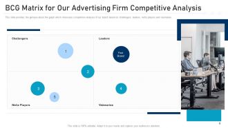
Slide 9: This slide provides a glimpse of the graph, which showcases competitors' analysis of our brand based on challengers, leaders, niche players, and visionaries.
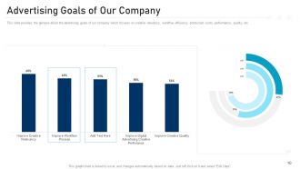
Slide 10: This slide provides a glimpse of the advertising goals of our company which focuses on creative relevancy, workflow efficiency, production costs, performance, quality, etc.
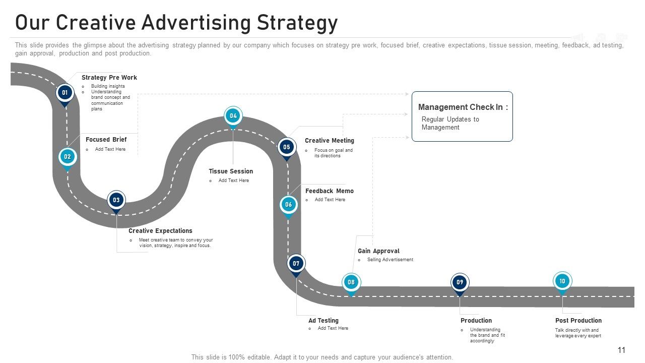
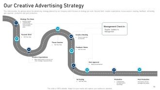
Slide 11: This slide provides a glimpse of the advertising strategy planned by our company which focuses on strategy prework, focused brief, creative expectations, tissue session, meeting, feedback, ad testing, gain approval, production, and post-production.
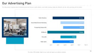
Slide 12: This slide provides a glimpse of the advertising plan which focuses on public relations, social media marketing, display ads, billboards, print ads, radio spots, and time duration.
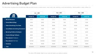
Slide 13: This slide provides a glimpse of the advertising budget plan, which focuses on market research, owned media, video advertising, social media advertising, marketing platform, creative software, etc.
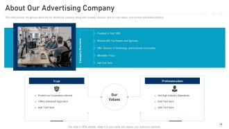
Slide 14: This slide provides a glimpse of our advertising company along with a company overview and our core values, such as trust and professionalism.
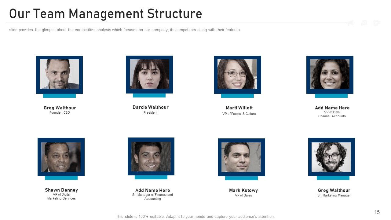
Slide 15: This slide provides a glimpse of the competitive analysis which focuses on our company, its competitors, and their features.
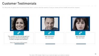
Slide 16: This slide provides a glimpse of the client testimonials wherein customers share their experience of using our company and how it benefits them.
Slide 17: This is an icon slide that represents the Marketing Pitch Deck.
Slide 18: This is a template that introduces the Additional Slides.
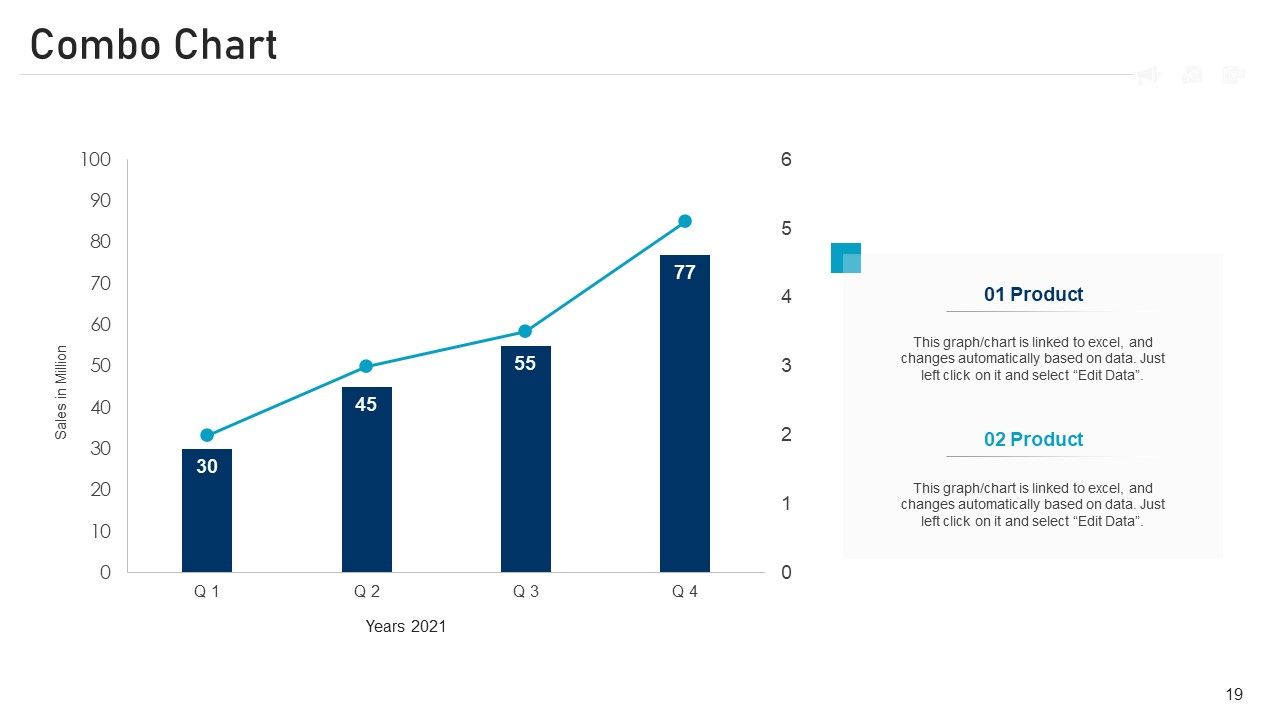
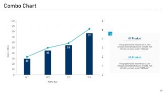
Slide 19: This is a Combo Chart slide that is linked to excel and changes automatically based on data.
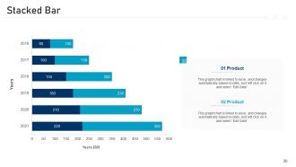
Slide 20: This is a Stacked Bar template that is linked to excel and changes automatically based on data.
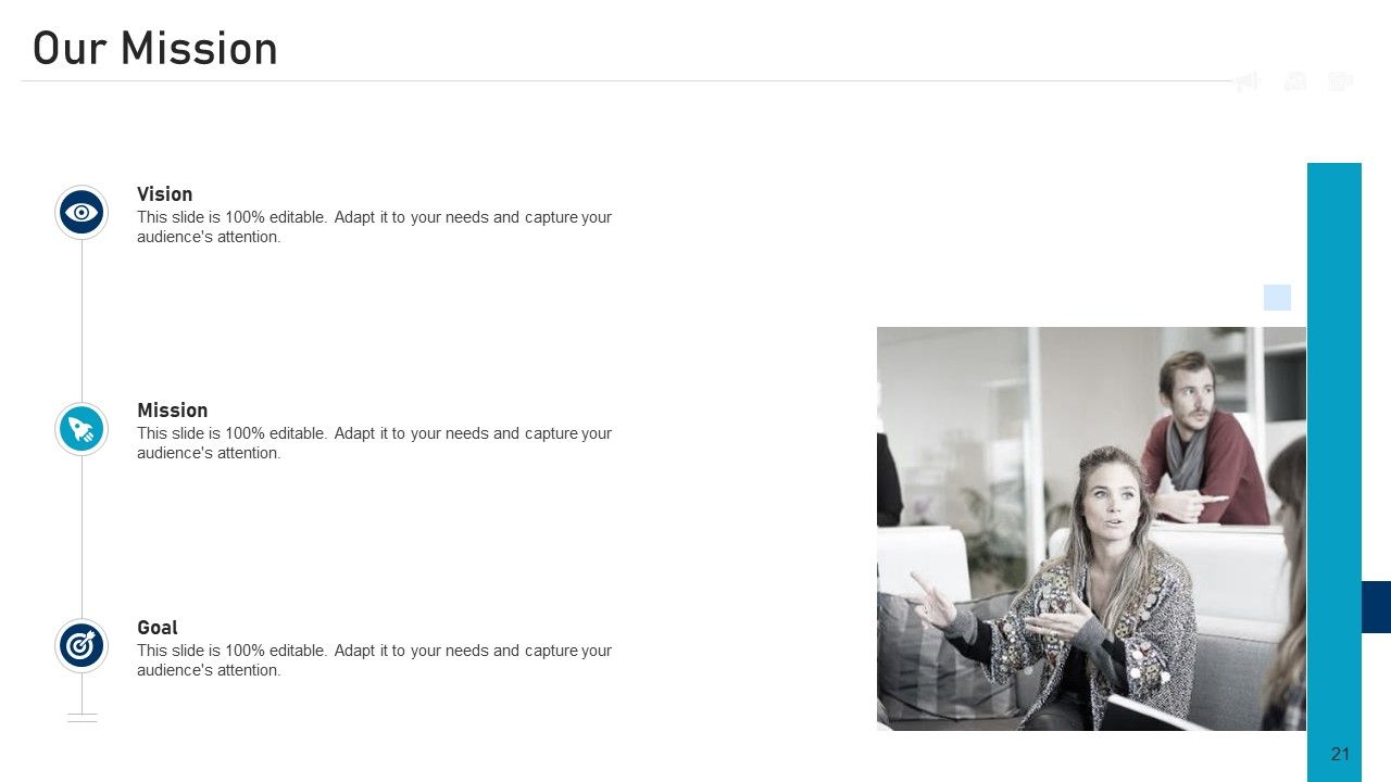
Slide 21: This is a company introduction template that illustrates our Mission, Vision, and Goal.
Slide 22: This is an About Us slide that illustrates Target Audience, Valued Clients, and more.
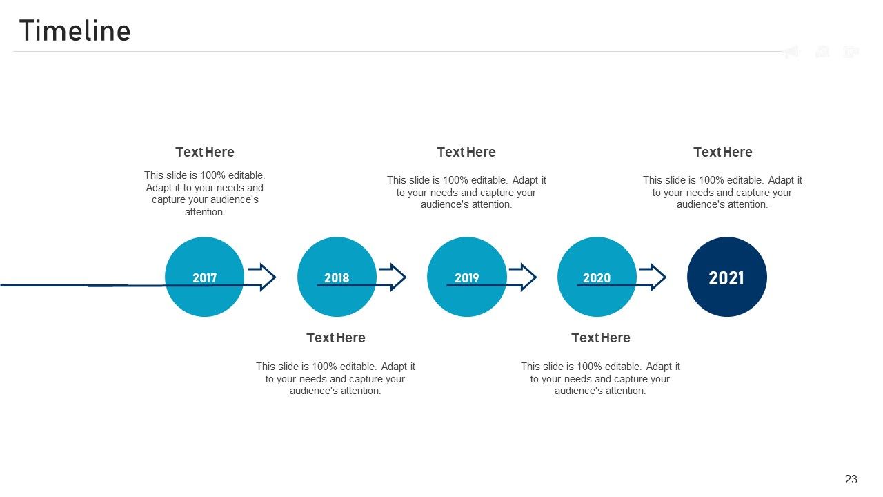
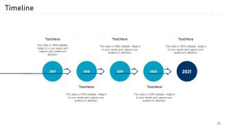
Slide 23: This slide is a Timeline template to showcase the progress of the steps of a project with time.
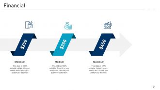
Slide 24: This slide presents the Financial data at a minimum, medium, and maximum percentage.
Slide 25: This slide contains Post-It Notes that can be used to express any brief thoughts or ideas.
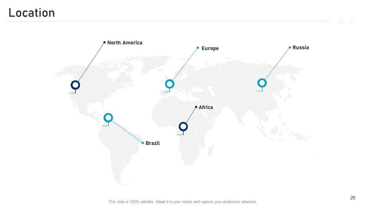
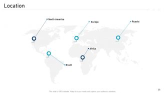
Slide 26: This is a 100% editable location slide that can be used to represent your company’s geographical presence.
Slide 27: This is a Thank you slide that illustrates the company address, contact number, email, and more.

FAQs for Marketing pitch

So for your marketing pitch deck, start with the problem you're solving and your unique solution. Target market size matters big time. Show the competitive landscape but don't spend forever on it. Your go-to-market strategy needs real tactics and timelines - investors hate vague stuff. If you've got any traction metrics, definitely include those. Business model and revenue projections are obvious must-haves. Team slide is crucial since they're literally investing in your marketing chops. Keep it visual over text-heavy - nobody wants to read paragraphs. Oh, and practice beforehand so you can see what lands with different investor personalities.

Think of your whole presentation like telling one big story - don't just shove it into a single slide. Open with a problem everyone gets, then show how your solution saves the day. I hate when people randomly throw in customer stories everywhere (so awkward), but when it's done right? Gold. Use real examples and case studies to back up your points instead of vague benefits. The flow should go: here's the mess (problem), here's how we fixed it (your approach), here's what happened (results). Make sure your examples feel real - actual customers, not made-up personas. After each section, tie it back to your main story so everything connects.

Honestly, less is way more when it comes to slides. One main point per slide, tons of white space. Ditch the text walls - use good photos, simple charts, or icons instead. Stick to maybe 2-3 colors from your brand (I always go overboard on colors and regret it later). Pick readable fonts, nothing weird. Your audience should focus on you, not struggle to read cluttered slides. Keep everything as bullet points or short phrases. Quick test: if you can't read it clearly on your phone screen, it's too busy. Trust me on this one.

Here's the thing - investors hate fluffy claims, but they love hard numbers. When you say "customers will love this," they roll their eyes. Show them actual conversion rates or user behavior instead. Real data proves you're not just making stuff up based on hunches. I always tell people to get specific - like "boosted engagement by 34%" hits way harder than "improved performance." Honestly, charts make everything look more legit too. Just don't go overboard with the graphs. Back up your big claims with actual metrics and watch how much more seriously they take you.
Okay so branding is huge for pitch decks. Like, way more than people think. Investors are drowning in presentations every day, and yours needs to stick out somehow. Consistent colors, fonts, and your logo throughout the whole thing makes you look legit and shows you actually care about details. It's also about telling your story - every slide should feel like it belongs together, you know? Don't just slap random templates together. Strong visual identity reinforces who you are in the market too. Honestly, I've seen great ideas tank because the deck looked thrown together last minute.

Keep your competitor slide honest but don't obsess over it. Make a simple chart showing 2-3 areas where you actually beat them - pricing, features, whatever your strong suits are. Never trash talk competitors (super unprofessional), but definitely highlight real gaps you're solving. One slide max, seriously. I've watched so many founders either pretend competition doesn't exist or spend like 10 minutes on competitive analysis - both make investors nervous. Frame it as "here's the opportunity we're going after" instead of just comparing feature lists. Focus on why your approach works better and you'll be golden.

You gotta figure out what each group actually cares about first. Investors? Hit them with market size and money stuff right away. Customers want to hear about their problems and how you fix them. Your internal team just wants timelines and what resources they'll need. I totally bombed a presentation once because I didn't get this - learned real quick after that mess! The content stays mostly the same, but you shuffle slides around and change up your language. Technical jargon for some groups, plain English for others. Oh, and swap examples that'll actually click with each audience. Write down their top 3 worries before you even open PowerPoint.

Map out your customer journey in 3-4 stages - awareness, consideration, decision, retention. At each stage, call out the pain points and show exactly how you solve them. Real customer quotes work way better than made-up examples, trust me on this. Include all the touchpoints where people actually interact with your brand and what they do next. Here's the thing though - don't just list stages. You need metrics for each point to prove it's working. Then connect the whole thing back to revenue goals. Otherwise you're just making pretty diagrams that don't mean anything to leadership.

Look, investors really just want to see metrics that prove you're actually making money and growing. CAC and LTV are must-haves. Conversion rates too. Month-over-month user growth is huge - honestly, this one can make or break your pitch. Retention rates matter way more than people think because sticky products = happy investors. Market penetration data helps if you have it. Oh, and viral coefficients if that's relevant to your model. The key thing is picking metrics that actually tell a story about where you're headed. Keep it visual, don't dump fifty charts on them at once. Really depends on your specific business model though.

Okay so first thing - grab them with a killer opening, none of that "thank you for having me" stuff. Then go problem-solution-proof. What's bugging your audience? Here's how you fix it. Here's why it actually works. Slides should be mostly visual - trust me, walls of text kill presentations faster than anything. I like the rule of three for main points, keeps things digestible. Oh and throw in questions or a demo every few minutes so people don't zone out. Don't end with "any questions?" That's weak. Give them one specific thing to do next.

The biggest mistake? Text-heavy slides that make everyone's eyes glaze over. Keep it short - maybe 10-15 slides tops. Nobody wants to sit through a 30-slide marathon. Focus on the problem you're solving instead of just listing features (trust me, investors care way more about the "why" than cool functionality). Be specific about your target market too - saying "everyone" isn't gonna cut it. Show real traction with actual numbers, not vague statements. And honestly, this might sound obvious, but you'd be surprised how many people forget to include a clear ask at the end.

Okay so honestly, actually LISTEN when people give you feedback - don't just smile and then ignore everything they said. Make a simple doc tracking comments by slide. Look for patterns too. Three people saying your value prop sucks? Yeah, it probably does lol. I used to get so defensive about this stuff, but random people catch mistakes you're totally blind to. Hit the biggest issues first. The small stuff can wait. Oh and test your updated deck with someone before the real presentation - you don't want to bomb in front of actual clients.

Canva and Pitch are solid choices since they're built for presentations with good templates. PowerPoint works too if you want more control - honestly, I've made some decent decks in basic PPT. Google Slides is fine for collaboration stuff. Figma's great but probably overkill unless you're already a design person. Here's the thing though - I've seen amazing pitches done in PowerPoint and trash ones made with fancy tools. Your story matters way more than whatever software you pick. Just use what feels comfortable and spend your time getting the narrative right instead of obsessing over tools.

Dude, timing is everything with pitch decks. Spend way more time on your problem/solution slides and market opportunity - those are your money makers. Don't waste 10 minutes droning on about company history (I've watched so many good pitches crash doing exactly this). Build momentum as you go, don't just wander around aimlessly. Practice with a timer so you know which slides actually matter. Here's the thing though - save 25% of your time for Q&A. That's honestly where the real magic happens and deals get made.

For your follow-up slide, map out the timing - day 1 email, day 3 call, day 7 send them something useful. Mix up your contact methods since everyone's different (I personally hate unexpected calls but love good emails). Don't forget the leads who aren't ready yet - maybe monthly newsletters or checking in quarterly. Show them you've got a real system, not just "we'll reach out eventually." Include who owns what so stuff doesn't get forgotten. Oh, and definitely put actual timeframes on everything.

Ratings and Reviews

100% of 100
Review Form
Write a review
Most Relevant Reviews
  1. 100%

    by Johnson Morris

    Wonderful templates design to use in business meetings.

1 Item

per page: