


News coverage powerpoint slide graphics




Try Before you Buy Download Free Sample Product
 Impress Your
 Audience
 100%
100% Editable
 Save Hours
 of Time


Get folks aware of intimidation with our News Coverage Powerpoint Slide Graphics. Enable them to counter any foul play.
People who downloaded this PowerPoint presentation also viewed the following :
Content of this Powerpoint Presentation
Description:
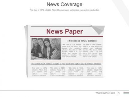
The image is a PowerPoint slide titled "News Coverage," which appears to be a template for presenting a news-related topic or summary. The slide is styled to look like a newspaper with the headline "News Paper" and an accompanying image of four people, possibly a news team, engaged in discussion or work. Below the newspaper headline, the phrase "This slide is 100% editable. Adapt it to your needs and capture your audience's attention." is repeated several times, indicating that the template is designed for customization and to add various details about news coverage.
Use Cases:
This type of slide can be adapted for use in different industries for purposes such as reporting relevant news, discussing media strategies, or summarizing current events:
1. Media and Journalism:
Use: Summarizing the latest news coverage for editorial meetings.
Presenter: News Editor
Audience: Journalists, Reporters
2. Corporate Communications:
Use: Reviewing media coverage of company news and events.
Presenter: Communications Manager
Audience: Corporate Executives, PR Team
3. Public Relations Firms:
Use: Showcasing PR campaign results to clients.
Presenter: PR Specialist
Audience: Clients, Media Partners
4. Education:
Use: Teaching students about media studies and news reporting.
Presenter: Professor
Audience: Students
5. Government Agencies:
Use: Briefing on public policy coverage in the media.
Presenter: Policy Analyst
Audience: Government Officials, Public Servants
6. Healthcare:
Use: Discussing media reports on healthcare topics and advancements.
Presenter: Healthcare Administrator
Audience: Medical Staff, Public Health Officials
7. Financial Services:
Use: Updating stakeholders on financial news affecting the market.
Presenter: Financial Analyst
Audience: Investors, Financial Advisors
News coverage powerpoint slide graphics with all 5 slides:
Acquire the franchise with our News Coverage Powerpoint Slide Graphics. Convince them of your ability to advance the cause.
FAQs for News coverage
Essential elements include compelling headlines, high-quality visuals or infographics, key statistics or data points, source credibility indicators, and clear call-to-action statements. These components work together by capturing audience attention, supporting narrative flow, and enhancing message retention, with many media organizations and corporate communications teams finding that strategic visual hierarchy and concise storytelling ultimately deliver stronger stakeholder engagement and more memorable presentations.
Graphics enhance news coverage storytelling by creating visual narrative flow, establishing emotional connection with audiences, simplifying complex data through infographics, and providing contextual background through maps or timelines. Through strategic visual elements, news organizations streamline information delivery, increase audience engagement, and improve story comprehension, with many broadcasters finding that well-designed graphics ultimately deliver more memorable coverage and stronger viewer retention.
Red, blue, and white combinations effectively convey urgency and credibility in news presentations, with deep blues establishing trust, strategic red accents highlighting breaking developments, and clean whites ensuring readability. These color schemes enhance viewer engagement by balancing authoritative professionalism with visual impact, with many news organizations finding that this strategic combination delivers both immediate attention and long-term credibility.
Infographics improve audience understanding by transforming complex datasets into visual narratives, using charts, graphs, timelines, and comparative displays to highlight key trends and relationships within news stories. Through strategic color coding, data visualization, and simplified layouts, news organizations can help audiences quickly grasp statistical information, polling results, and analytical insights, ultimately enhancing comprehension and engagement across diverse readership demographics.
Balancing text and visuals in news coverage slides requires strategic use of compelling headlines, concise bullet points, high-quality images, infographics, and white space to create visual hierarchy. Effective slides combine minimal text with impactful visuals like charts and photographs, ensuring key messages are digestible and memorable, while maintaining professional credibility that keeps audiences focused and engaged throughout presentations.
Best practices for sourcing images in news presentations include using licensed stock photography, obtaining proper media permissions, verifying image authenticity, maintaining attribution records, and ensuring copyright compliance. These practices streamline legal protection while enhancing credibility, with many news organizations finding that systematic sourcing protocols ultimately deliver faster production workflows and stronger audience trust.
Interactive news coverage PowerPoint slides can incorporate clickable hotspots, embedded video clips, hyperlinked headlines, animated data visualizations, and interactive timelines that allow viewers to explore content at their own pace. These interactive elements enhance audience engagement by enabling deeper exploration of breaking news stories, real-time polling during presentations, and seamless navigation between related topics, ultimately delivering more dynamic storytelling experiences for media organizations and newsrooms.
Charts and graphs transform complex news statistics into accessible visual narratives, enabling audiences to quickly grasp trends, comparisons, and data relationships that would be overwhelming in text format. These visual tools enhance comprehension by highlighting key patterns, supporting editorial arguments with clear evidence, and making statistical information memorable for viewers, ultimately delivering more impactful and credible news storytelling.
Animations can emphasize key points in news coverage slides through strategic fade-ins for breaking news alerts, zoom effects on critical data points, progress bars for polling results, and slide transitions that mirror news segment pacing. These visual techniques help journalists and news organizations deliver more engaging presentations by directing viewer attention to essential information, enhancing data comprehension, and creating professional broadcast-quality storytelling that keeps audiences focused on crucial developments.
Political news templates benefit from authoritative layouts with bold headers, clean fonts, and structured data sections, while sports templates work best with dynamic visuals, action-oriented graphics, and vibrant color schemes that capture energy. Entertainment templates excel with creative layouts, engaging imagery spaces, and flexible design elements, with many news organizations finding that genre-specific templates enhance viewer engagement and streamline content creation across different editorial teams.
Breaking news summaries require prioritizing the most critical information through hierarchical content organization, focusing on who, what, when, where, and immediate impact in opening slides. Strategic use of bullet points, compelling visuals, and data highlights enables journalists and newsrooms to deliver comprehensive updates while maintaining audience engagement, with many media organizations finding that concise slide formats enhance both broadcast presentations and digital distribution across multiple platforms.
Tools that enhance PowerPoint slide graphics for news coverage include Canva for drag-and-drop templates, Adobe Creative Suite for professional design elements, Piktochart for data visualization, and Unsplash for high-quality imagery. These platforms streamline content creation by providing news-specific templates, infographic tools, and visual assets, enabling media organizations to deliver compelling, broadcast-ready presentations while maintaining professional standards.
Visuals mitigate news bias by presenting objective data through infographics, charts, and timelines that allow audiences to draw independent conclusions, while balanced imagery and diverse perspectives reduce editorial influence. Through strategic visual design, news organizations enhance transparency and credibility, with many broadcasters and digital publishers finding that data-driven graphics ultimately deliver more balanced coverage and improved audience trust.
Emerging trends in news coverage graphics for digital presentations include interactive data visualizations, real-time social media integration, mobile-optimized layouts, animated infographics, and multi-layered storytelling elements. These approaches enhance audience engagement by streamlining complex information delivery, enabling dynamic content updates, and creating immersive viewing experiences, with many news organizations finding that strategic visual integration significantly improves viewer retention and story comprehension.
Cultural differences significantly influence news presentation graphics through color symbolism, reading patterns, visual hierarchy preferences, typography choices, and iconographic interpretations. While Western designs often emphasize bold contrasts and left-to-right flow, Asian markets frequently favor subtle gradients and vertical elements, with many international news organizations finding that localized graphic adaptations enhance audience engagement and credibility across diverse markets.
-
Unique and attractive product design.
-
Best way of representation of the topic.