


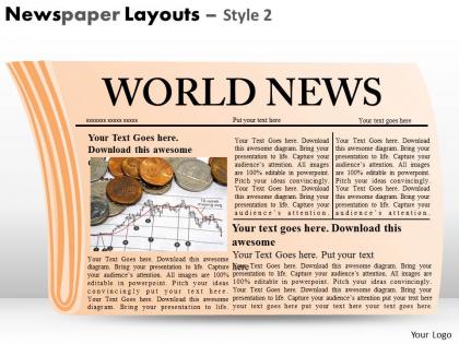
Newspaper layouts style 2 ppt 4




Try Before you Buy Download Free Sample Product
 Impress Your
 Audience
 100%
100% Editable
 Save Hours
 of Time


Lovely clean design available 24/7. Our Newspaper Layouts Style 2 PPT 4 are always here to help your presentations look their best.
People who downloaded this PowerPoint presentation also viewed the following :
Newspaper layouts style 2 ppt 4 with all 3 slides:
Stop wasting time on the design details. Our range of Newspaper Layouts Style 2 PPT 4 will take care of all the cosmetic details for you.
FAQs for Newspaper layouts style
Traditional newspaper layout components include mastheads, headlines, bylines, body text columns, photo captions, pull quotes, and classified sections. These elements work together by creating visual hierarchy, guiding reader flow, and maximizing information density per page, with many publications finding that strategic layout combinations enhance reader engagement while maintaining the authoritative, structured presentation that builds credibility.
Modern digital newspaper layouts differ from print versions by incorporating interactive elements, multimedia integration, responsive design for multiple devices, and real-time content updates. Through adaptive formatting and scrolling navigation, digital publications enhance reader engagement with embedded videos, hyperlinks, and social sharing features, while streamlining content consumption across smartphones, tablets, and desktops, ultimately delivering personalized reading experiences.
Hierarchy guides readers through newspaper content by establishing visual importance through headline sizes, font weights, column widths, and strategic placement of stories. This systematic approach enables readers to quickly identify breaking news, prioritize information consumption, and navigate seamlessly between sections, while helping publishers maximize engagement, optimize advertising placement, and deliver structured information experiences that keep audiences informed efficiently.
Effective text-image balance techniques include strategic white space allocation, grid-based alignment systems, visual hierarchy through typography scaling, proportional image sizing, and consistent margin frameworks. These approaches streamline reader navigation by creating clear focal points, establishing logical information flow, and enhancing content digestibility, with many publishers finding that balanced layouts ultimately deliver higher engagement rates and improved reader retention across diverse audience segments.
Color schemes significantly enhance reader engagement by creating visual hierarchy, improving readability, and evoking emotional responses that guide attention to key stories. Strategic color choices help newspapers establish brand identity, differentiate content sections, and increase scan-ability, with many publications finding that well-designed color palettes boost reader retention and circulation rates.
Grids in newspaper design deliver enhanced readability, consistent visual hierarchy, efficient space utilization, professional appearance, and streamlined content organization across multiple sections. Through systematic column structures and alignment guides, publishers achieve faster layout production, reduced design errors, and improved reader navigation, with many media organizations finding that grid-based approaches significantly accelerate their daily production workflows while maintaining editorial consistency.
Typography enhances newspaper readability by establishing clear hierarchies, improving text flow, and guiding reader attention through strategic font choices, sizing, and spacing. These design elements streamline information consumption by reducing eye strain, accelerating content scanning, and creating visual pathways, with many publishers finding that optimized typography significantly increases reader engagement and retention rates.
Essential front page elements include compelling headlines, high-impact visuals, strategic white space, clear navigation hierarchy, and prominent story placement. These design components work together by creating visual flow, establishing information priority, and enhancing readability, with many successful newspapers finding that balanced layouts combining bold typography with engaging imagery ultimately deliver stronger reader engagement and increased circulation.
Niche newspapers adapt their layout styles through specialized content placement, targeted visual hierarchies, audience-specific typography choices, and strategic use of white space and imagery. Publications serving financial audiences emphasize data-rich tables and charts, while lifestyle newspapers prioritize vibrant photography and magazine-style layouts, ultimately delivering more engaging reader experiences and stronger audience retention.
Creating visually appealing feature stories involves strategic headline hierarchy, compelling photo placement, varied column widths, pull quotes, and white space optimization. These design elements work together by drawing readers into the narrative flow, breaking up dense text blocks, and creating visual breathing room, with many newspapers finding that strategic typography combinations and image-text integration significantly boost reader engagement and story completion rates.
Infographics transform traditional news reporting by making complex data more accessible, enhancing visual storytelling, and increasing reader engagement through compelling design elements. These visual tools streamline information consumption, reduce text-heavy layouts, and enable news organizations to present statistics, timelines, and comparisons more effectively, ultimately delivering faster comprehension and broader audience appeal in an increasingly digital media landscape.
Accessibility considerations in newspaper design include high contrast ratios, readable font sizes, clear hierarchical structures, alternative text for images, and consistent navigation patterns. These design elements enhance readability for visually impaired readers, support screen reader compatibility, and ensure broader audience engagement, with many publications finding that accessible layouts ultimately deliver improved user experiences and expanded market reach.
Common newspaper layout mistakes include overcrowded pages, inconsistent typography, poor hierarchy, inadequate white space, and misaligned elements. These design flaws significantly impact reader engagement by creating visual confusion, reducing readability, and overwhelming audiences, with many publishers finding that streamlined layouts with clear focal points and consistent spacing ultimately deliver better user experiences and increased circulation.
Emerging technologies revolutionize newspaper layouts by enabling responsive design, interactive multimedia integration, personalized content algorithms, and real-time data visualization capabilities. Through AI-driven automation and digital platforms, publishers streamline production workflows, enhance reader engagement with dynamic elements, and deliver personalized experiences, while reducing costs and accelerating content delivery in an increasingly competitive media landscape.
Newspaper layout styles vary significantly across sections, with sports pages featuring dynamic action photos, bold headlines, and statistics boxes, while lifestyle sections emphasize elegant typography, softer color palettes, and magazine-style layouts. These strategic design approaches enhance reader engagement by matching visual presentation to content expectations, with sports sections prioritizing energy and immediacy, and lifestyle sections focusing on sophistication and readability, ultimately delivering targeted experiences.
-
awesome! thank you for this.
-
Easily Understandable slides.
-
Use of icon with content is very relateable, informative and appealing.