

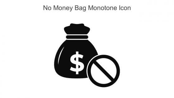
No Money Bag Monotone Icon In Powerpoint Pptx Png And Editable Eps Format




Try Before you Buy Download Free Sample Product
 Impress Your
 Audience
 100%
100% Editable
 Save Hours
 of Time


This No money bag monotone icon in powerpoint pptx png and editable eps format is a 100 percent editable icon. The downloaded file will have this icon in EPS, PNG and Powerpoint pptx format and is perfect for your next project. It has a simple yet stylish design.
People who downloaded this PowerPoint presentation also viewed the following :
No Money Bag Monotone Icon In Powerpoint Pptx Png And Editable Eps Format with all 6 slides:
Use our No Money Bag Monotone Icon In Powerpoint Pptx Png And Editable Eps Format to effectively help you save your valuable time. They are readymade to fit into any presentation structure.





FAQs for No Money Bag Monotone Icon In Powerpoint Pptx Png And
The "No Money Bag Icon" signifies budget constraints, cost reduction initiatives, financial losses, or the absence of funding in financial presentations and business communications. This visual element helps organizations communicate budget limitations, expense elimination strategies, or resource allocation challenges across departments, while enabling clearer financial storytelling that enhances stakeholder understanding and supports strategic decision-making processes.
The absence of the Money Bag Icon eliminates visual redundancy and potential confusion, allowing audiences to focus directly on specific financial data, metrics, and strategic insights without generic symbolism. This streamlined approach enhances message clarity by emphasizing actual content over decorative elements, with many financial institutions and corporate presentations finding that clean, icon-free designs deliver more professional credibility and stronger audience engagement.
Alternative icons for financial concepts include dollar signs, coin stacks, credit cards, bank buildings, calculator symbols, and bar charts. These versatile options enable designers to represent different financial aspects like currency, banking services, calculations, and growth trends, with many organizations finding that specific icons like piggy banks for savings or upward arrows for investment growth create clearer, more targeted messaging than generic money bags.
Removing the Money Bag Icon adds value when presentations focus on non-monetary benefits like employee satisfaction, environmental impact, social responsibility, or innovation metrics, where financial symbols might overshadow these strategic priorities. This approach enhances audience engagement in scenarios like corporate social responsibility reports, employee wellness programs, and sustainability initiatives, with many organizations finding that eliminating direct financial imagery creates more inclusive discussions and broader stakeholder buy-in.
Minimalistic design enhances audience engagement by reducing cognitive load, improving focus on core messaging, and creating cleaner visual hierarchies that guide attention more effectively. This approach streamlines user experience across digital platforms, with many financial services and tech companies finding that simplified iconography increases comprehension rates, accelerates decision-making processes, and ultimately delivers stronger conversion rates.
Using Money Bag Icons in financial presentations can appear unprofessional, oversimplified, or culturally insensitive in formal business contexts, potentially undermining credibility with investors, stakeholders, and international audiences. While these icons work for informal communications, many financial institutions find that sophisticated visual elements like charts, graphs, and data visualizations better convey strategic insights and analytical depth.
The "No Money Bag Icon" approach can be effectively applied to non-financial presentations by avoiding clichéd symbols and generic imagery that oversimplify complex topics. This methodology enhances presentations across healthcare, education, technology, and manufacturing sectors by using contextually relevant visuals, data-driven graphics, and industry-specific iconography, ultimately delivering more professional credibility and audience engagement.
Cultural perceptions of wealth significantly shape how audiences interpret the Money Bag Icon, with some cultures viewing it as prosperity and success while others associate it with greed or inequality. These varying interpretations influence marketing strategies, educational materials, and business communications across different regions, with many global organizations finding that culturally-sensitive visual alternatives enhance audience engagement and avoid potential misunderstandings.
**INPUT**: What visual metaphors can replace the Money Bag Icon to represent financial success? **OUTPUT**: Visual metaphors for financial success include upward trending arrows, growing bar charts, rising stock graphs, trophy symbols, and target icons with checkmarks. These alternatives enhance presentations by representing growth trajectories, achievement milestones, and strategic goal completion, with many financial services companies finding that growth-oriented visuals resonate more effectively with clients than traditional currency symbols. [Word count: 55 words]
Presenters can avoid financial clichés by using specific data visualizations like growth trend charts, comparative bar graphs, ROI calculators, and industry-specific metrics instead of generic money symbols. These alternatives enhance credibility while delivering clearer insights, with many financial professionals finding that concrete visual representations of performance data, cost-benefit analyses, and strategic projections ultimately create more compelling presentations than traditional iconography.
Removing the Money Bag Icon shifts visual focus from individual wealth accumulation to strategic resource distribution, budget planning, and organizational financial management. This approach enhances clarity in presentations about departmental funding, project investments, and operational expenses, with many financial teams and corporate strategists finding that neutral iconography promotes more objective discussions about resource allocation and budget optimization.
Design principles supporting the exclusion of Money Bag Icons include visual sophistication, audience credibility, brand professionalism, contextual relevance, and cognitive clarity. These approaches enhance financial presentations by reducing visual clutter, establishing executive-level authority, and maintaining focus on data-driven insights, with many financial institutions finding that streamlined iconography delivers stronger stakeholder engagement and competitive differentiation.
The "No Money Bag Icon" strategy facilitates financial literacy discussions by eliminating intimidating monetary symbols, creating more approachable conversations about budgeting, saving, and investing. This approach enables educators, financial advisors, and organizations to engage audiences through neutral visual cues, ultimately reducing psychological barriers while encouraging participation in essential financial planning discussions across diverse demographics.
Audiences focused on social impact, healthcare, education, and non-profit sectors often benefit from presentations without money bag icons, as these symbols can undermine trust and appear overly commercial. Academic institutions, government agencies, and community organizations particularly appreciate messaging that emphasizes mission-driven outcomes rather than profit motives, ultimately enhancing credibility and audience engagement.
Incorporating the "No Money Bag Icon" concept enhances financial equity perception by visually representing cost-free solutions, accessible services, and inclusive financial approaches that remove traditional barriers. This strategic visual communication helps organizations demonstrate commitment to equitable access, particularly in healthcare, education, and social services sectors, ultimately building trust and credibility with diverse stakeholder groups.
-
I faced no difficulty while searching for the slide I wanted. Honestly, the website’s interface is easy to use and can be navigated easily!
-
Professional and unique presentations.