


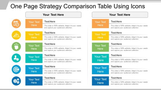
One page strategy comparison table using icons





Try Before you Buy Download Free Sample Product
 Impress Your
 Audience
 100%
100% Editable
 Save Hours
 of Time


Here is a professionally designed Strategy Comparison Table with Icons PowerPoint Presentation slide. Strategy comparison is the most useful component in an organization’s internal report. This generalized business strategy comparison diagram PPT template caters to an array of concerns related to analysis. It can be used as an effective tool for examining different strategies, plans or ideas. This comparison table design with icons is an impactful tool for strategic planning analysis. While comparing different plans, the best – suited strategy can be spotted easily with the help of the crisp info graphic design of the presentation slide. As choosing the perfect strategy is the basis of a successful business model, the importance of this simple yet attractive presentation design cannot be undermined. The comparison diagram can be used in research projects, decision making and for educational purposes. The editable icons provide visual enhancement to the presentation and engage the audience. With this comparative diagram presentation template, a comparison can be made between two sets of data covering the various features of both. So, without another thought, download this strategy comparison table at the click of a button. Our One Page Strategy Comparison Table Using Icons bring your competence to the fore. Your expertise will get clearly exhibited.
People who downloaded this PowerPoint presentation also viewed the following :
One page strategy comparison table using icons with all 5 slides:
Emphasise on the decisive factors. Put them in the spotlight with our One Page Strategy Comparison Table Using Icons.
FAQs for One page strategy comparison
For strategy icons, simple is everything. Bold shapes work at any size - trust me, complex details just turn into blurry messes on slides. I'd stick to maybe 2-3 colors with good contrast so they actually pop. The icons that work best tell their story instantly. Think arrows for growth, connected circles for teamwork - honestly the more obvious, the better. Some of my favorites are almost ridiculously simple but they stick in your head. Oh, and keep them consistent! Nothing looks worse than a random mix of styles when you're presenting the full strategy.
Dude, icons are game-changers for presentations. They turn complicated stuff into something people actually get right away. Instead of reading through walls of text, your audience can just glance and understand. Honestly, bullet points make me want to fall asleep - icons keep things visually interesting and help ideas stick in people's heads way longer. They're perfect if you're presenting to folks who speak different languages too. Oh, and here's what I'd do: swap out like half your text for good icons next time. Trust me on this one.
Colors make a huge difference with strategy icons. Red for risks, green for opportunities, blue for processes - whatever works, just pick meanings and stick with them across everything. Random colors are the worst, honestly. I've watched people get totally lost trying to decode dashboards that had no color logic whatsoever. Start by deciding what each color means in your framework first. Then use those same colors religiously. Also make sure they're accessible - some people can't see certain color combos well. Your brand colors should fit in somewhere too, but don't sacrifice clarity just to match your logo perfectly.
Oh man, this stuff gets weird fast. Red means danger here but good luck in China. Thumbs up? Totally offensive in parts of the Middle East - learned that one the hard way. Arrows mess people up too since tons of languages don't read left-to-right like we do. Religious symbols are basically asking for trouble, and don't even get me started on hand gestures. Animals can be dicey too depending on cultural taboos. Honestly, just test your icons with actual people from those regions first. What looks super obvious to you might completely bomb somewhere else. Trust me on this one.
Don't overcomplicate your icons - they'll look like a mess when they're tiny. I learned this the hard way on my first project lol. Also avoid mixing different styles in one set because it just looks sloppy. Sometimes a basic shape works way better than trying to cram a whole concept into a little picture. Test them with real people too! What's obvious to you might confuse everyone else. I always do a quick check with friends before calling anything "done." Stay consistent and keep things simple. That's honestly like 90% of good icon design right there.
So basically, icons turn complex strategy stuff into instant visual shortcuts. Your brain processes a gear beating a turtle way faster than reading "competitive advantage through operational efficiency." Road signs do this same thing, right? Pick symbols people already know - arrows for growth, shields for protection, lightbulbs for innovation. Puzzle pieces work great for integration strategies. The trick is staying consistent once you choose them. I'd start by listing your main strategic themes, then find 3-4 icons that capture each one clearly. Honestly, this approach saves so much meeting time because everyone just gets it immediately.
Start with 2-3 standard icon sizes and stick to them religiously. Use the same icon family throughout - mixing styles looks messy, trust me. Put your icons directly on the slide masters so they show up automatically. Vector formats are your friend (SVG or high-res PNG) since they won't get pixelated when you resize. Make sure there's good contrast with your backgrounds. Oh, and here's something that's saved me tons of time - create one slide with all your approved icons so people can just grab what they need instead of hunting around or, worse, using random ones they found online.
Yeah, so companies pick icons that already make sense to their customers. Tech bros go crazy for arrows and circuit designs - anything that screams "we're innovative." Healthcare sticks with hearts and crosses because, duh, caring vibes. Finance loves those upward trend lines and shield symbols to show they'll grow your money safely. Retail's pretty predictable too - shopping carts, star ratings, map pins for stores. Honestly, it's kind of formulaic once you notice the pattern. But it works because people instantly get what you're about when the visuals match their expectations.
Definitely go with vector tools for strategy icons - they'll stay sharp no matter what size. Illustrator is still the best if you ask me, has all the pro features you need. Figma's great too, especially for collaboration stuff. Both can make really solid icons. Oh and if budget's tight, Inkscape is free and pretty decent. Even Canva has some icon tools now which is kinda wild. Just make sure whatever you pick can export SVG files. That way your icons won't look pixelated when people zoom in or use them different places.
Your brain is basically wired to remember pictures way better than words. Like, you see a phone icon and instantly know what it means, but reading "mobile communication device" takes actual effort. I always tell people to pick maybe 5-8 solid icons for their main strategy stuff and then use those same ones everywhere. Seriously, don't switch it up - consistency is what makes them stick. When you pair your key concepts with the same visual over and over, people will remember your strategy points weeks later without even thinking about it. It's honestly kind of wild how well it works.
So static icons are basically just normal images that don't move. Animated ones do stuff - fade in, bounce around, rotate, whatever. The moving ones definitely catch your eye more and can highlight important stuff, but honestly? They get annoying real quick if you use too many. For professional presentations, I'd probably stick with static ones so people focus on what you're saying. Animated works better when you're showing processes or want something more energetic. My advice - go static first, then add animation only if it actually helps tell your story.
Pull your brand colors and fonts straight into those strategy icons - it makes a huge difference. Match whatever vibe your company already has going on, whether that's clean and minimal or more detailed. Honestly, I've watched so many teams nail the content but then use random icons that look like they're from a totally different company. Super jarring. Check if your design team has icon guidelines first. No guidelines? Just make a quick style sheet covering colors, line weights, basic visual stuff. Your stakeholders will definitely pick up on it when everything feels polished and connected.
Minimalism's huge right now - everything's moving toward cleaner icons that actually work in both light and dark modes. Animation is getting really big too, especially those little micro-interactions that help explain tricky concepts. Oh, and there's this whole push for more inclusive iconography instead of just the same old chess pieces everywhere (though let's be real, those aren't disappearing anytime soon). The main thing though? Make sure your icons scale properly. They've gotta look crisp whether someone's squinting at them on their phone or you're presenting to a room full of people.
Focus on three main things: visual clarity, cultural sensitivity, and tech accessibility. High contrast colors are your friend - simple shapes too so visually impaired users can actually see what's going on. Hand gestures are tricky since they mean totally different things depending on where you're from (trust me on this one). Don't forget alt text! Screen readers need that stuff to work properly. Honestly, the best thing you can do is test early with different people. Run icons by coworkers from various backgrounds before you commit to anything - saves so much headache later.
Honestly, custom strategy icons are a game-changer for presentations. Your slides will look way more pulled-together instead of like you raided five different stock photo sites. You know that awkward thing where nothing matches? Yeah, custom icons fix that completely. They'll match your brand colors and style, so everything feels intentional. Plus your audience won't be sitting there thinking "wait, I've seen that icon before in someone else's deck" - which happens more than you'd think, trust me. I'd start with whatever strategic concepts you use most often and get those done first.
-
Visually stunning presentation, love the content.
-
Innovative and Colorful designs.