

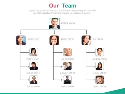
Organizational chart for business employees powerpoint slides




Try Before you Buy Download Free Sample Product
 Impress Your
Audience
 100%
Editable
 Save Hours
of Time


Looking for an organizational chart come PPT presentation that not only helps to set a chain of command or supports to make the employees understand their role in the operation in the company. It’s not always about increasing the efficiency but also the PPT graphic can be put to use to enhance uniformity and control in the system so that your business organizations works and performs better. An organizational chart for business employees PowerPoint slide provides a base for various features like placing hierarchical setup, plus helps to put emphasis on the role functioning of the people or tam workers in the lower and middles strata of the organization. Companies world over look to bring in innovation and creativity to their business activities for modeling autonomy and bring have a managerial oversight for all the people working in the organization. With proper positioning of the role functioning, everyone who is working gets to know who is associated with what; all good graphically loaded PPT slide show easily helps to manage the same. Arrive at the correct formula with our Organizational Chart For Business Employees Powerpoint Slides. Your ideas will create the chemistry.
People who downloaded this PowerPoint presentation also viewed the following :
Organizational chart for business employees powerpoint slides with all 4 slides:
Guard against falsehoods with our Organizational Chart For Business Employees Powerpoint Slides. Build belief based on facts alone.


FAQs for Organizational chart for business
You'll want reporting lines that actually make sense, plus job titles and contact details for everyone. Show the real hierarchy - who answers to who - and include ALL departments (yeah, even accounting lol). Keep the design clean with readable boxes and consistent formatting. Skip the fancy graphics though, they just make it messy. Update it whenever someone leaves or gets promoted - stale org charts are worse than useless. Stick copies in conference rooms and put the digital version somewhere everyone can actually find it on the shared drive.
Honestly, org charts are lifesavers for cutting through workplace confusion. Your team stops wasting time wondering who actually calls the shots or whether they need to CC someone's manager. People can just glance at it and know exactly who handles approvals or feedback. No more of that weird "um, should I include your boss on this email?" awkwardness. The hierarchy becomes super obvious. I swear, half of office drama comes from unclear reporting lines anyway. Just make sure you keep it updated and stick it somewhere everyone can find it easily.
So there's basically three types you'll see: hierarchical (classic pyramid with clear chain of command), matrix (when people report to multiple bosses - kinda messy but works for cross-team projects), and flat (barely any layers, super popular with startups). Most places just go hierarchical by default even if it makes zero sense for their vibe. Matrix works great for temporary teams or when you've got tons of collaboration happening. Flat's perfect when you want everyone contributing to decisions instead of waiting for approval from above. Just pick whatever actually matches how stuff gets done at your company, not what looks pretty.
Honestly, digital org charts are a game changer. Use something like Lucidchart or Visio - way better than those ancient PowerPoint boxes everyone used to make. The cool thing is you can sync them with your HR system, so promotions and department moves update automatically. No more digging through someone's email for that PDF from March that's totally wrong now. Cloud-based tools are clutch since everyone sees the same version. You can even add photos and contact info which actually makes it useful. Oh, and interactive profiles are pretty slick if you're feeling fancy.
Honestly, org charts are a lifesaver for new hires. They show people exactly who they'll be reporting to and which teams they'll work with most. New employees can see how their job connects to everything else instead of feeling lost. I swear, some people study these like they're cramming for a test! But it really cuts down on all that "wait, who handles marketing again?" stuff. Just double-check yours is current first - nothing worse than outdated info during someone's first week.
Look, your org chart isn't something you make once and forget about. Companies change constantly - new teams pop up, roles get more specialized, management layers multiply (sometimes way too much honestly). I'd say check it every quarter or so to make sure reporting lines still make sense. Nothing's worse than someone genuinely not knowing who their boss is because the chart's six months out of date. Keep it somewhere people can actually see it and update the thing regularly. When you're growing fast, it'll shift more than you think.
Don't overcomplicate it - that's the main thing. Skip showing every tiny reporting line because it just becomes a mess nobody can read. Keep your job titles consistent and actually talk to the managers first (trust me on this one). Regular updates are huge too, otherwise you're stuck with some outdated chart that confuses everyone. I've seen way too many that look all polished but tell you absolutely nothing about how things really work. Forget the fancy design stuff. Just focus on mapping what actually happens day-to-day, not whatever looks impressive in a presentation.
Okay so first figure out who actually reports to who - not just what the titles say. I learned this the hard way lol. Then add those dotted lines for when people work with other teams but don't technically report there. You'll want different colors or boxes for full-time vs contractors too. Honestly, the real decision-making flow is usually way different than what's on paper. Ask around because I guarantee you'll get some of it wrong at first. Oh and update it every few months - teams change constantly. Better to be accurate than make it look super polished.
Honestly, just get a proper org chart tool instead of fighting with PowerPoint forever. The drag-and-drop stuff actually works, plus you get decent templates that don't look like a 5-year-old made them. When people inevitably switch roles (which is like every other month at my company), updating everything is super quick. Most tools pull employee info straight from HR systems too, so that's one less headache. The interactive features are pretty cool - people can click around to find contact details and team info. I'd mess around with some free versions first to figure out what you actually need.
Honestly, just embed that thing everywhere - your employee handbook, onboarding stuff, company intranet. Most HR systems will auto-sync the data so when Jim from accounting finally gets that promotion, it updates across the board. I swear, nothing's worse than having like five different org charts floating around with completely wrong info. Super confusing. Link it to your contact directory and job descriptions too. Pick one main source first, then connect everything else to it. The whole point is making it actually useful instead of some random PDF someone made two years ago.
Totally! I do this all the time actually. Your org chart shows you exactly where the holes are - like when someone's juggling five different roles or you've got a whole department but they're missing key skills. Marketing's a perfect example - you might have amazing creatives but realize nobody can read analytics data (happens more than you'd think). Just scan through each team and see what feels off. Where are people stretched too thin? What expertise is completely missing? Then you know whether to hire someone new or invest in training. It's honestly one of the easiest ways to spot what you need.
Honestly? I'd say quarterly is a good baseline, but it really depends on your company. Startups and fast-growing places probably need monthly updates - those environments are just chaos. More stable companies can get away with twice a year. The real trick is not overthinking it. Update whenever there's a big role change, new leadership hire, or department shuffle. Don't wait around for the "perfect moment" because that's never happening. Just set a calendar reminder and stick to it. I learned this the hard way when our org chart was like six months out of date and nobody knew who reported to whom anymore.
Honestly, less is more with org charts. Don't jam everything onto one slide - nobody can read tiny text from across the room anyway. Start with your C-suite level, then break out departments on separate slides. Colors help show different teams, but avoid the rainbow explosion look (you know what I mean). Make those names and titles big enough that even Karen in the back row can see them. Oh, and definitely prep for when someone inevitably asks where some random person sits in the hierarchy. Trust me, it'll happen. Keep shapes consistent and fonts readable - pretty basic stuff but you'd be surprised how many people mess this up.
Honestly, remote work totally changes how you should think about org charts. Forget the old pyramid structure - now it's all about showing how people actually collaborate and communicate. Geographic location? Doesn't matter anymore (which is honestly pretty liberating). But you've got to be crystal clear about decision-making flows and who talks to whom. I'd throw in virtual team setups, project-based connections, maybe even time zones if you're dealing with global teams. The whole point is mapping how work really gets done when everyone's scattered, not just the traditional "this person reports to that person" thing.
Honestly, don't just dump a finished chart on everyone - that's how reorgs die. Get your key people involved from the start. Ask them what's broken and what they want fixed. Then when you make changes, explain exactly why and how it solves their actual problems. Run some workshops where folks can ask questions and complain (they will anyway). Find your champions early - those people everyone listens to. Give them a sneak peek and let them help tweak things. I've watched so many leadership teams just announce changes from their ivory tower and wonder why nobody's buying in. People need to feel heard, not steamrolled.
-
Excellent design and quick turnaround.
-
Much better than the original! Thanks for the quick turnaround.