

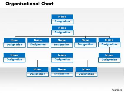
Organizational chart powerpoint presentation slide template




Try Before you Buy Download Free Sample Product
 Impress Your
 Audience
 100%
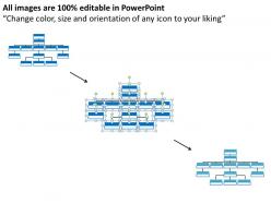
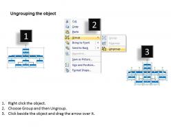
100% Editable
 Save Hours
 of Time


Collect and connect with our Organizational Chart Powerpoint Presentation Slide Template. Your ideas will function better.
People who downloaded this PowerPoint presentation also viewed the following :
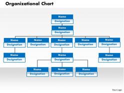
Organizational chart powerpoint presentation slide template with all 5 slides:
Really important presentations happen every day. Luckily our Organizational Chart Powerpoint Presentation Slide Template are on hand 24/7 to make each presentation looks its best.
FAQs for Organizational chart powerpoint
Start with CEO at the top, then branch out by departments. Names, job titles, who reports to who - that's your must-have stuff. Contact info like emails or phone extensions are super helpful too. Photos can be nice if your workplace isn't too stuffy about it. Honestly, these things turn into a hot mess fast if you don't organize by clear department boundaries. Oh, and make it readable! Nobody's got time to decode some tiny, cramped chart when they just need to find their manager's boss.
Honestly, org charts are kind of a game-changer for avoiding confusion. People finally know who their actual boss is (weird how often that's unclear, right?). New employees can see the whole structure right away instead of spending weeks figuring out who does what. Communication gets way smoother too - no more sending emails to five different people when you only needed one. I'd just grab a basic template and drop in everyone's names and titles. Takes like 20 minutes but saves so much headache later. Shows career paths too, which people actually care about more than you'd think.
So there's basically three you'll run into most: hierarchical (classic pyramid thing), flat (barely any managers), and matrix where people report to like multiple bosses which honestly sounds like a nightmare to me. Hierarchical's solid for traditional companies that need clear chains of command. Startups love flat structures since decisions happen way faster. Matrix is messy but works when you need teams crossing departments. Oh, and there's functional ones that group by department plus divisional that organize by product/region. Just pick whatever actually matches how your team talks and decides stuff, not what looks pretty.
Honestly, design makes or breaks whether people will actually look at your org chart. Use the same colors for each department - it helps group things visually. Different box sizes show hierarchy pretty well, and please use fonts people can actually read without glasses! White space helps too. I swear, some charts look like a tornado hit them. Flow matters - go top-to-bottom or left-to-right, whatever feels natural. Connect everything with clean lines that make sense. If it's too cluttered, nobody's gonna bother using it.
Honestly, just start with whatever you already have before buying anything new. PowerPoint works fine for basic charts - most people know how to use it anyway. If your company has Visio, that's amazing for complex stuff. Google Drawings is free and gets the job done. Lucidchart and Draw.io are pretty good for online collaboration. You could even use Excel, though it gets weird with bigger teams. I mean, I've seen people make org charts in Excel and... yeah, it's not pretty but it works.
So here's the thing - you really want to match your template to what your industry actually does. Healthcare ones are great for mapping out all those complex hierarchies between doctors, admins, and support staff. Tech companies usually go flatter since they're all about those cross-functional teams. Manufacturing? They focus heavily on operational chains and safety reporting (which honestly makes total sense). Retail chains use them to track everything from store managers up to corporate. Just pick something that fits your typical workflow, then tweak it from there.
Honestly, digital org charts are such a lifesaver compared to those old paper ones that were outdated the second someone printed them. When people switch roles or quit, you just update it once and boom - everyone sees it immediately. The search feature is clutch when you're hunting down some random person from accounting or whatever. Being able to click on someone's box to see their contact info and what they actually do? Super helpful, especially if you work somewhere huge. My coworker swears by Lucidchart but honestly even a shared Google drawing works fine to start.
Honestly? Update it whenever someone big leaves or joins, gets promoted, that kind of thing. Most companies do quarterly check-ins which works pretty well. Really depends on your situation though - if you're at a startup hiring like crazy, maybe monthly makes more sense. Stable company? Twice a year is probably fine. The main thing is don't let it get super outdated. Nothing's more awkward than showing someone an org chart with your old boss who quit three months ago still on it. Set a calendar reminder or you'll totally forget about it.
Honestly, color coding makes org charts so much easier to read. I usually go with one main color - like blue - then use darker shades for executives and lighter ones as you go down. So your CEO might be navy, middle managers are regular blue, and entry-level staff get light blue. Way better than just black boxes everywhere! Don't go crazy with like 5 different colors though. I learned that the hard way on a project last year - looked like a rainbow exploded. Stick to 2-3 max or people won't know what they're looking at.
Definitely add location stuff to your org chart - like little icons showing who's remote, hybrid, or in the office. Makes such a difference when you need to know if someone's around for a quick call or if you should just send an async message instead. Oh, and throw in how people prefer to be contacted too. Some folks are glued to Slack, others barely check it and live in email. For hybrid people, maybe show their office days if that matters for your team? The whole point is making it super obvious how to actually reach someone without playing communication roulette.
Don't overthink it - that's mistake
-
I discovered this website through a google search, the services matched my needs perfectly and the pricing was very reasonable. I was thrilled with the product and the customer service. I will definitely use their slides again for my presentations and recommend them to other colleagues.
-
Top Quality presentations that are easily editable.