


Percentage increase in price ppt diagrams




Try Before you Buy Download Free Sample Product
 Impress Your
 Audience
 100%
100% Editable
 Save Hours
 of Time


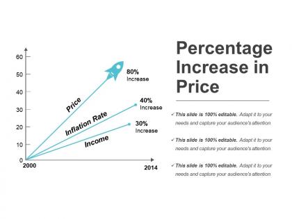
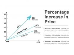
Percentage increase in price PPT diagrams is a PowerPoint presentation model equipped with a neatly crafted graph and text content. The graph of x-axis and y-axis as shown here depicts the arrows marking the growth in price, inflation rate and income exclusively. Also, the actual percentage increase in all the three parameters in shown at the end of the three arrows. The price increase graph PPT presentation visual as shown here can be used by economists to describe the relationship and impact of the increase in the rate of inflation on the pricing of commodities and also the salary of the professionals. This graph if one wants to design from scratch, will consume a lot of his time and efforts if output like this one is desired. To save you from all this hassle, we have come up with the thoroughly editable flawless PPT graphic as percentage change PPT template. Students, teachers, economists, and other related field personnel may make use of the provided real income PPT slide infographic to illustrate the concept of real income. The text placeholder as provided alongside the graph can be used to define the particulars taken on each of the two axes, or the concept of inflation, price, and income. Inject a bit of humor with our Percentage Increase In Price Ppt Diagrams. It allows you to deliver a couple of jokes.
People who downloaded this PowerPoint presentation also viewed the following :
Percentage increase in price ppt diagrams with all 5 slides:
Drive home the importance of believing in humanity with our Percentage Increase In Price Ppt Diagrams. Be an advocate of integration.
-
Great experience, I would definitely use your services further.
-
Informative design.