

Performance Kpi Dashboard Measure Financial Position Financial Planning Analysis Guide Small Large Businesses




Try Before you Buy Download Free Sample Product
 Impress Your
 Audience
 100%
100% Editable
 Save Hours
 of Time


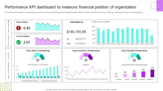
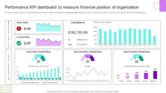
The following slide outlines a comprehensive key performance indicator KPI dashboard highlighting different financial metrics. The KPIs are quick and current ratio, cash balance, days sales outstanding etc.
People who downloaded this PowerPoint presentation also viewed the following :
Performance Kpi Dashboard Measure Financial Position Financial Planning Analysis Guide Small Large Businesses with all 7 slides:
Use our Performance Kpi Dashboard Measure Financial Position Financial Planning Analysis Guide Small Large Businesses to effectively help you save your valuable time. They are readymade to fit into any presentation structure.





FAQs for Performance Kpi Dashboard Measure Financial Position Financial Planning Analysis Guide
Key performance metrics include revenue growth, customer acquisition costs, conversion rates, operational efficiency ratios, and employee productivity indicators. These metrics enable organizations to streamline decision-making, enhance resource allocation, and monitor competitive positioning, with many businesses finding that comprehensive dashboards ultimately deliver faster insights and improved strategic outcomes across departments.
Organizations ensure KPI dashboard alignment with strategic objectives by mapping metrics directly to business goals, involving stakeholders in KPI selection, and regularly reviewing relevance. Through strategic planning sessions, companies identify key performance indicators that reflect priority outcomes, establish clear connections between departmental metrics and organizational targets, ultimately creating dashboards that drive decision-making toward strategic success.
Effective KPI dashboard visualizations include gauge charts for target progress, trend lines for performance over time, heat maps for comparative analysis, bar charts for categorical data, and scorecard displays for key metrics. These techniques enhance decision-making by providing immediate visual context, enabling quick pattern recognition, and highlighting performance gaps, with many organizations finding that strategic combinations deliver clearer insights and faster executive responses.
Real-time data integration enhances KPI dashboard functionality by providing instant visibility into performance metrics, eliminating data lag, and enabling immediate decision-making capabilities. Through automated data feeds, organizations can monitor operational efficiency, track customer behaviors, and identify emerging trends as they happen, ultimately delivering faster response times and competitive advantage in increasingly dynamic business environments.
User experience plays a central role in KPI dashboard design by ensuring data accessibility, visual clarity, and intuitive navigation that enables quick decision-making. Through strategic layout design, responsive interfaces, and customizable views, organizations streamline information consumption, reduce analysis time, and enhance executive productivity, with many finding that well-designed dashboards ultimately deliver faster insights and improved strategic responsiveness.
Organizations can tailor KPI dashboards by customizing metrics, visualization formats, data granularity, and access levels based on each stakeholder's role and priorities. Executive dashboards emphasize high-level strategic indicators, while operational managers require detailed performance metrics and department heads need team-specific data, ultimately enabling targeted decision-making and enhanced organizational alignment across all levels.
Common pitfalls include overwhelming users with too many metrics, selecting vanity metrics over actionable KPIs, poor data visualization choices, lack of real-time updates, and insufficient stakeholder input during design. These issues can render dashboards ineffective by creating confusion, delayed decision-making, and reduced user adoption, with many organizations finding that streamlined, purpose-driven dashboards ultimately deliver better strategic outcomes.
KPIs should typically be reviewed monthly or quarterly for strategic metrics, with operational indicators monitored weekly or daily depending on business needs and industry dynamics. The review frequency varies by metric type, with financial KPIs often assessed quarterly, customer satisfaction metrics monthly, and operational efficiency indicators weekly, ultimately enabling organizations to maintain relevance and drive continuous improvement.
**INPUT**: What software or tools are recommended for building interactive KPI dashboards? **OUTPUT**: Recommended tools for building interactive KPI dashboards include Tableau, Power BI, Qlik Sense, Google Data Studio, and Grafana, each offering unique visualization capabilities and integration features. These platforms streamline data analysis by enabling real-time updates, customizable interfaces, and seamless connectivity with multiple data sources, with many organizations finding that strategic tool selection ultimately delivers enhanced decision-making speed and operational transparency.
A performance KPI dashboard contributes to improved decision-making by providing real-time visibility into critical metrics, centralizing data from multiple sources, and highlighting performance trends through visual analytics. These dashboards enable leaders to identify issues quickly, benchmark against targets, and make data-driven strategic adjustments, with many organizations finding that streamlined access to key insights accelerates response times and enhances competitive positioning.
Performance KPI dashboard data collection requires establishing automated data integration, standardizing metrics across departments, implementing real-time monitoring systems, and ensuring data accuracy through validation protocols. These practices streamline reporting by eliminating manual processes, reducing errors, and providing consistent insights, with many organizations finding that centralized dashboards ultimately deliver faster decision-making and enhanced operational transparency.
Predictive analytics integrates into KPI dashboards through machine learning algorithms, historical data modeling, trend analysis, and statistical forecasting techniques. These capabilities enable organizations to anticipate market shifts, resource needs, and performance bottlenecks before they occur, with many companies finding that predictive KPI dashboards reduce operational costs while enhancing strategic decision-making speed.
Performance KPI dashboard readability improves through clear visual hierarchy, consistent color coding, intuitive layout structure, appropriate font sizing, and strategic white space utilization. These design elements work together by reducing cognitive load, enabling faster data interpretation, and streamlining decision-making processes, with many organizations finding that well-designed dashboards significantly enhance operational efficiency and strategic responsiveness.
Companies can effectively train employees through hands-on workshops, role-specific tutorials, and interactive simulations that demonstrate real-world KPI scenarios. By combining initial comprehensive training sessions with ongoing support resources, mentorship programs, and regular refresher courses, organizations streamline dashboard adoption while enhancing data literacy, ultimately delivering improved decision-making capabilities and measurable performance outcomes.
Customer satisfaction metrics include Net Promoter Score (NPS), Customer Satisfaction Score (CSAT), Customer Effort Score (CES), first-call resolution rates, and average response times. These indicators streamline customer experience monitoring by tracking loyalty trends, service efficiency, and support effectiveness, with many retail and financial services organizations finding that combining these metrics delivers comprehensive insights and competitive advantage.
-
Top Quality presentations that are easily editable.
-
Wow, never been this impressed with any online service provider. Really appreciate the customer support all along from the navigation to purchasing the right products.