

Performance Measure Powerpoint PPT Template Bundles





Try Before you Buy Download Free Sample Product
 Impress Your
 Audience
 100%
100% Editable
 Save Hours
 of Time


Our Performance Measure Powerpoint PPT Template Bundles are topically designed to provide an attractive backdrop to any subject. Use them to look like a presentation pro.
People who downloaded this PowerPoint presentation also viewed the following :
Performance Measure Powerpoint PPT Template Bundles with all 14 slides:
Use our Performance Measure Powerpoint PPT Template Bundles to effectively help you save your valuable time. They are readymade to fit into any presentation structure.

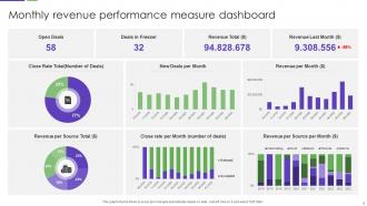
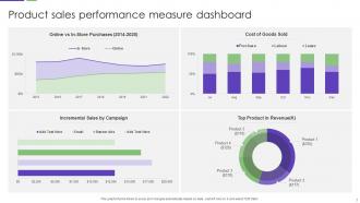
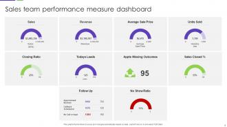






FAQs for Performance Measure Powerpoint
Key elements include clear KPI definitions, visual data charts, trend analysis sections, benchmark comparisons, and actionable insights dashboards. These components work together by streamlining performance communication, enabling stakeholder alignment, and facilitating data-driven decision making, with many organizations finding that well-structured templates ultimately enhance transparency and accelerate strategic responses.
Visual aids enhance performance metrics understanding by transforming complex data into digestible charts, graphs, infographics, and dashboards that highlight trends, comparisons, and key insights at a glance. These visual elements streamline data interpretation, enable faster decision-making, and improve stakeholder engagement during presentations, with many organizations finding that well-designed visual aids significantly increase comprehension and retention of critical performance information.
Consistent design themes in performance measure templates enhance data comprehension, streamline stakeholder communication, and reinforce organizational branding through unified visual elements. These standardized templates enable teams to focus on analysis rather than formatting, reduce preparation time significantly, and create professional presentations that build credibility with executives and clients alike.
PowerPoint enables effective data trend visualization through dynamic charts, comparative graphs, timeline infographics, color-coded metrics dashboards, and interactive slide animations. These presentation tools streamline complex performance data by highlighting key patterns, benchmarking against targets, and showcasing progress over time, with many organizations finding that visual storytelling ultimately enhances stakeholder understanding and accelerates data-driven decision making.
A comprehensive performance measure PowerPoint template bundle should include customizable KPI dashboards, editable chart types, adjustable color schemes, modifiable data visualization elements, and flexible layout options. These customization features enable organizations across sectors like healthcare, manufacturing, and financial services to tailor metrics presentations to their specific branding requirements and performance indicators, ultimately delivering more impactful stakeholder communications and strategic alignment.
Animated elements enhance performance metrics presentations by drawing attention to key data points, creating visual flow between related statistics, and enabling step-by-step revelation of complex information. These animations help presenters control pacing during financial reviews and quarterly reports, while audiences better retain critical performance insights, ultimately delivering more impactful stakeholder communications and strategic decision-making sessions.
Best practices for presenting complex performance data include using visual hierarchies, color coding, progressive disclosure, data groupings, and interactive dashboards. These approaches streamline comprehension by breaking down overwhelming datasets into digestible segments, with many organizations finding that strategic visualization combinations ultimately enhance decision-making speed and stakeholder engagement across all operational levels.
Different industries require unique approaches in their performance measure PowerPoint templates because they track distinct KPIs, regulatory requirements, and operational metrics specific to their business models. Healthcare organizations focus on patient outcomes and compliance metrics, while manufacturing emphasizes efficiency ratios and quality control, and financial services prioritize risk assessments and profitability indicators, ultimately enabling more targeted decision-making and strategic alignment.
Color psychology significantly influences audience perception, comprehension, and decision-making in performance measure presentations through strategic use of red for urgent metrics, green for positive outcomes, and blue for stability indicators. These color choices enhance data interpretation, reduce cognitive load, and improve retention rates, with many organizations finding that consistent color coding across dashboards streamlines stakeholder understanding and accelerates performance discussions.
Storytelling in performance metrics presentations involves creating narrative arcs that connect data points to business outcomes, using character-driven scenarios like customer journeys or departmental challenges, and structuring metrics as problem-resolution sequences. These approaches transform raw numbers into compelling narratives by contextualizing achievements within broader organizational goals, highlighting turning points where interventions improved performance, and ultimately delivering presentations that engage stakeholders while demonstrating measurable business impact and strategic progress.
PowerPoint offers several interactive features for performance measure presentations, including hyperlinks, action buttons, triggers, animations, and embedded charts with real-time data connections. These tools enable presenters to create dynamic dashboards where stakeholders can navigate between different metrics, drill down into specific performance areas, and explore data relationships, ultimately delivering more engaging presentations that enhance decision-making processes and strategic discussions.
Infographics are crucial for conveying performance measures as they transform complex data into visually digestible formats, enhance comprehension through charts and graphs, and enable faster decision-making by highlighting key trends and patterns. Organizations across healthcare, finance, and retail find that well-designed infographics streamline stakeholder communication, reduce interpretation time, and ultimately deliver clearer strategic insights that drive actionable business outcomes.
**INPUT**: What types of templates can cater to both detailed reports and high-level overviews of performance measures? **OUTPUT**: Multi-level dashboard templates, executive summary layouts, drill-down presentation formats, modular report designs, and tiered visualization templates effectively serve both detailed analysis and high-level reporting needs. These versatile frameworks enable organizations to present comprehensive data to technical teams while simultaneously delivering streamlined insights to executives, ultimately enhancing decision-making across all organizational levels.
Presenting performance measures to stakeholders typically requires high-level strategic narratives focused on ROI, competitive positioning, and business outcomes, while team presentations emphasize operational metrics, individual contributions, and actionable insights. Stakeholder presentations benefit from executive summaries and trend analysis, whereas team meetings leverage detailed breakdowns and collaborative discussion formats, with many organizations finding that tailored approaches enhance decision-making speed and accountability across both audiences.
Common pitfalls include overwhelming audiences with excessive data, using unclear or inconsistent visualizations, failing to contextualize metrics with relevant benchmarks, neglecting to tell a coherent story with the data, and presenting information without actionable insights. These presentation challenges can significantly undermine strategic decision-making and stakeholder engagement, with many organizations finding that streamlined, narrative-driven performance dashboards enhance comprehension and drive better business outcomes.
-
Easy to edit slides with easy to understand instructions.
-
Easy to use and customize templates. Helped me give a last minute presentation.