


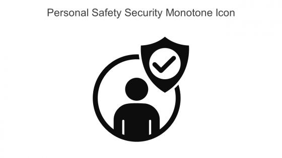
Personal Safety Security Monotone Icon In Powerpoint Pptx Png And Editable Eps Format




Try Before you Buy Download Free Sample Product
 Impress Your
 Audience
 100%
100% Editable
 Save Hours
 of Time


This Personal safety security monotone icon in powerpoint pptx png and editable eps format is a 100 percent editable icon. The downloaded file will have this icon in EPS, PNG and Powerpoint pptx format and is perfect for your next project. It has a simple yet stylish design.
People who downloaded this PowerPoint presentation also viewed the following :
Personal Safety Security Monotone Icon In Powerpoint Pptx Png And Editable Eps Format with all 6 slides:
Use our Personal Safety Security Monotone Icon In Powerpoint Pptx Png And Editable Eps Format to effectively help you save your valuable time. They are readymade to fit into any presentation structure.





FAQs for Personal Safety Security Monotone Icon In Powerpoint Pptx Png And
Key design elements for personal safety security icons include universal symbolism, high contrast colors, clear geometric shapes, scalable vector formats, and consistent visual hierarchy. These elements work together by ensuring instant recognition across diverse audiences, maintaining visibility in emergency situations, and delivering accessible communication that transcends language barriers, ultimately enhancing user response times and safety outcomes.
Cultural interpretations of personal safety security symbols vary significantly, with colors, shapes, and imagery carrying different meanings across regions and societies. While red universally signals danger in most Western cultures, it represents good fortune in China, and religious symbols like crosses may indicate medical help in Christian societies but hold different significance elsewhere, requiring organizations to adapt their safety communications for global effectiveness.
Color psychology and symbolism significantly influence personal safety security icon design by enhancing recognition, conveying urgency levels, and ensuring universal comprehension across diverse user groups. Red communicates immediate danger and emergency situations, yellow signals caution and warnings, while green indicates safety and permitted actions, with many organizations finding that consistent color application reduces response times and improves safety compliance.
Personal safety security icons achieve universal recognition through standardized design principles, consistent color coding, culturally neutral symbols, and adherence to international guidelines like ISO standards. Through simplified imagery and cross-cultural testing, organizations in healthcare, transportation, and public safety streamline communication barriers, ultimately delivering clearer emergency responses and enhanced safety protocols across diverse global environments.
Effective materials for displaying personal safety security icons include high-contrast vinyl decals, reflective aluminum signage, LED-backlit panels, weather-resistant polycarbonate, and digital displays with motion sensors. These materials enhance visibility by delivering durability in outdoor conditions, maintaining readability in low light, and providing dynamic updates for emergency protocols, with many public facilities finding that strategic combination of reflective and illuminated elements significantly improves safety compliance.
Personal safety security icons can be tailored for specific demographics through age-appropriate visual design, simplified symbolic language, enhanced contrast and sizing, culturally relevant imagery, and accessible color schemes. These customizations enhance comprehension and response rates by addressing cognitive differences, visual capabilities, and cultural contexts, with healthcare facilities, educational institutions, and senior living communities finding that demographic-specific iconography significantly improves safety compliance and emergency preparedness across diverse populations.
Successful implementations include airport evacuation symbols improving passenger response times, hospital safety icons reducing workplace injuries, manufacturing facilities using hazard symbols decreasing accidents, and smartphone emergency icons enabling faster crisis response. These visual systems streamline safety communication by providing instant recognition, crossing language barriers, and delivering consistent messaging, with many organizations finding that standardized iconography ultimately enhances emergency preparedness and reduces liability risks.
Digital platforms revolutionize personal safety security icon design through standardization, real-time updates, and cross-device compatibility, while enabling interactive features like hover states and animations. These platforms streamline icon deployment across mobile apps, websites, and software interfaces, with organizations finding that consistent digital iconography enhances user recognition, reduces response times, and ultimately delivers more intuitive safety experiences.
Ethical considerations include ensuring universal accessibility across cultures and disabilities, avoiding fear-mongering or anxiety-inducing designs, maintaining clear communication without bias, and balancing urgency with calm guidance. These principles enable designers to create inclusive, responsible iconography that enhances safety communication across diverse populations, ultimately delivering effective emergency responses while respecting cultural sensitivities and user psychological well-being.
User feedback informs personal safety security icon improvements by revealing comprehension gaps, cultural interpretation differences, and usability challenges across diverse demographics. Through testing with healthcare workers, transportation operators, and emergency responders, organizations streamline recognition speed, enhance accessibility features, and minimize misunderstandings, ultimately delivering clearer communication and faster emergency response times.
Current trends in personal safety security iconography include AI-enhanced detection symbols, IoT connectivity indicators, biometric authentication icons, contactless safety features, and mental health awareness graphics. These evolving visual elements reflect technological advancement and holistic safety approaches, with many organizations finding that modern iconography enhances user comprehension while addressing both physical and digital security concerns in an increasingly connected safety landscape.
Emergency services integrate personal safety security icons by incorporating standardized visual symbols into dispatch systems, training manuals, mobile applications, and public communication materials. These icons streamline emergency response protocols, enhance cross-departmental communication, and improve public safety awareness campaigns, with many fire departments, police forces, and medical services finding that visual consistency reduces response times and minimizes miscommunication during critical situations.
Designers face cultural symbol interpretation differences, color meaning variations, and accessibility requirements across diverse audiences when creating personal safety security icons. These challenges require extensive research into regional safety conventions, religious sensitivities, and visual literacy levels, with many organizations finding that universal symbols combined with localized testing ultimately delivers broader comprehension and more effective safety communication.
Personal safety security icons enhance mobile app user safety by providing instant visual recognition for emergency features, location sharing, panic buttons, help requests, and security alerts. Through intuitive design, these icons enable users to quickly access emergency contacts, activate GPS tracking, and alert authorities during critical situations, ultimately delivering faster response times and peace of mind.
Accessibility in personal safety security icons ensures all individuals, including those with visual impairments, cognitive disabilities, or language barriers, can quickly understand critical safety information. These inclusive design principles incorporate high contrast colors, simple shapes, universal symbols, and multiple communication methods, ultimately delivering life-saving clarity across diverse populations and emergency situations where comprehension speed directly impacts personal protection outcomes.
-
I was really impressed with the presentation I created with their templates. I’ll be using their services moving forward.
-
Amazing product with appealing content and design.