

Pitch deck for first venture capital funding powerpoint presentation slides





Try Before you Buy Download Free Sample Product
 Impress Your
Audience
 100%
Editable
 Save Hours
of Time


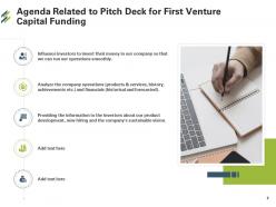
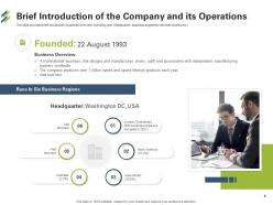
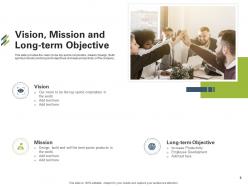
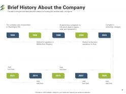
Analyze company operations and financials with the help of Pitch Deck For First Venture Capital Funding PowerPoint Presentation Slides. The slideshow gives a brief introduction about the company with vision, mission, and long-term objectives. Highlight the company’s milestones, achievements, key executives, and shareholder structure by using our readily available private equity fund pitch deck PPT presentation. Provide information on future opportunities for the company by taking advantage of content-ready start-up pitch deck PowerPoint templates. Our attention-grabbing PPT presentation also provides detail on the product with description, rating, and pricing structure. Furthermore, the slide deck presents the detail of the new product development plan, strategy, and competitive landscape analysis. Utilize our PowerPoint layouts to display competitor analysis related to the product. Showcase SWOT analysis of the business by employing these stunning PPT visuals. Present information on the company operations in different geographic regions by incorporating our professionally designed PPT slideshow.
People who downloaded this PowerPoint presentation also viewed the following :
Pitch deck for first venture capital funding powerpoint presentation slides with all 45 slides:
Use our Pitch Deck For First Venture Capital Funding Powerpoint Presentation Slides to effectively help you save your valuable time. They are readymade to fit into any presentation structure.




FAQs for Pitch deck for first venture capital funding
So you'll want the usual suspects: problem, solution, market size, business model, traction, team, financials. Make sure your problem slide hits hard - like, investors should immediately think "ugh yes that's so frustrating." Your solution comes next, then prove the market's actually big enough to care about. Show how you make money (obvs) and any early wins or validation you've got. Team slide is huge since people invest in founders, not just the idea itself. Keep it tight - maybe 10-12 slides tops, but definitely have extras ready when they start drilling down into specifics.
Dude, storytelling is what makes investors actually give a shit about your pitch deck instead of zoning out after slide 3. Don't just throw features at them - create an actual narrative. Problem, your journey, solution, where you're going. Humans are wired to connect with stories way more than boring spreadsheets (who would've thought?). Your startup becomes the hero fixing real problems instead of just another random app. Structure it like you're explaining why this matters and who it helps. Start with a problem people can relate to, then your solution becomes the satisfying ending.
Honestly, the worst thing you can do is cram every detail onto your slides like you're writing a textbook. One clear point per slide, that's it. And please don't use those crusty default templates - I swear investors must see the same blue gradient background 50 times a week. Start with the problem you're solving, not all your cool features. Even rough financial projections are better than none. Stick to 10-12 slides or you'll lose them. Oh, and actually practice beforehand so you're not just standing there reading everything out loud like a robot.
Dude, who you're pitching to changes EVERYTHING about your deck. VCs want to see market size, scalability, exit strategy - all that numbers stuff. But customers? They just care if your product actually solves their problem. I watched this guy completely crash and burn using his investor slides for a client meeting. Such a mess. Research who's gonna be in the room first. Then switch up your language, visuals, even the order of slides. What matters to them should drive how you tell your story. Oh, and definitely don't use the same deck for different audiences!
Look, you absolutely need solid market research for your pitch deck - it's what backs up everything you're claiming. Without it, investors will tear apart your assumptions in minutes. The research proves there's real demand for your product and helps you nail down your target market size. Plus it shows you actually know who you're competing against (trust me, saying "we have no competition" is a red flag). You'll need this data to build realistic financial projections too. Honestly, the whole thing just proves you've done actual work instead of going off some random hunch. Start collecting this stuff early though - good insights take time.
Dude, visuals are a game changer for pitch decks. People absorb images like 60,000 times faster than text - which honestly blows my mind every time I think about it. Skip the wall of bullet points. Show your revenue growth with a clean chart instead. Market size? Perfect for an infographic. Nobody's trying to read paragraphs during your presentation anyway. Use visuals to tell your story - user journey, competitive landscape, all that stuff becomes way clearer. Just don't go crazy with decorative nonsense that doesn't actually support your point. Keep it simple and data-focused, you know?
Dude, that first slide is make-or-break time. You've got like 30 seconds before people zone out and start checking their phones. Open with something that actually grabs them - a crazy stat, bold statement, whatever connects to your problem. Don't do the boring corporate intro thing. I've literally watched great pitches die because they started with generic fluff. Once you lose them early, you're screwed for the rest of the deck. Hit them with something memorable right away and they'll lean forward wanting more.
Dude, you gotta tailor your pitch to what each investor actually wants to hear. VCs are chasing unicorns - they want massive market size and crazy growth potential. Angels? They're betting on YOU as a person, so focus on the problem you're solving and why you're the one to fix it. Corporate VCs need to see how you fit their parent company's strategy. Family offices are way more conservative - show them steady returns and how you're managing risk. It's honestly exhausting switching between all these different conversations, but research their recent deals first. Then just tell them what they need to hear.
Dude, focus on your core growth numbers - MRR, CAC, LTV, and active users. Revenue growth rate is gold if you've got it. Burn rate and runway too, obviously. I swear investors care more about these spreadsheets than your actual product half the time. Pre-revenue? Show user growth and engagement instead. Unit economics are clutch for proving your model actually works. Don't go crazy though - pick like 3-5 metrics max that tell your best story. Market validation data helps too if it's solid.
Put your value prop right after the problem slide - slide 3 or 4 works best. First, nail down the problem they're actually feeling. Then boom: "Here's how we're different from everyone else." Think movie trailer vibes, you know? You want that moment where they go "oh, interesting." Your solution slide should tie back to this unique angle, then use demo/traction to prove it's not just talk. Keep it simple though - I always test mine on my neighbor first since she's got zero clue about tech stuff. If she gets it, you're golden.
Look for body language first - are they leaning forward, scribbling notes, actually engaged? That's way more telling than anything they say initially. When investors shift from those boring generic questions to digging into your actual numbers and strategy, you're onto something. The room just has this different vibe, honestly. They'll start throwing around next steps and timelines instead of giving you the polite brush-off. Oh, and pay attention to their language - if they're saying "when we partner" rather than "if we decide to move forward," you've probably nailed it. Trust your gut on the energy.
Dude, practice sessions are a game changer - you'll see what actually trips people up vs what you *think* will confuse them. Which slides bore people to death? Where are you flying through key points? I watched one founder totally flip their whole deck after two practice runs because their "amazing" story flow confused literally everyone. Wild. The feedback helps you fix your messaging and catch tech issues early. Different people will spot different problems, so do 3-4 sessions minimum. Trust me on this one.
Honestly, it depends on your budget and how tech-savvy you are. Canva's probably your best bet to start - their pitch deck templates are actually pretty solid and you don't need design skills. PowerPoint works too if you're already comfortable with it, though sometimes I think people overthink these things. Beautiful.ai is decent for the middle ground since it auto-formats everything nicely. If you want to get fancy, Figma or Adobe Creative Suite are great but they'll take forever to learn. Google Slides is fine in a pinch. I'd mess around with Canva first and see how it feels.
Stick to 10-12 slides max, present in 10-20 minutes. I've sat through so many bloated 30-slide disasters - people just zone out. One key point per slide, that's it. Cut anything that doesn't support your main story (you can prep backup slides for questions later). Skip the paragraph text blocks. Bullet points work way better, and good visuals carry most of the weight anyway. Oh, and figure out your core story first, then build slides around that. Don't just dump everything you know onto slides - nobody wants that.
Think of it like telling a story - problem first, then your solution swoops in to save the day. Most decks I've seen are all over the place honestly, which just confuses people. Make each slide flow into the next by ending with a question that the following slide answers. So after showing the problem, you'd naturally transition to "here's how we fix this." Cover your market size, business model, traction - but keep those verbal bridges smooth when you're presenting. Oh and practice those transitions out loud! You want investors leaning in thinking "okay, what's next" instead of scratching their heads.
-
Great product with highly impressive and engaging designs.
-
Thanks for all your great templates they have saved me lots of time and accelerate my presentations. Great product, keep them up!
-
Professional and unique presentations.
-
Very unique, user-friendly presentation interface.
-
Great quality product.
-
Out of the box and creative design.
-
Wonderful templates design to use in business meetings.
-
Design layout is very impressive.
-
Easily Editable.
-
Top Quality presentations that are easily editable.
-
Page:
- You're currently reading page 1
- Page 2
-
