

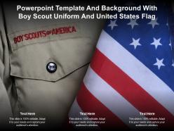
Powerpoint template and background with boy scout uniform and united states flag





Try Before you Buy Download Free Sample Product
 Impress Your
Audience
 100%
Editable
 Save Hours
of Time


The following Powerpoint Image slide titled Powerpoint Template And Background With Boy Scout Uniform And United States Flag is an editable Powerpoint template available in Standard as well as Widescreen size. This slide has an image pasted strategically on a slide with sections for text that you can fill in. You can move and edit any element and paste your own image in place of this provided image if required.
People who downloaded this PowerPoint presentation also viewed the following :
Powerpoint template and background with boy scout uniform and united states flag with all 2 slides:
Use our Powerpoint Template And Background With Boy Scout Uniform And United States Flag to effectively help you save your valuable time. They are readymade to fit into any presentation structure.
FAQs for Powerpoint template and background with boy scout uniform and
Definitely include the Scout Oath and Law - those are must-haves. But here's the thing, stories work way better than just reciting values. Like, actual examples of kids being trustworthy or helpful. Make it interactive too - let them share their own experiences instead of just listening to you talk. Oh, and end each part with something they can actually do afterward. Kids zone out pretty fast if you're just lecturing at them. The whole point is getting them engaged so this stuff actually sticks, you know?
Honestly, start with the classic scout colors - those blues, reds, and earth tones just work. They give off that trustworthy vibe you're going for. Throw in some subtle scout stuff like badges or the fleur-de-lis as background elements. Clean layouts are key since they show you've got your act together (messy presentations are such a turnoff). You could add some motto elements or rank visuals to play up that advancement thing scouts love. Oh, and definitely use bold, readable fonts - squinting at tiny text is annoying. If your troop has an official template, grab that first, then tweak it to match your group's personality.
Dude, go with real action shots - kids actually hiking, building stuff, around campfires. That authentic adventure vibe works way better than those cheesy posed group photos (you know the ones I mean). Merit badge icons are solid, and nature shots always hit different. The fleur-de-lis adds some official credibility but don't go crazy with it. Honestly? Skip the stock photos of kids pretending to be scouts - they're so obvious and kinda cringe. Focus on genuine moments where they're exploring or learning something new. Keep it adventure-heavy and you'll connect with parents way better.
Honestly, just think about who you're talking to. Parents care about character building and whether their kid will be safe. Leadership meetings? Focus on logistics and what volunteers actually need to do. But for the kids themselves - make it all about adventures and camping photos because let's be real, they don't give a damn about merit badges at first. Switch up your testimonials too. Parent quotes work for parent nights, scout stories for recruitment stuff. Practice a few different versions so you're not scrambling to change slides at the last second. Trust me on this one.
Definitely go with Boy Scout colors - navy, red, and khaki/tan are your best bet. Don't get too wild with neon stuff, it'll just look weird. Arial or Calibri work great for regular text. Headings can be something like Montserrat if you want to mix it up a bit. Navy background with white text is super safe and looks clean. I always think the outdoor, trustworthy look is what you're going for anyway. Keep everything readable and you're golden! Oh, and avoid Comic Sans obviously - learned that one the hard way lol.
Dude, start with some crazy story from your own scouting days - kids love that stuff way more than boring slides. When you're explaining merit badges, don't just read the requirements. Tell them about the kid who almost burned down his kitchen trying to cook for Cooking merit badge (happened in our troop lol). Stories about teamwork during disasters work great too. My go-to is this camping trip where everything went wrong but scouts figured it out together. Keep each story under 2 minutes though - you'll lose them otherwise. Just make sure you tie it back to whatever skill you're actually teaching them.
Honestly, go photo-heavy for this stuff - parents eat it up. Timeline layouts work amazing for showing rank progression and merit badges. Photo grids are perfect for camp shots and service projects since nobody wants to read paragraphs anyway. Before/after layouts really pop for Eagle projects. Oh, and definitely include a stats slide with fun numbers like miles hiked or service hours completed. The photos will do most of the talking. Keep text super minimal - that's what people actually remember walking out. Trust me on the timeline thing though, seeing that growth over time hits different for families.
Dude, videos of actual scout activities work amazing - way better than just talking at them. Interactive maps are clutch for orienteering stuff too. Oh, and audio for knot instructions is surprisingly helpful since kids can replay the tricky parts. Before/after campsite photos hit different than you'd expect. Some leaders get animation-happy but honestly, simpler is better. Match your media to what you're teaching though - fire safety demos crush bullet points every time. Just test your tech beforehand because nothing's worse than everything freezing up when you're trying to show the cool part!
Check out PowerPoint's "Community Project" templates - they're perfect for this stuff. Budget charts and mission statement sections are already built in, which saves you time. Canva has some good nonprofit ones too if you want something more visual. Honestly? Keep it super simple. Parents and local businesses just want to see where their money's going, not fancy animations. I learned that the hard way at our last troop meeting. Make sure there's room for action photos of the scouts and clear fund breakdowns. The transparency thing is huge - people donate more when they can literally see the impact.
Honestly, having a solid template is a game-changer for Scout presentations. You'll look way more put-together when talking to parents and sponsors instead of cobbling together random slides last minute (guilty as charged). Templates let you drop in your event info, photos, and fundraising goals without the headache of designing everything from zero. The whole point is making your community service projects and volunteer opportunities actually sound exciting - which is harder than it should be, tbh. Just swap out the details for each event and you're done. Way better than those messy PowerPoints we've all sat through at troop meetings.
Dude, personal stories are what make these presentations actually stick with kids. Nobody remembers random facts about merit badges, but they'll totally remember when you talk about that camping trip where everything went wrong or how you finally earned Eagle after like three tries. Build "story spots" right into your template - maybe after talking about each core value or skill. That way you won't forget to share the good stuff and just drone on about requirements. Oh, and definitely add a slide or section that just says "personal story here" as a reminder. Trust me, those real moments are what connect with them way more than any official handbook stuff.
So basically, it gives your new leaders a framework instead of making them figure everything out themselves. You can plug in your troop's specific stuff - policies, safety rules, whatever. Saves a crazy amount of prep time. Plus everyone gets the same info no matter who's doing the training. I've watched troops where veteran leaders just improvise and honestly? They forget key things all the time. With a template, your volunteers can actually focus on engaging people rather than scrambling to remember what comes next. Oh, and definitely keep it updated when policies change.
Oh definitely focus on contrast first - high contrast colors are huge, and skip red/green combos since so many people can't distinguish those. Make your fonts big enough that someone squinting from the back can still read them. Videos need captions or at least transcripts. Since scouts range from little kids to adults, keep your language pretty straightforward - nothing too fancy that'll trip up younger ones or non-native speakers. Also don't use color as your only way to show important stuff. Here's my lazy test: squint at your slides from across the room. Can you still make everything out? If not, you've got work to do.
Just add a quick eval slide at the end - ask scouts to rate sections and throw in improvement ideas. That traffic light thing works great (green for clear, yellow for confusing, red for boring). Kids eat up the colors. Make a feedback form that matches your presentation structure so you'll actually spot patterns when you're hitting different troops. Here's what I learned the hard way - set monthly reminders to review that feedback or it'll just sit there forever. The whole point is keeping your feedback system as organized as your actual content. Otherwise you're basically collecting responses for no reason.
Honestly, the worst thing you can do is cram way too much text on each slide. Kids will check out immediately when they see walls of bullet points - I've watched it happen so many times! Go heavy on visuals instead. Think cool camping photos, not paragraphs about badge requirements. Skip those boring corporate templates too. Your scouts want something that actually connects to their adventures. Oh, and definitely test everything beforehand with real content. Technology always crashes at the worst possible moment, so have a backup ready!
-
Innovative and Colorful designs.