

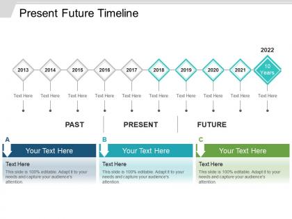
Present future timeline ppt design




Try Before you Buy Download Free Sample Product
 Impress Your
 Audience
 100%
100% Editable
 Save Hours
 of Time


Embrace diversity with our Present Future Timeline Ppt Design. Extract the best from every discipline.
People who downloaded this PowerPoint presentation also viewed the following :
Present future timeline ppt design with all 5 slides:
Applaud acts of exceptional bravery with our Present Future Timeline Ppt Design. Encourage folks to exhibit indomitable courage.
FAQs for Present future
Honestly, AI tools are game-changers for building timelines now. You get predictive modeling that actually updates itself when things shift - way better than manually tweaking everything constantly. Teams can collaborate in real-time too, which is clutch when you're all working on the same projections. Sustainability features are popping up everywhere (makes total sense though). What's really cool is the personalization aspect - timelines morph based on how users interact with them instead of staying static. Oh, and collaborative features let multiple people jump in simultaneously. Definitely try some AI-powered options first. They'll handle most updates automatically so you're not stuck doing busy work.
Interactive maps and clickable hotspots are your best bet for letting people explore specific events deeper. AR overlays work great too. VR's still pretty rough for timeline stuff, though some historical experiences are cool. Animation libraries like D3.js make transitions feel smooth and natural. Real-time data feeds keep everything current, plus AI can customize content based on what users actually care about. Honestly, don't go crazy adding every feature at once - pick one interactive element first and see how people respond. You can always layer more on later.
Honestly, UX can make or break your timeline. People will either actually look at it or just scroll right past. Start with clear visual hierarchy - nobody wants to squint at tiny text or guess what comes next. Break content into bite-sized pieces that don't overwhelm. I've definitely seen gorgeous timelines that were total disasters to navigate! Interactive features help too, so users can dig deeper if they want. Oh, and chronological order sounds obvious but you'd be surprised how often people mess that up. Test it with real people first - you'll catch issues you never thought of.
Honestly, visual storytelling is what makes timelines actually interesting instead of just boring lists of dates. Try color coding different themes - like blue for political events, red for wars, whatever makes sense. Icons work great too for showing key moments at a glance. I always mess around with line thickness to show which events had bigger impact. The whole point is creating a visual narrative that tells your story. Every design choice should help people see connections between events quickly. It's like... you want someone to look at it and immediately get the bigger picture without having to read everything twice.
Focus on the big milestones first - those are what people will remember years from now. Add supporting details in order, but honestly don't get too caught up in every tiny thing or you'll bore everyone to death. I made that mistake once and could literally see people's eyes glazing over. Related events should be grouped together, and try to keep your time intervals consistent so people can actually follow along. Each milestone needs to connect back to your main story somehow. Oh, and always build in extra time between major points because stuff WILL go wrong. Trust me on that one.
Yeah, industries are totally different with timing stuff. Tech teams do those sprint cycles so they can pivot whenever - super flexible. But manufacturing? Nah, they're locked into rigid milestones because you can't just "iterate" on a half-built factory. Healthcare has all these regulatory checkpoints that literally cannot be skipped, which is honestly a nightmare. Finance wants risk assessments for everything (shocker). Creative agencies are hilarious - they'll block out entire weeks for "creative thinking time" that would give any normal PM a heart attack. You gotta match your approach to what actually makes sense for your industry's constraints.
Oh man, avoid those rainbow timeline disasters - they're so distracting! Go with colors that flow together, like blues shifting to warmer oranges as you move from present to future. Analogous colors work great (the ones sitting next to each other on the color wheel). You could also try ramping up saturation to show progression. Keep it to 3-4 colors tops. Make sure there's good contrast between your text and background since everyone's looking at different screens. Actually, test your colors on both light and dark backgrounds first - learned that one the hard way!
Honestly, animations are a game-changer for timelines. Instead of just dumping all the dates at once, you can show events appearing one by one so people actually follow the flow. It's way easier to see how things connect when they unfold naturally - kinda like watching dominoes fall vs. just seeing them all knocked over already. You can highlight specific periods or zoom into details without overwhelming anyone. I'd probably start with something basic though. Even simple fade-ins make your timeline feel less like a boring history textbook and more engaging.
TimelineJS is probably your best bet - it's free and works in your browser. Canva's good too if you want something that looks professional without being a design wizard. I've honestly seen people make killer timelines in just Google Slides, so don't overthink the fancy software thing. Lucidchart handles complex project stuff well. Oh, and Aeon Timeline is clutch for historical work or if you're plotting out a novel with tons of interconnected events. Figma works for quick mockups since you can collaborate live. Just figure out your content first, then match the tool to how complex you're getting.
Honestly, turning your timeline into something visual makes all the difference - nobody wants to read through a boring list. Color coding works great for different themes or players. Make important events pop with thicker lines or cool icons. Interactive stuff is where it gets fun though - hover effects and filters keep people actually engaged instead of just scrolling past. I'd start simple with maybe one or two visual tricks, then build from there. The whole point is making it feel like you're telling a story, not just dumping data on someone. Way more effective that way.
Honestly, the worst thing you can do is be super optimistic with timing - I'm guilty of this constantly! Dependencies will absolutely wreck your schedule if you don't plan for them. Buffer time is your best friend because random stuff always comes up. Oh, and get your stakeholders involved early or you'll hate yourself later when they have "feedback." Review cycles take forever - like, way longer than you think. Start by figuring out what depends on what first, then work backwards from your deadline. Trust me on this one.
Honestly, it's all about knowing your audience. Executives want the big picture stuff - milestones and business impact, not every tiny detail. Technical teams are the opposite though - they actually need those specific deliverables and dependencies to do their jobs. Age is weirdly a factor too. Younger people usually love interactive visuals, but older stakeholders often prefer straightforward linear presentations. Match your language to how familiar they are with the topic. Oh, and here's the thing that really matters - before you design anything, figure out what they need to know and what they'll do with that info afterward.
Three main things to nail down: visual, cognitive, and technical stuff. High contrast colors are huge, but don't just rely on color alone - throw in some icons or patterns too. Text needs to be readable obviously, plus you'll want screen reader descriptions. Honestly, I always screw up the cognitive piece at first - like dumping everything on users instead of breaking info into digestible chunks. Oh and make sure keyboard navigation actually works with your timeline. My advice? Test it yourself with accessibility tools before anyone else touches it. Way easier to catch issues early.
Build your timeline with pieces that can shift around for different screens. I usually separate the layers - dates, events, details - so you can stack them vertically on mobile or spread horizontally on desktop. Honestly, mobile users don't need every tiny detail your desktop version has anyway. Set up responsive breakpoints and just hide the extra stuff when space gets tight. The trick is having one main timeline that's smart enough to show/hide content based on screen size. Works way better than trying to maintain separate versions.
Look, narrative structure is what separates timelines that actually work from ones people just scroll past. You need cause-and-effect connections between events - show how each milestone triggers the next one. Chronological bullet points are basically worthless for getting buy-in. Instead, think chapters in a book where there's real momentum building. Each phase should feel like it naturally flows into what comes next. Honestly, I'd start by figuring out your major turning points first. Then work backwards to map out what causes each transition. Makes the whole thing feel inevitable rather than random.
-
Really like the color and design of the presentation.
-
Easily Editable.