

Pricing Table Bundle Powerpoint Ppt Templates And Slides





Try Before you Buy Download Free Sample Product
 Impress Your
 Audience
 100%
100% Editable
 Save Hours
 of Time


Our Pricing Table Bundle Powerpoint Ppt Templates And Slides are topically designed to provide an attractive backdrop to any subject. Use them to look like a presentation pro.
People who downloaded this PowerPoint presentation also viewed the following :
Pricing Table Bundle Powerpoint Ppt Templates And Slides with all 34 slides:
Use our Pricing Table Bundle Powerpoint Ppt Templates And Slides to effectively help you save your valuable time. They are readymade to fit into any presentation structure.



















FAQs for Pricing Table Bundle Powerpoint Ppt
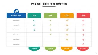
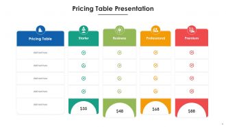
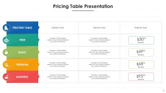
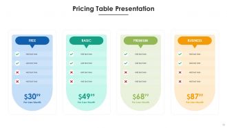
Okay so first thing - list your services with super clear pricing tiers. People need to see exactly what each plan includes. Definitely highlight whichever one's most popular (seriously, that social proof thing actually works). Add any setup fees and whether it's monthly or yearly billing. Oh, and make sure each tier's key features are obvious - like what makes the premium worth it vs basic. Clean design is huge here too. Nobody wants to squint at cramped text when they're trying to spend money. Each option needs its own action button that's easy to spot. Really the whole point is removing any confusion so they can just pick and move on.
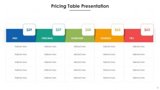
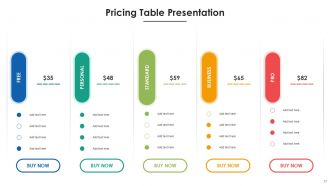
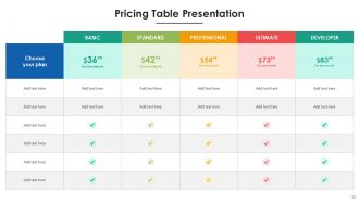
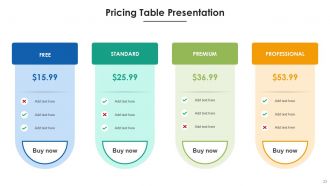
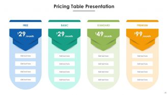
Hey! So good visual design is huge for pricing tables - people need to scan them super quickly. Make your font sizes different to create hierarchy, and definitely highlight your most popular plan with some color or a border. White space is your friend here, nobody wants to look at a cramped mess. Oh and use icons for features instead of endless bullet points - way more digestible. I'd stick to a simple color scheme but use contrast to draw attention where you want it. Honestly, the whole point is making their choice feel obvious and easy. Test it with real people though, you'll be surprised where they get confused!
Oh man, don't cram everything into tiny unreadable text - I swear some pricing pages look like they're trying to fit War and Peace in there. Put your best plan right up front where people actually see it. Skip the rainbow colors and weird fonts that hurt your eyes. Your call-to-action buttons need to be super obvious too. Honestly, I'd just keep it clean and simple. Maybe test it out on a few friends first? They'll tell you real quick if something's confusing. Most people scan these things in like 3 seconds anyway.
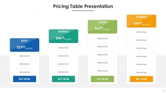
Oh yeah, tiered pricing is sneaky but it totally works! Most people see three options and automatically skip the cheapest one (feels like you're getting ripped off) and the expensive one (ouch). So they go for the middle tier thinking they're being smart. Companies know this and design their pricing around it - honestly it's kind of genius. You want your middle option packed with the stuff people actually need, then use the other two to make it look like the obvious pick. Definitely test different setups though, since every audience is weird about money differently.
Colors totally mess with people's heads when they're looking at pricing - it's wild how much it matters. Blue's your best friend for building trust (PayPal does this perfectly), and green screams "good deal" plus action. Red and orange work for urgency but honestly, I've seen so many sites go crazy with bright red premium plans and it just looks sketchy. Makes people bounce immediately. Your priciest option should stick to calm blues or classy grays. Here's the thing though - you want your recommended plan popping with warmer colors while everything else stays neutral. Don't overthink it, just make it feel trustworthy.
Honestly, just stick short customer quotes or star ratings right under each pricing plan. Works way better than you'd think. Or throw a testimonials section below the whole table - I've done both and they convert well. Don't go overboard though, like 2-3 max per plan or it gets messy. Customer logos are solid for social proof too. Pick quotes that mention actual results or ROI if you have them. Oh, and test putting testimonials above your pricing sometimes - people need that social proof push before they even look at prices, you know?
Stack those columns vertically on mobile - trust me, horizontal cramming is the worst. Make your buttons bigger (44px minimum) since we're all tapping with our thumbs here. Font sizes need to be bumped up too. Show your best plan first, then let people swipe through the rest. Horizontal scrolling can be weird depending on the phone though, so definitely test that part. Honestly? Just grab your phone right now and try using your own table. If it feels clunky to you, it'll feel clunky to everyone else.
Look at what actually makes people upgrade - that's your gold. Lead with the core stuff that solves their main problem, then add 2-3 premium features that create obvious gaps between tiers. Most pricing tables are a mess of specs nobody cares about. Usage limits work great for pushing upgrades. So do integrations and support levels. I'd test different combinations and watch what converts. Your customers basically tell you what matters through their behavior anyway. Benefits over features every time - way more compelling than listing a bunch of technical details that just confuse people.
Honestly, pricing tables work best for SaaS companies and consultants - anyone offering multiple tiers really. Think web agencies, fitness trainers, subscription services, freelancers. Even seen restaurants use them for catering (weird but it works!). The whole point is helping customers compare options without getting overwhelmed. Got just one product at one price? You probably don't need the fancy table setup. But multiple service levels or features? Definitely worth grabbing a template. Makes the decision process way smoother for people.
So A/B testing is basically comparing different versions of your pricing page to see what converts better. Test button colors, layouts, how you describe features - whatever. Companies get way too obsessed with button colors though when their copy is just confusing as hell. Focus on one thing at a time so you actually know what made the difference. Give each test at least a week to get real data. Then just go with whatever wins. I'd start with your main call-to-action button since that's what people see first anyway.
Start with conversion rates by pricing tier - that's gonna tell you the most. Heat mapping is honestly where it's at though, you can see exactly what people are staring at on your table. Track click-through rates on each plan button and how long they're hanging out on the page. Customer acquisition cost per tier matters too, but I'd worry about that later. Oh and if you're running A/B tests on copy or layout, definitely monitor those results. The drop-off points are huge - figure out where people bail and you're golden. Set up analytics now and you'll have real data in like a week.
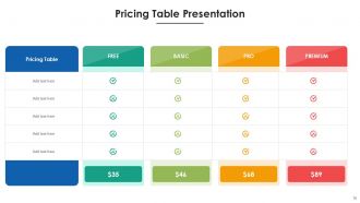
Yeah definitely! Switch up your pricing tables based on what you're pushing. Value-focused? Make those "most popular" badges pop and show off all the features. Premium stuff needs tons of white space - honestly makes anything look more expensive. For beating competitors, throw in comparison columns. Budget campaigns work better with super clean layouts that scream "cheap but good." Oh and here's the thing - whatever your main selling point is, make that the biggest or brightest element on there. Like if you're all about savings, make those dollar amounts huge. It's basically about matching what people care about most to what they see first.
Honestly, Canva's probably your easiest bet - tons of pricing table templates and you can customize them pretty quickly. Figma works great too if you're into that. HTML/CSS gives you way more control but obviously you gotta know what you're doing there. Oh, and if you're already using Notion for other stuff, they actually have some solid table options (kinda underrated tbh). WordPress people should definitely look into TablePress. Really just depends where you're putting these and how fancy you need them. I'd probably start with Canva though - clean look, super fast to set up.
Word choice is huge for pricing pages. "Popular" and "Best Value" badges create instant social proof. Plan names matter too - I saw someone switch from "Basic" to "Starter" and conversions jumped because nobody wants to feel basic, you know? "Professional" vs "Enterprise" hits different audience expectations. Button text helps - "Get Started" feels way less pushy than "Buy Now." Focus on benefits over features in your descriptions. Oh, and always make your preferred plan look like the obvious smart choice. These little tweaks add up fast.
Pricing tables are sneaky good for this. Make your middle tier the "most popular" one - people gravitate toward that anyway. Then stack features so there's obvious value jumps between each level. Cross-selling is easier when you throw in add-ons as optional extras right in the pricing tiers. Honestly? Most people won't pick the cheapest option - there's some weird psychology there. Visual stuff matters too. Use highlighting or badges to push attention toward plans you actually want to sell. Different colors work great for this. Oh, and definitely test layouts because what works for one audience might totally flop for another.
-
SlideTeam provides PPTs on every single topic. Their templates suit my job very well. I am very grateful!
-
Excellent products for quick understanding.