

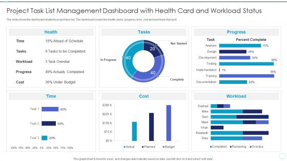
Project Task List Management Dashboard With Health Card And Workload Status




Try Before you Buy Download Free Sample Product
 Impress Your
 Audience
 100%
100% Editable
 Save Hours
 of Time


The slide shows the dashboard related to project task list. The dashboard covers the health, tasks, progress, time, cost and workload of project.
People who downloaded this PowerPoint presentation also viewed the following :
Project Task List Management Dashboard With Health Card And Workload Status with all 7 slides:
Use our Project Task List Management Dashboard With Health Card And Workload Status to effectively help you save your valuable time. They are readymade to fit into any presentation structure.





FAQs for Project Task List Management Dashboard With Health Card
Honestly, just track the stuff that actually matters. Schedule performance and budget variance are non-negotiables - gotta know if you're on track and not bleeding money. Completion percentage is obvious but super helpful for quick updates. Resource utilization gets overlooked but it's clutch when you're managing multiple things at once. Milestone tracking and risk indicators are what everyone's gonna bug you about in meetings anyway, so might as well have those ready. Quality metrics if they apply to your project. Don't go crazy though - stick to like 5-7 max or you'll drown in data.
So here's the thing - when people can actually customize their dashboard to show what they care about, they'll actually use it. Like, instead of avoiding the thing completely, they're checking it daily because it finally makes sense for their brain and their job. I've watched entire teams flip from doing these painful weekly meetings to just collaborating in real-time because suddenly everyone could see their own priorities without digging through a bunch of random data they don't need. Honestly, just start simple - let people pick their top 3-5 metrics to show first.
Honestly, **Tableau** and **Power BI** are your best bet if you want something that actually looks professional. Both have crazy customization options. **Monday.com** and **Asana** work great too - their dashboards look clean right out of the box, which is nice because who has time to fiddle with settings all day? **Notion** is solid if your team's already using it. Google Data Studio's decent for tight budgets. I'd probably avoid going too fancy at first though. Pick whatever your team won't abandon after a week, then build from there once you figure out what numbers people actually care about.
Daily updates work best for most teams, maybe every 2-3 days if you're swamped. Real-time sounds cool but honestly just creates panic over tiny fluctuations - nobody needs that stress. You get enough visibility to spot problems early without obsessing over every metric. Weekly's way too slow when things move fast. Start daily and see how it feels, then adjust based on your team's rhythm. Oh, and definitely automate the data pulls if you can - manually updating dashboards is such a time sink.
Dude, real-time data turns your dashboard from a glorified Excel sheet into something you actually want to look at. Instead of stale weekly reports, you're seeing budget burns and project status as they happen. When stuff hits the fan (and it will), you can pivot fast. Bottlenecks become obvious. Resource problems jump out at you before they tank your timeline. Honestly, I was skeptical at first but now I'm hooked. Set up alerts for the metrics that matter most - way better than refreshing screens like a maniac all day.
Talk to your actual users first - seriously, this sounds obvious but so many people skip it. Ask each group what they really need to see and how they want it laid out. Clean design beats fancy every time. Don't cram everything on one screen just because you can. Most important stuff goes up top, use the same colors consistently, and honestly? Labels should be so clear your mom could understand them. Oh, and test changes with like 3-4 people before you push anything live. I've watched too many "pretty" dashboards flop because they're impossible to use.
Honestly, the biggest mistake is cramming everything onto one screen. I know it's tempting - more data feels better, right? But cluttered dashboards are basically useless. Stick to maybe 5-7 metrics that actually matter for decisions. Skip the vanity stuff that looks cool but doesn't help anyone do their job. Oh, and definitely test with real people first. I've seen so many "perfect" dashboards that made zero sense to actual users. Visual hierarchy matters too - make it obvious what's important. Start simple, then build from there based on what people actually need.
Honestly, mobile access changes everything for remote work. Your team can update stuff and flag problems right from their phones - keeps everyone in sync even when you're in different time zones. Super helpful when clients call and you're not at your computer, or you're on the train and suddenly remember something urgent. Quick decisions happen way faster when everyone can check project status on the go. Just make sure the mobile version actually works well though - I've seen too many "mobile-friendly" dashboards that are basically unusable. Real-time comments and status updates from anywhere? That's where it gets really powerful.
Get real-time alerts set up first - seriously, they're lifesavers for catching stuff before it blows up. A visual risk matrix helps too, showing probability vs impact so you can instantly see the nightmare scenarios. Track how risks change over time and keep mitigation status updated. Connect it to your task management system so risks tie directly to action items. Different dashboards for different people work well since your PM doesn't need the same view as executives. Actually, I'd probably start simple with just the alerts and build from there - that alone will save you tons of headaches.
Honestly, dashboards are clutch because everyone sees the same info at once - no more endless email chains or playing phone tag for updates. Tasks, deadlines, blockers, it's all there. You can comment directly on stuff and tag people when you need them. Way better than those awkward "wait, who's doing what?" moments in meetings. Your team checks updates whenever instead of waiting around, which is honestly refreshing. The notification setup takes like 5 minutes but makes everything run so much smoother. Trust me on this one.
OK so visual hierarchy is basically about making sure the most important stuff jumps out first - like urgent deadlines or tasks that are totally overdue. Size, color, and where you put things all matter here. Without this, your dashboard just turns into this chaotic mess that makes everyone's eyes glaze over (seriously, I've made this mistake before and people avoided looking at it entirely). Put your critical metrics up top where they can't be missed. Then stack the less urgent info below. The whole point is helping people scan quickly and actually understand what needs their attention right now.
So first thing - connect your dashboard to different data sources and use visualization tools to catch trends. Most PM tools already have analytics built in, which is nice. But here's what actually matters: track leading indicators instead of just boring stuff like task completion rates. Set up automated reports for velocity trends, resource utilization, risk scores - you know, the good stuff. Oh and don't fall into the trap of making things look pretty but useless. Pick 3-4 KPIs that'll actually help you decide things better, then expand from there.
Honestly, dashboards are clutch for agile work. Real-time sprint tracking, burndown charts, velocity metrics - all that good stuff in one place. You'll spot blockers right away and actually know if you're gonna hit your sprint goals. Most of them play nice with Jira or Azure DevOps too, which saves you from building something from scratch (been there, not fun). The visual piece is huge during standups - everyone's looking at the same data instead of guessing. Just set up auto-updates so you're not wasting sprint time manually refreshing metrics.
Honestly, connecting third-party tools to your PM dashboard is such a time-saver. Pull financial stuff from accounting, HR data for resources, CRM feedback - whatever you're constantly checking gets dumped into one spot. No more tab-hopping like a maniac. Your stakeholders actually get updates automatically instead of bugging you for reports every week (thank god). Decision-making gets way faster when everything's right there. I'd start with whatever external sources you check most - probably 2-3 max at first so you don't overwhelm yourself.
Honestly, just start asking people what they actually think - surveys, quick interviews, whatever works. Look at your analytics too because they'll show you which features are basically dead weight. I swear, half the dashboards I've used look amazing but are complete nightmares to navigate daily. Listen when users complain about their workflow or ask for specific stuff - they're literally telling you what's broken. Oh, and don't change everything at once. Test small tweaks with a few people first. Way easier than fixing a mess later.
-
Easy to use and customize templates. Helped me give a last minute presentation.
-
Understandable and informative presentation.