

Radiation symbols hazard warning with 6 danger signs ppt slide





Try Before you Buy Download Free Sample Product
 Impress Your
Audience
 100%
Editable
 Save Hours
of Time


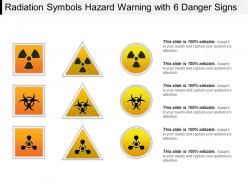
Spread maximum awareness about the potential radioactive hazards using radiation Symbols Hazard Warning With 6 Danger Signs PPT Slide. The PPT template consists of an icon depicting the radioactive hazard warning featuring six concerns related to it. Using the warning PowerPoint slide you can inform the audience about the radiation substances that are a threat to living beings. This PPT slide enables you to explain the samples of radiations which can prove to be a severe threat to mankind. Use the radiation symbol PPT to make people aware of the measures to follow in order to prevent the toxin-related health hazards. The warning logo helps you provide six precautions at one go that can be used to avoid the radioactive pitfalls. Download this radiation symbol hazard warning PowerPoint and regulate risk exposure by increasing the audience’s understanding.
People who downloaded this PowerPoint presentation also viewed the following :
Radiation symbols hazard warning with 6 danger signs ppt slide with all 5 slides:
Your ability to analyse is extraordinary. Convince them of your gift with our Radiation Symbols Hazard Warning With 6 Danger Signs Ppt Slide.




FAQs for Radiation symbols hazard warning with 6 danger
So there's basically three main radiation symbols you'll see. The classic trefoil - looks like a three-blade propeller thing - that's for ionizing radiation like X-rays and nuclear stuff. The newer red/yellow "dangerous source" symbol came out in 2007. Kinda creepy looking tbh, like a skull with danger lines shooting out. Then you've got electromagnetic radiation warnings for lasers and RF gear - usually lightning bolts or wave patterns. Most industries stick to these but they'll throw in their own colors or extra text sometimes. Oh, and definitely check your workplace safety manual since every place does things slightly different. Better safe than sorry with radiation stuff.
So radiation symbols basically tap into this universal visual language that works even if you can't read. Bright colors, bold shapes - stuff that just screams danger, you know? The trefoil is recognized everywhere now. Those newer skull versions are pretty effective too, though honestly the classic one still reminds me of a fan blade sometimes lol. High contrast colors at eye level work best. Your brain needs to process "nope, stay back" in like two seconds flat, especially if you don't speak the language. Pretty clever design when you think about it.
So radiation symbols are usually yellow and black - that bright yellow background with the black trefoil thing. Yellow catches your eye fast (like those annoying construction signs), and black gives good contrast so you can actually see it. Sometimes you'll see red mixed in for really nasty stuff, or magenta for certain materials. Honestly, the color system is pretty smart since you can tell how dangerous something is without squinting at tiny text. But yeah, if you ever see these colors at work, definitely check what the label actually says and follow whatever safety rules your place has. Don't just wing it.
Yeah so the basic trefoil is mostly the same everywhere, but you'll notice different color combos - some countries do magenta/yellow instead of black/yellow. Honestly threw me off when I first saw it. EU tends to add extra pictograms for specific radiation types which is actually pretty helpful. Japan's big on bilingual labels too. The text warnings change a lot obviously - different languages but also just different ways of saying the same hazard level. Oh and definitely look up local regs before you work somewhere new because the wrong symbol can seriously mess up your compliance.
Look, those radiation warning symbols are literally your best shot at keeping people safe. You can't see or feel radiation, so the signs do the work for you. OSHA and NRC don't mess around with this stuff - you have to put them up, it's not negotiable. New employees pick up on them fast since they're the same everywhere. Oh and definitely check them regularly because faded symbols are useless symbols. Trust me, it's way better to be overly cautious with radiation than sorry later.
Look, those radiation symbols are basically your instant safety cheat sheet. The trefoil one? Classic for good reason - you'll spot it even when everything's going crazy. Different colors mean different threat levels, so you know if it's just some medical waste or the kind that'll actually kill you. Honestly, I'd rather know what I'm walking into than waste time running tests first. Your team can grab the right gear immediately instead of guessing. Takes like 5 minutes to memorize the main ones, but when your heart's racing and you need to make quick calls, you'll be glad you did.
Okay so here's the thing - people think all radiation symbols mean the same danger level, but they really don't. There's the classic trefoil you see everywhere, then this newer red-and-yellow one for seriously dangerous stuff, plus different transport labels. Also, not every yellow symbol means radiation (I learned that the hard way once). That new ISO symbol from 2007? Total curveball since it looks nothing like the movie version we're all used to. My rule: take any radiation symbol seriously, but context matters. If you're unsure, just read whatever text is around it or grab someone who actually works there.
Your crew needs to know all three radiation symbols - the classic trefoil, that newer ISO one, and whatever supplementary signs are posted around. Do recognition drills first, then run them through scenarios where they actually encounter each type. Honestly, real workplace examples work way better than stock photos. They've gotta understand caution vs danger vs emergency symbols, plus what to do for each - evacuation routes, who to call, PPE stuff. Memory fades fast with this material, so I'd do refreshers every quarter or so.
Oh that's actually pretty interesting! So back in 1946, UC Berkeley's Radiation Lab needed something to warn people about radioactive stuff after all the atomic bomb work. They went with that three-blade design on purpose - wanted it to look unfamiliar and kinda scary so people would instinctively back away. Smart move honestly, since you don't want folks accidentally wandering into danger zones. By the 1960s it became the standard everywhere. The whole point was making you think "nope, not going near that" without needing any explanation. That's why it still looks so ominous today.
So radiation symbols are basically your early warning system - they tell you to back off before you even get near dangerous stuff. Way more serious than those wet floor signs though, obviously. They work with all the other safety gear like lead shields and dosimeters to keep you protected. Here's the thing - I'd never ignore one of those symbols. Soon as you see it, stop and figure out what's going on. Follow whatever safety steps you're supposed to before doing anything else. It's like having multiple safety nets, and the symbol is usually your first heads-up that you need to be careful.
Those radiation symbols work really well, honestly. People see that trefoil thing and immediately know to stay away - even my mom recognizes it and she's terrible with science stuff. It's the same deal as skull and crossbones for poison. The visual just clicks faster than reading text ever could. What makes them so effective is they don't need translation - works everywhere. Short sentences grab attention too. If you're making any safety stuff, definitely throw the symbols in with your words. Oh, and they tap into that gut reaction where people naturally get cautious around unfamiliar warnings, which is exactly what you want.
So you'll definitely see those trefoil radiation symbols all over radiology - on X-ray room doors, CT suites, nuclear medicine areas. Portable equipment gets labeled too. Honestly, they're pretty hard to miss once you know what you're looking for. The signs usually mark controlled areas where you need authorization to enter. Your facility probably has specific protocols about this stuff, so definitely check those out. Oh, and you'll see the symbols on dosimeters and film badges too - basically anywhere there's potential radiation exposure. Just get in the habit of scanning for warning signs before walking into imaging areas.
So radiation symbols are getting way smarter now. Instead of those old static signs, you've got digital displays that actually change color based on real radiation levels - which is honestly pretty neat. QR codes let you scan for updated safety protocols too, though I still think some of the old pictograms are confusing as hell. There's even AR stuff where you can point your phone at equipment and see safety info right on your screen. Just make sure your team knows how to use these digital systems before anyone's out there dealing with the actual equipment, you know?
Yeah, cultural stuff totally changes how people read radiation symbols. The classic trefoil works fine here because we grew up with nuclear warnings, but in places without that history? It can actually look pretty or decorative - which is obviously not great. That's why they made that new "ouch guy" symbol with the skull and person running away from radiation beams (kinda dramatic but gets the point across). Colors are tricky too. Our yellow/magenta danger combo might mean something completely different elsewhere. Honestly, if you're doing international signage, just test it with locals first instead of assuming everyone gets it.
You'll need radiation symbols if you're dealing with radioactive stuff above certain levels - think nuclear facilities, medical imaging, research labs with isotopes, transport, that kind of thing. The regulatory mess is honestly pretty confusing though. NRC handles most commercial and medical stuff, OSHA does workplace safety, DOT covers transport. Your state has rules too. Basically, if you're storing, using, or moving anything radioactive, proper signage is required. I'd definitely hit up your radiation safety officer first - they'll know the specific requirements for your situation.
-
Excellent products for quick understanding.
-
Presentation Design is very nice, good work with the content as well.