

Risk Assessment Matrix Powerpoint Ppt Template Bundles




Try Before you Buy Download Free Sample Product
 Impress Your
 Audience
 100%
100% Editable
 Save Hours
 of Time


Our Risk Assessment Matrix Powerpoint Ppt Template Bundles are topically designed to provide an attractive backdrop to any subject. Use them to look like a presentation pro.
People who downloaded this PowerPoint presentation also viewed the following :
Risk Assessment Matrix Powerpoint Ppt Template Bundles with all 17 slides:
Use our Risk Assessment Matrix Powerpoint Ppt Template Bundles to effectively help you save your valuable time. They are readymade to fit into any presentation structure.
-
Risk Assessment Matrix
-
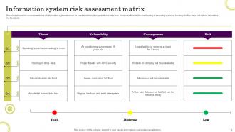
Information system risk assessment matrix
-
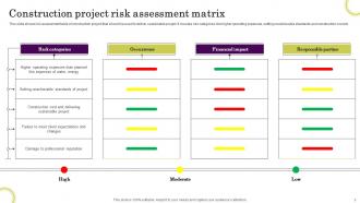
Construction project risk assessment matrix
-
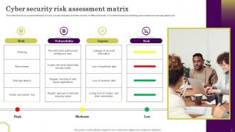
Cyber security risk assessment matrix
-
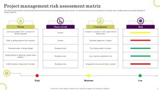
Project management risk assessment matrix
-
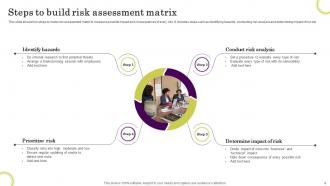
Steps to build risk assessment matrix
-
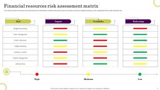
Financial resources risk assessment matrix
-
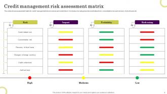
Credit management risk assessment matrix
-
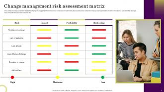
Change management risk assessment matrix
-
Project management risk assessment matrix icon
-
Financer risk assessment matrix icon
-

Thanks for Watching
-

-

-

-

-

FAQs for Risk Assessment Matrix Powerpoint
You need two main scales - probability (how likely) and impact (how bad if it happens). Define each level clearly so your team isn't guessing what "medium risk" actually means. Colors work great for the visual grid - red/yellow/green is pretty standard for a reason. Assign an owner to each risk, otherwise nobody takes responsibility and stuff just sits there. Review dates are crucial too. Honestly, most companies build these things and then forget about them completely, which defeats the whole point. Make it a living document that people actually use, not just something pretty for presentations.
Yeah, you can totally tweak your risk matrix! First step - figure out what actually threatens your specific industry. Healthcare folks obsess over patient safety while tech companies lose sleep over data breaches, you know? Adjust your probability and impact scales to match real scenarios you'd face. Then mess with the color coding based on how much risk your company can handle. Oh, and don't forget regulatory stuff if that applies to you. Honestly, grab people from different departments when you're doing this. They'll spot things you missed - happens every time.
Don't make your scales too vague - like what does "medium risk" even mean? You'll get totally different answers from everyone. Define your criteria with actual examples upfront. Also, cramming multiple risks into one box defeats the point of prioritization. People always forget about timing too, not just the bad stuff that could happen. Honestly, the worst thing is building this beautiful matrix then letting it collect dust. Risks shift constantly! Keep it simple and review quarterly at minimum. Oh, and don't just focus on negative impacts - think about speed and urgency too.
Honestly, just build it right into your planning from day one and treat it like a living doc. PMI and Agile both have solid risk processes - you map probability vs impact, then that stuff flows into your schedule and budget. I keep mine pulled up during sprint planning because it actually drives decisions. Regular project checkpoints are when you'd review and update it, helps you figure out what needs fixing now vs just watching. Oh and pro tip - make risk review a standard thing in meetings you're already having anyway.
Go qualitative when your data's sketchy or you're dealing with new risks nobody really gets yet. Perfect for quick initial screenings too - you can sort through tons of potential issues fast. Non-technical people actually understand the color-coded matrices, which is huge. I've seen too many executives zone out the second you pull up spreadsheets with formulas. Start qualitative to get everyone on board, then switch to the heavy number-crunching for your top risks once leadership's paying attention. Works way better than diving straight into quantitative stuff.
Honestly, ditch those static spreadsheets - they're basically useless for risk management. Get some decent GRC software that pulls in real data automatically and updates your likelihood/impact scores without you babysitting it. The visual dashboards actually help when you're presenting to executives who zone out at spreadsheets. AI can spot patterns you'd totally miss, but don't go full robot mode on it. What's really nice is setting alerts for when risks spike. Then you can dig into specific scenarios super fast instead of hunting through tabs. Start with some Excel add-ins if budget's tight, or go bigger with proper platforms.
You absolutely need stakeholder input for your risk matrix. Operations, finance, legal, frontline staff - they all see risks differently than you do. Without their perspectives, you're basically guessing at probability and impact scales. Plus, people won't use something they didn't help build (learned that the hard way on a project last year). Get them involved early in development, not just rubber-stamping at the end. Their real-world experience is what makes your matrix actually useful instead of just another pretty spreadsheet collecting dust.
Honestly, once a year is the absolute minimum - but that's pretty much useless if you ask me. Big changes should trigger updates right away. New regulations, major incidents, restructuring, whatever. Most companies I know do quarterly reviews and it works way better. Quick monthly check-ins on your biggest risks too. Don't be like those teams who create it once and never touch it again (I've seen this happen so many times). Oh, and set that calendar reminder now or you'll totally forget about it.
Honestly, jump straight into real examples from your own company instead of boring hypotheticals. People constantly confuse probability with impact - drives me crazy - so nail that distinction first. Get everyone on the same page about what "high risk" actually means for you guys. Try having different teams assess identical risks separately, then hash out the differences. Those debates are where the real learning happens. Oh, and don't let people get rusty between sessions. Skills fade fast if you're not practicing regularly. Group exercises work way better than lectures too.
Look, risk assessment matrices are pretty straightforward once you get past the fancy name. Regulators eat this stuff up during audits because it shows you're not just winging it. You plot your risks by how bad they'd be versus how likely they are to happen. High priority stuff gets tackled first - makes total sense, right? I've seen people overthink these things, but honestly auditors just want to see you've thought through potential problems systematically. The visual layout is clutch too. Start with whatever compliance areas matter most in your industry, then build around those requirements. Way easier than it sounds.
Here's what I'd track: accuracy first - does your matrix actually predict real risks? Then completeness - are you missing the big stuff? False positives will drive everyone crazy, so watch those too. Nothing worse than chasing ghosts while real problems slip by. Honestly, usability matters most though - if your team won't use it consistently, the whole thing's pointless. I'd also measure how fast you go from spotting risks to actually doing something about them. Maybe survey people to see if they trust the system? Start with just 2-3 metrics monthly - don't overcomplicate it.
Look, your risk matrix needs to actually match what your company cares about - not just some generic template you grabbed online. Map those categories straight to your risk tolerance. Conservative bank? Your "high risk" bar should be way lower than some scrappy startup's. Leadership reviews are crucial here. Schedule them quarterly with your risk committee to check if the scoring still makes sense. Things change fast in business, and your matrix should too. Honestly, I've seen too many companies stick with outdated matrices that don't help anyone make real decisions. Don't be that company.
Honestly, it's a game-changer because you can instantly see your worst risks instead of hunting through boring spreadsheets. Those red "high impact, high probability" boxes? That's where your nightmares live - tackle those first. Your boss will love how easy it makes explaining priorities too, especially if they're not into technical stuff. Color-coding helps a ton (though maybe avoid neon colors - learned that the hard way). You'll spot exactly where to throw your resources and which risks can wait. Update it every quarter or so to keep it actually useful.
Honestly, just throw it on Miro or Google Sheets so everyone can jump in at once. No more of that "wait, which version are we using?" nightmare. Schedule regular video calls where you're all looking at it together - way better than trying to hash this stuff out over Slack. Color coding helps too, makes it super obvious who owns what risk. The tricky part with remote teams? Things change fast and you miss those random coffee chat updates. So actually stick to updating it regularly or risks will pile up without anyone noticing.
Dude, risk matrices are clutch when everything's hitting the fan and you need to decide stuff fast. The color coding makes it super obvious what's actually urgent vs what can wait - no digging through spreadsheets or whatever. I swear it's saved my ass so many times when my boss is asking pointed questions. Short sentences work great here. You can literally point at the red squares and say "this is why we're doing X first." Way better than trying to explain some complex analysis. Just make sure you actually update the thing regularly or it becomes useless pretty quick.
-
Great experience, I would definitely use your services further.
-
Professional and unique presentations.