


Service Offering Ppt Images Gallery




Try Before you Buy Download Free Sample Product
 Impress Your
 Audience
 100%
100% Editable
 Save Hours
 of Time


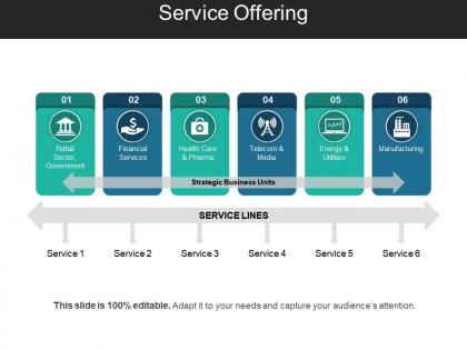
To improve your customer satisfaction levels all you need to work upon your service structure. Thus, use our service offering PPT slide design to improve your service levels. This service management PowerPoint template will work as a guideline to define your service model towards your potential investors. As if you have a profitable service structure than only it will help in enhancing your future growth or development rate. This service offering model PowerPoint slide template also allows you to take a step ahead over your competitors in the market. It also results in attracting more potential investors to invest in your business model. You can even describe the level of service for the price which needs to be receive for providing the given service with this customer service Presentation layout. Thus, it provides or adds more value to your customer base. Hence, start working over this professional PowerPoint slide diagram right now. Thus, click on the download link given below. Avoid folks going around aimlessly with our Service Offering Ppt Images Gallery. They believe in conservation of energy.
People who downloaded this PowerPoint presentation also viewed the following :
Service Offering Ppt Images Gallery with all 5 slides:
Our Service Offering Ppt Images Gallery encourage accurate deductions. The data displayed is completely factual.
FAQs for Service Offering
Honestly, what makes ours different is we actually think about presentation flow instead of just making things look nice. The layouts are smart - they adjust automatically when you dump in more content. Most companies don't bother with speaker notes or transition tips, but we include both. Oh, and the colors actually work on crappy projectors (trust me on this one). We throw in industry-specific icons and data templates that don't look like they're from different decades. Short version: you'll spend time on your actual message instead of wrestling with fonts and alignment. Start with the marketing deck - it's honestly our best template.
We break down templates by industry and build them from actual client feedback. Healthcare ones have HIPAA stuff built in, fintech focuses on all those regulatory headaches - you know how that goes. Each template comes loaded with the right terminology and standard processes for that sector. We work with industry experts to make sure everything actually reflects how these businesses run day-to-day, not just theoretical nonsense. Plus you can still tweak things if your situation's different from the norm. It's honestly pretty flexible once you get the base framework down.
So first, I dig into your brand stuff and current materials to get what you're going for visually. The brainstorming part is honestly my favorite - I'll sketch out maybe 2-3 different concepts based on what content you need. After that, wireframes come next (whatever software you prefer). Focus is on making sure everything flows well and is actually readable. Once you're happy with the structure, that's when I add your colors, fonts, all that good stuff to finish the templates. Usually takes about 5-7 days depending on how complex things get. Oh, and definitely have your brand assets ready from the start - saves us both time later.
Oh totally! The templates are way more flexible than they look. Colors, fonts, layout stuff - you can swap basically everything out. Some are easier to mess with than others though. Like the basic ones? Super customizable. The fancier structured ones still let you change content and styling, just not as dramatically. Honestly the drag-and-drop thing makes it pretty straightforward once you get the hang of it. My advice would be pick something close to what you're going for first, then just start tweaking. Way easier than trying to completely gut a template from scratch.
Honestly, we just bake it into everything we do. Surveys after big releases, user interviews every few weeks, plus our support team tracks complaint patterns - that stuff is pure gold for finding what actually sucks. Beta programs with our power users help too before we ship anything major. But here's the thing most people mess up: you've got to circle back and tell users when their feedback actually changed something. Otherwise they'll just stop bothering. Start with one feedback method you can actually handle before going crazy with ten different channels you can't keep up with.
So there's actually a bunch of stuff to help you get started. The dashboard has this whole video tutorial series - covers layouts, colors, all that basic stuff. Honestly, I'd just start with their template library though. Way easier to customize something that already looks decent than starting from scratch. They do live Q&A sessions twice a week if you get stuck, and the community forum is surprisingly helpful. Oh, and there's a step-by-step guide for your first project. Templates first to build some confidence, then hit the tutorials when you're feeling more comfortable with everything.
Dude, we bake accessibility straight into every template from day one. High contrast colors, readable fonts, proper headings - all that stuff is already there. Alt text placeholders too. Your content automatically hits WCAG standards, which is honestly a lifesaver because retrofitting accessibility later is such a nightmare (trust me on this one). Keyboard navigation works out of the box, plus screen reader compatibility. Oh, and each template has this quick checklist you can run through before presenting - just in case you want to double-check everything. Follow the guidelines and you're set.
Honestly, graphics aren't just there to make things pretty - they're doing the heavy lifting in your templates. I place visual elements to guide people through the content flow, you know? Icons and color blocking create these clear zones so users know where to look first. Without good visuals, your template just becomes this confusing wall of text (learned that the hard way). The graphics work like anchors that organize everything hierarchically. Don't treat them as decoration - they're functional tools that make your templates actually usable. Polish comes after functionality, always.
Oh totally, we're always watching what's hot. Minimalist stuff is everywhere right now - clean white space, big bold fonts, the works. Data storytelling is huge too because honestly, most people's charts look like garbage. Mobile viewing is kinda changing everything since everyone's checking presentations on their phone now. Interactive elements are pretty popular, plus those modular layouts where you can just drag and drop sections around. Check our quarterly trend report - it'll show you what's actually working vs what's completely flopped.
So they do big updates every quarter, then smaller stuff like new templates monthly. Notifications show up in your dashboard but honestly they're pretty easy to miss - the alerts aren't great. Most updates actually come from user requests and seasonal stuff, which is cool. Q4 is always crazy busy since everyone's getting ready for next year. Oh, and definitely check your notification settings are on or you'll probably miss everything. The timing usually makes sense though - they're not just pushing random features.
Yeah, totally! This marketing agency boosted their proposal close rate by 40% using our strategic planning template - said it made their pitches way more organized. There's also this small business owner who swears our financial forecasting template saved her butt from a cash flow crisis months before it would've hit. Pretty cool stuff, honestly. I'd say browse the case studies on our site if you want more examples, though sometimes I think the best way is just jumping in with whatever template matches your project right now. Those success stories are what make this whole thing worth it.
Yeah, they work with PowerPoint, Google Slides, and Keynote - pretty much whatever you're already using. Just import them straight in, no weird formatting disasters or having to start over. The designs adapt to each platform automatically, so your animations won't break when you switch between your laptop and Google Drive sharing. Honestly, I'd grab whichever template pack matches what you use most - saves you from tweaking stuff later. Oh, and the transition effects actually work properly across platforms, which is kinda nice since that used to be hit or miss.
Honestly, it totally depends on who you're presenting to. Corporate stuff needs clean layouts and professional colors that match their brand - pretty straightforward. But educational presentations? That's where interactive elements really shine, plus visuals that actually help people remember things. Creative presentations are my favorite though - you get to go wild with bold designs and layouts that break all the rules. The trick is figuring out your audience first. Are they expecting formal boardroom vibes or something more relaxed? Just send over your content with some context about the situation, and we'll nail the right style.
So you need three key things: visual consistency, different layout options, and clear placeholders with helpful text. Keep fonts, colors, and spacing the same across everything - sounds boring but trust me, it works way better than fancy stuff. Make layouts for different content types (titles, bullet points, image slides, whatever). The whole point is letting people focus on their actual message instead of wrestling with design. Oh and definitely test it with coworkers first - they'll spot confusing parts you missed. You'll save everyone so much time once it's dialed in.
So here's the thing - online presentations need way bolder visuals since you can't gauge people's reactions. Think bigger fonts, high contrast colors, interactive stuff like polls. In-person slides can actually be more detailed because everyone can see your screen clearly (shocking, I know). Also, format your handouts differently. Online folks want PDFs they can download and save for later, but printed materials work better when you're all in the same room. Oh, and figure out your delivery method first - that'll determine which template style makes sense.
-
Great quality product.
-
Innovative and attractive designs.