


Supply chain management icons ppt images




Try Before you Buy Download Free Sample Product
 Impress Your
 Audience
 100%
100% Editable
 Save Hours
 of Time


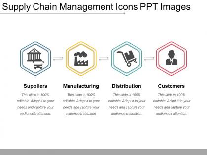
Inform folks about the journal with our Supply Chain Management Icons Ppt Images. Acquaint them with articles of interest.
People who downloaded this PowerPoint presentation also viewed the following :
Supply chain management icons ppt images with all 5 slides:
Our Supply Chain Management Icons Ppt Images deliver emphatically. They underline the strength of your conviction.

FAQs for Supply chain management
Keep your supply chain icons super simple - trucks for shipping, boxes for storage, arrows showing direction. I've made this mistake before but don't get fancy with the designs! People should instantly know what they're looking at without thinking about it. Stick with the same colors throughout your whole system. Also make sure they look good whether you're using them in a tiny dashboard widget or blown up in a presentation. Oh, and definitely test them with real users first - if they're confused, you'll know right away. Simple beats clever every time.
Dude, icons are a game changer for supply chain stuff. People get warehouse ops and shipping routes instantly instead of reading paragraph after paragraph. Honestly, those quarterly meetings are brutal enough without making people decode text walls. Icons work like a cheat code - everyone understands them, even if they're not supply chain people. My boss always zones out during presentations, but throw in some visuals and suddenly he's asking questions. Try swapping your bullet points for icons next time. Works way better than drowning people in industry speak they don't know.
Keep it simple and boring, honestly. Your icons need to work everywhere - different countries, tiny phone screens, massive dashboards. I'd stick with stuff everyone recognizes: boxes for inventory, trucks for shipping, arrows for flow. Don't get fancy with the design either. Same line thickness, consistent colors throughout the whole set. The creative part of me wants to say "make them unique!" but nah - when someone's rushing to find the warehouse icon, they want the obvious choice. Oh, and definitely test them with real people first. You'll be surprised what doesn't make sense to others.
Yeah, this stuff gets tricky fast. Colors are the biggest trap - red screams danger here but means good luck in China. Hand gestures or religious symbols? Total minefield in some places. Right-to-left reading cultures will process your workflow diagrams completely backwards too, which honestly never occurred to me until I saw it happen. We had this disaster last year where our icons made zero sense to the Middle East team. Now I just test everything with local people first, or play it super safe with basic arrows and shapes. Way less exciting but saves so much headache later.
Honestly, you'll see the same icons everywhere - trucks, warehouses, and those network node things that look like connected dots. Shipping boxes and forklifts are super common too. Designers love throwing globes on anything international (kinda overdone if you ask me). Conveyor belts, cargo ships, delivery vans - pretty standard stuff. Oh, and those circular arrows for returns or processes. My advice? Just stick with what people already know. Users shouldn't have to guess what your icons mean, so go with the obvious choices.
So basically icons are like universal translators for supply chain stuff. A truck means transportation, boxes equal inventory - you get the idea. Everyone understands them instantly, no matter if they're tech-savvy or not. Way better than drowning people in confusing text, honestly. Pick symbols that make sense from real life (warning triangles for problems work great). Start with whatever processes confuse people most and just swap out the wordy explanations. It's weird how much clearer things get with simple graphics instead of paragraphs nobody wants to read anyway.
Honestly, color schemes make a huge difference with supply chain icons. Your team will navigate way faster when they can instantly recognize what they're looking at. Pick consistent colors for similar stuff - green for approved, red for delays, that kind of thing. I usually go with blue for logistics and orange for warehousing, but whatever you choose, just stick with it. The worst thing is making people think harder than they need to. Map out your main categories first, assign each one a color, then use that same system everywhere. Oh, and don't overthink the specific colors - consistency beats perfection every time.
Honestly, the whole supply chain icon game has gotten way more interesting lately. AI tools can whip up custom icons that actually fit your specific processes instead of using those generic warehouse cliparts everyone's sick of. You can make them interactive too - people click through different stages which keeps them awake during presentations. There's even analytics now showing which icons work best (though who has time to dive deep into icon metrics, right?). The coolest part? Icons that change colors based on real-time data from your actual supply chain. I'd mess around with Figma or Canva's AI stuff first - way easier than starting from scratch.
Honestly, icons are a game changer for training. People zone out hard when you throw text walls at them - I've seen it happen in way too many supply chain meetings. Visual learners especially need those little truck symbols and warehouse graphics to actually get what you're explaining. It's wild how much faster someone processes a simple icon versus reading "transportation management" for the hundredth time. Your trainees will remember inventory flows and vendor stuff way better. I'd swap out like a third of those text-heavy slides with visuals. Trust me, you'll see the difference.
Just swap out the industry stuff while keeping the basic flow concept. Manufacturing? Throw in factories, conveyor belts, that heavy equipment look. Retail's more about shopping carts and storefronts - way different vibe. Keep your visual style consistent though - same line thickness, colors, all that. Honestly, the coolest ones I've seen just change like one element. Someone switched a warehouse icon to a distribution center and it totally worked. First figure out your 5-6 main supply chain steps, then design around those. Way easier than trying to reinvent everything from scratch.
Definitely go with vector tools since they stay sharp when you resize. Illustrator's probably your best bet - super precise and professional looking results. Figma's really solid too, especially if you're working with other people since you can all edit at once. Way cheaper than Adobe subscription madness. I've actually seen some pretty decent stuff made in Canva, though you're kinda limited with what you can do. Inkscape's free and works well if budget's tight. Oh, and whatever you use, make sure you can save as SVG files - trust me on that one.
So basically, icons work like visual breadcrumbs for your supply chain story. Map out your main steps first, then pick specific icons for each - warehouses for storage, trucks for shipping, factories for production, whatever. People can follow along way easier than if you just dump paragraphs on them. I actually think this is where most presentations totally bomb - they go text-heavy when simple visuals would do the trick. Just stay consistent with your icon choices across slides. Otherwise people get confused about what means what. It's like giving them a visual cheat sheet for your whole process.
Don't use vague icons that could mean anything - like slapping a generic truck on "logistics" when you really mean last-mile delivery. Your audience will get confused if everything looks too similar or abstract. I made this mistake once in a client presentation and it was awkward. Keep your sizing and colors consistent throughout the whole thing. Mix different icon styles and it'll look like a mess. Oh, and definitely test your icons on someone who didn't help create them - they'll tell you real quick if your "supply chain optimization" icon actually looks like a random puzzle piece.
Honestly, user feedback is everything when it comes to supply chain icons. Test them with real people first - just show someone the icon and ask what they think it means. The results will probably surprise you. I've watched so many "brilliant" designer icons totally bomb because users had no clue what they represented. Get feedback super early, even from coworkers in the hallway. Short usability tests work great too. Watch for any hesitation or confused looks - that's your cue to redesign. Don't wait until you've rolled everything out company-wide to discover your icons are confusing everyone.
Yeah, everyone's moving away from those confusing industry symbols toward icons that actually make sense. Simple truck shapes instead of weird logistics graphics, you know? The animated ones are pretty slick too - way better than staring at boring static images all day. Minimalist stuff works better across different cultures and devices anyway. Oh, and literally every company is throwing in sustainability icons now to look eco-friendly. Honestly, you should probably check if your current icons would confuse someone who doesn't work there. Most do.
-
Unique research projects to present in meeting.
-
Excellent work done on template design and graphics.