

Three labels reb blue green with tabs and their explanation ppt slides diagrams templates powerpoint info graphics




Try Before you Buy Download Free Sample Product
 Impress Your
 Audience
 100%
100% Editable
 Save Hours
 of Time


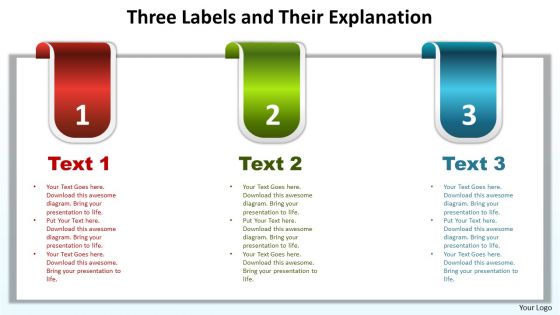
Enhance collective competency with our three labels red, blue, green with tabs and their explanation PPT slides diagrams templates PowerPoint infographics. This diligently prepared collection of relevant icons will be very certain to make you understand the fundamentals of well-to-do business. The concept of customer service and labels explanation has been defined in this icon template diagram. Use this icon template for business key points related presentations. Our planners have used spelling colors to keep the observer retained throughout the presentation. The idea of direction, business growth, teamwork and customer service can be glued in this excellent PowerPoint slide. You can edit the text section to write your resolutions on the process. This is a very simple design created for the purpose of expressing your ideas through minimal design. So just entice this excellent PowerPoint slide and make your business presentations a brilliant one. Advertise your ideas with our three labels reb blue green with tabs and their explanation ppt slides diagrams templates powerpoint info graphics. Your products will do brisk business.
People who downloaded this PowerPoint presentation also viewed the following :
Three labels reb blue green with tabs and their explanation ppt slides diagrams templates powerpoint info graphics with all 4 slides:
Any time you need high quality design we're here for you. Our three labels reb blue green with tabs and their explanation ppt slides diagrams templates powerpoint info graphics are waiting to make your next presentation stellar.

FAQs for Three labels reb blue green with tabs and their explanation ppt slides diagrams templates
Blue and green tabs in presentation design primarily serve to organize content hierarchically, create visual navigation systems, establish color-coded categorization, improve information flow, and enhance audience comprehension through consistent visual cues. These design elements streamline complex data presentation by enabling quick section identification, reducing cognitive load, and delivering professional visual structure, with many organizations finding that strategic tab implementation significantly improves presentation clarity and audience engagement.
Blue and green tabs enhance user experience by creating intuitive navigation pathways, reducing cognitive load through color-coded organization, and establishing clear visual hierarchies that guide audience attention seamlessly. These design elements streamline information processing, minimize confusion during complex presentations, and ultimately deliver more engaging, professional experiences that keep audiences focused and improve comprehension rates across diverse business contexts.
Blue and green create psychological responses that enhance trust, credibility, and emotional balance in audiences, with blue conveying reliability, professionalism, and stability while green represents growth, harmony, and innovation. These color combinations are particularly effective in corporate presentations, financial services, and healthcare sectors, where organizations find that strategic color usage significantly improves audience engagement and message retention.
Blue green tabs improve information hierarchy by creating clear visual separation, establishing logical content flow, and enabling intuitive navigation through complex material. These color-coded elements help audiences quickly identify different sections, prioritize key information, and follow presentation structure seamlessly, with many presenters finding that strategic tab placement reduces cognitive load while enhancing audience engagement and comprehension.
Common design mistakes with blue and green tabs include insufficient contrast ratios, using colors without considering colorblind accessibility, overcrowding tabs with excessive text, and failing to maintain consistent hover states. These issues can confuse users and reduce navigation effectiveness, with many organizations finding that proper spacing, clear typography, and accessibility testing ultimately deliver better user experiences and higher engagement rates.
Blue green tabs integrate effectively into presentation software through customizable template systems, drag-and-drop functionality, and universal formatting compatibility across platforms like PowerPoint, Keynote, and Google Slides. These design elements streamline content organization by enabling consistent visual hierarchy, enhancing audience navigation through complex information, and delivering professional aesthetics, with many organizations finding that standardized tab systems significantly reduce preparation time while improving presenter confidence and audience engagement.
Blue green tabs offer corporate presentations enhanced visual hierarchy, improved audience navigation, professional aesthetic appeal, and streamlined information organization across complex business content. These design elements prove particularly valuable in financial services, consulting, and technology sectors, where presenters must guide stakeholders through multi-layered data and strategic frameworks, ultimately delivering clearer communication and more persuasive business cases.
Blue green tabs enhance educational presentations by organizing complex information, creating visual hierarchy, improving navigation flow, and enabling seamless topic transitions. Educational institutions find these tabs particularly effective for course modules, curriculum overviews, and multi-section lectures, as they help students follow structured content while maintaining engagement, ultimately delivering clearer learning pathways and improved information retention.
Blue tabs evoke trust, professionalism, and reliability, making them highly effective for financial services, healthcare, and corporate communications, while green tabs suggest growth, sustainability, and progress. These cultural associations significantly impact user engagement and brand perception, with many organizations finding that blue enhances credibility in conservative industries, while green drives action in environmentally-conscious sectors, ultimately delivering stronger user connection and conversion rates.
Blue green tabs influence audience engagement by creating visual hierarchy, reducing cognitive load, and enabling intuitive navigation through complex information sets. These design elements streamline content consumption by organizing data into digestible segments, guiding viewer attention systematically, and minimizing information overwhelm, with many presenters finding that strategic color coding ultimately delivers higher retention rates and more focused audience participation.
Case studies showcasing successful blue-green tabs include McKinsey's client strategy presentations using color-coded project phases, Deloitte's organizational restructuring decks with departmental divisions, and IBM's product roadmap presentations featuring timeline segments. These implementations streamline complex information by enhancing visual hierarchy, reducing cognitive load, and enabling audiences to navigate multi-layered content more effectively, ultimately delivering clearer communication and faster decision-making processes.
Select complementary colors by using warm tones like coral, orange, or gold that naturally balance blue and green's coolness, while incorporating neutral anchors such as white, cream, or soft gray. Strategic color pairing enhances visual hierarchy and user navigation, with many design teams finding that limiting palettes to 3-4 coordinated colors ultimately delivers stronger brand consistency and improved user experience.
Best practices for blue green tabs include maintaining consistent color coding, using clear descriptive labels, organizing content logically by priority or category, ensuring adequate contrast for accessibility, and limiting tab quantities to prevent cognitive overload. These organizational strategies streamline user navigation by reducing decision fatigue, enhancing visual hierarchy, and enabling faster content discovery, with many digital platforms finding that strategic tab design ultimately delivers improved user engagement and operational efficiency.
Blue green tabs facilitate storytelling in presentations by creating clear narrative sections, establishing visual continuity between story segments, and providing intuitive navigation pathways that guide audiences through your storyline. These structured elements enable presenters to build compelling narratives with distinct chapters, seamless transitions between plot points, and memorable visual anchors, ultimately delivering more engaging presentations that maintain audience attention while enhancing message retention and comprehension.
Accessibility ensures blue and green tabs remain distinguishable for users with color vision deficiencies, requiring sufficient contrast ratios, clear typography, and alternative visual cues like icons or borders. These design considerations enhance usability across diverse audiences, with many organizations finding that accessible tab designs improve overall user engagement while meeting compliance standards, ultimately delivering inclusive experiences and broader market reach.
-
Unique design & color.
-
Awesome use of colors and designs in product templates.