


Timeline For Social Media Strategy Management




Try Before you Buy Download Free Sample Product
 Impress Your
 Audience
 100%
100% Editable
 Save Hours
 of Time


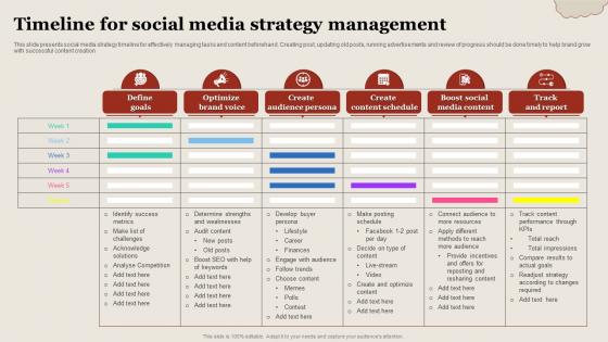
This slide presents social media strategy timeline for effectively managing tasks and content beforehand. Creating post, updating old posts, running advertisements and review of progress should be done timely to help brand grow with successful content creation.
People who downloaded this PowerPoint presentation also viewed the following :
Timeline For Social Media Strategy Management with all 6 slides:
Use our Timeline For Social Media Strategy Management to effectively help you save your valuable time. They are readymade to fit into any presentation structure.





FAQs for Timeline For Social
Start with the big milestones first, then add details underneath. Dates need to be readable - seriously, I've seen timelines where the text is microscopic. Space everything evenly and maybe color-code different phases if that helps. Your text should be short but clear enough that someone gets it without your constant explanation. Oh, and definitely mark where you are now on the timeline. People always forget that part. The whole thing should flow like a story, not just random events thrown together. Consistent formatting makes a huge difference too.
Honestly, timelines are perfect for this stuff because our brains just *get* chronological order - it's how we naturally think. You can break down complicated events into smaller chunks that don't overwhelm people. Shows cause-and-effect really clearly too. Way better than paragraphs of dense text that nobody wants to read anyway (let's be real). Pick your most important events first, then fill in around those. Use colors or icons to group similar things together - keeps it from looking chaotic. The trick is being picky about what you include. Don't try to cram everything in there.
Horizontal layouts work way better than vertical ones - trust me on this. Space everything evenly and pick one visual style, then stick with it. Contrasting colors are great for highlighting big milestones, just don't go crazy with animations that'll distract people. Your text needs to be huge since someone's gonna be sitting in the back row squinting. Oh, and here's what saved me last time: step back from your screen when you're done. If you can't quickly spot the main dates and events, nobody else will either.
Honestly, interactive timelines are such a game changer compared to the boring static ones. People can actually click around, watch embedded videos, filter by topics they want - way better than just scrolling and reading. Your audience stays engaged longer because they're exploring instead of zoning out. Plus you can see exactly what people click on most through analytics, which is pretty cool. I'd say try adding just one interactive feature first and watch how much more time people spend on your timeline. The difference is honestly night and day.
TimelineJS is honestly your best bet - free and works with Google Sheets so you don't have to learn anything crazy. Tiki-Toki's pretty cool too if you want fancy visuals, though it takes some getting used to. For overlapping events, Preceden's solid. I've seen people go nuts with PowerPoint animations but... why torture yourself? Oh, and start with the free option obviously. You can always upgrade later if TimelineJS doesn't cut it.
Honestly, timelines are like giving people a story they can actually follow. Your brain loves chronological stuff - it just clicks. Break down complex info into chunks and suddenly everything makes sense. Plus there's this natural suspense that builds as you move through events. People stay way more engaged when they can see how A led to B led to C. I always tell people to start with something like "Here's how we got here..." because it immediately pulls them in. It's basically creating a roadmap that doesn't make their eyes glaze over.
Oh man, don't cram every tiny detail in there - it'll look like a hot mess. Unrealistic deadlines are project killers too. I've watched so many teams crash and burn because of this. Your milestones need to be super specific, not wishy-washy stuff like "research done." Buffer time is clutch since weird stuff always pops up. Actually update the thing regularly though - outdated timelines are basically useless. Start with your big milestones and work backwards from there.
Honestly, just pick whatever matches your content and audience. Simple horizontal timelines work great for basic project overviews. Got something complex with tons of details? Gantt charts or vertical layouts handle that mess way better. Interactive ones seem cool but let's be real - most people won't bother clicking through them. Figure out if you actually need specific dates or if showing the sequence is enough. Also, definitely test it with someone else first. I've learned the hard way that what seems obvious to me can be totally confusing to others. The format should make your info easier to digest, not harder.
So for history stuff, go with chronological timelines - just straight linear layouts showing dates and what happened when. Project planning? Totally different beast. Gantt charts work better there, or milestone timelines that track deadlines and who's doing what. The whole point changes, you know? Historical ones tell stories about the past. Project ones are more about keeping everyone on track and hitting deadlines. I've definitely seen people try to use historical-style timelines for project management and... yeah, that was messy. Just think: are you explaining what already happened or what still needs to get done?
Hey! So color choices can totally make or break your timeline - seriously. Don't use light gray text on white backgrounds because people will just give up trying to read it. High contrast works, but maybe skip the neon colors unless you want to blind everyone lol. Pick consistent colors for similar events so people can scan through easily. Like, all your milestone dates could be blue or whatever. Oh and definitely test it with someone who's colorblind - I learned this the hard way on a project last year. You don't want to accidentally exclude people from understanding your timeline.
Honestly, typography can make or break your timeline. Different font sizes help people figure out what's important - like making dates bigger than descriptions or whatever. I've seen way too many timelines that are just blocks of identical text and they're impossible to follow. Give everything some breathing room with consistent spacing. Maybe use a clean font for work stuff, something fancier if it's creative. Oh and contrasting fonts work great for separating different info types. Just pick your font system first before you start dumping content in there.
Honestly, icons are a game-changer for timelines - use them to show different event types. Color coding helps too, like keeping similar themes the same color. Mix up your text sizes so people know what matters most. Don't cram everything together though, whitespace is your friend here. Connecting lines work great, or throw in progress bars if you're showing data changes. Oh, and small charts can be clutch for data over time. Just make sure you're not adding random stuff that looks cool but serves no purpose. I'd start simple with one visual element, then build it up from there.
Progressive reveal works amazing - just have events pop up one by one while you're talking. Or start zoomed way out on the whole timeline, then dive into specific chunks. I've been totally hooked on this sliding spotlight thing lately where you highlight different periods with a moving overlay. Honestly, it's such a clean look. You could get creative too - make your timeline flow like a river or grow like tree branches if that matches your topic. Just make sure the animation speed matches how fast you're narrating, and use those builds to control what info hits when.
Honestly, timelines are like a sanity check for your whole project. You take those massive, overwhelming goals and chop them into actual tasks with real deadlines. Super helpful for figuring out what's doable vs what's total fantasy. Your stakeholders will love having clear dates instead of vague "soon" promises. Visual milestones keep everyone pumped and help you catch problems early - before they completely wreck your schedule. I always work backwards from the final deadline, then add extra time because something always goes sideways. Trust me on that buffer thing.
Timelines are clutch when you need to show stuff happening in order - project milestones, how products evolved, historical events, that kind of thing. They're way better than bullet points when you've got overlapping activities or need to show how one thing led to another. Use them when your audience cares about "what happened when" not just "what happened." Honestly, I've seen people try to explain complex sequences in presentations and it's painful without a visual timeline. Start with your key events, then layer in the timing and connections between them. Works great for user journeys too.
-
“I always have a wonderful experience with SlideTeam. It's my ""go to"" when I need a template.”
-
I am a big fan of their newsletters because that is how I found my perfect requirement at the time of urgency. Thank God, I kept opening those.