

Timeline graphs powerpoint presentation slides




Try Before you Buy Download Free Sample Product
 Impress Your
 Audience
 100%
100% Editable
 Save Hours
 of Time


Get down to brass tacks with our Timeline Graphs Powerpoint Presentation Slides. Embed the basics in the minds of your team.
People who downloaded this PowerPoint presentation also viewed the following :
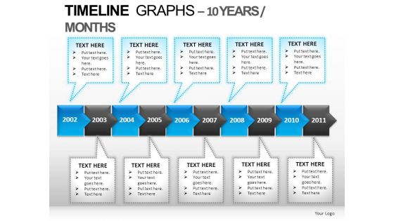
Timeline graphs powerpoint presentation slides with all 27 slides:
Finish planning your presentation and get back to your life. Our Timeline Graphs Powerpoint Presentation Slides help you wrap things up fast.
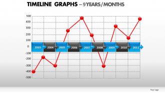
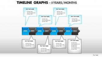
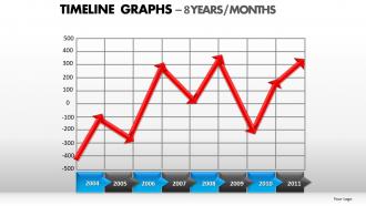
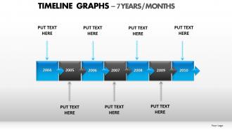
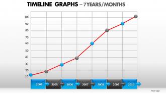
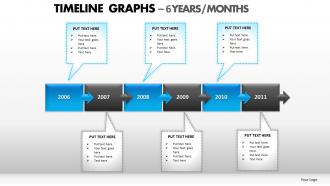
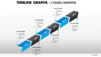
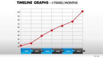

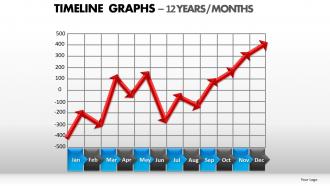
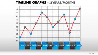
FAQs for Timeline graphs
Effective timeline graphs include clear chronological markers, consistent visual hierarchy, strategic color coding, concise milestone descriptions, and logical spacing between events. These elements work together by enhancing audience comprehension, maintaining visual flow, and highlighting critical developments, with many organizations finding that well-designed timelines significantly improve project updates and strategic communications.
Timeline graphs enhance storytelling by creating visual narrative structure, establishing chronological flow, highlighting key milestones, and enabling audience engagement through progressive revelation. These visual tools transform complex sequences into compelling stories, with presenters in education, corporate training, and project management finding that timeline-driven narratives increase comprehension, retention, and emotional connection while delivering more impactful messaging.
Best practices for timeline graph colors and fonts include using high-contrast color schemes, maintaining consistent font hierarchies, selecting colorblind-friendly palettes, limiting colors to 3-5 maximum, and choosing readable sans-serif fonts. These design principles enhance data comprehension by ensuring visual clarity, reducing cognitive load, and improving accessibility across diverse audiences, ultimately delivering more effective communication and better stakeholder engagement in presentations.
Horizontal timeline graphs are more effective when displaying extended timeframes, accommodating lengthy event descriptions, or presenting data on wide screens and presentations. They work particularly well for project management timelines, historical narratives, and business roadmaps where readers naturally scan left-to-right, with many organizations finding that horizontal layouts deliver better readability and enhanced audience engagement during strategic planning sessions.
Dataset complexity significantly impacts timeline graph design through data volume considerations, temporal granularity choices, overlapping event management, and visual hierarchy decisions. Complex datasets with multiple variables, irregular intervals, or dense information require strategic simplification, selective filtering, and layered visualization approaches, with many organizations finding that thoughtful design prioritization ultimately enhances user comprehension and analytical effectiveness.
Professional timeline graph creation is enhanced by tools like Visio, Lucidchart, Canva, PowerPoint, and specialized software such as Timeline Maker Pro and Preceden. These platforms streamline project visualization by offering customizable templates, collaborative features, and export options, with many organizations finding that integrated solutions like Microsoft Project or Google Workspace ultimately deliver seamless workflow management and enhanced stakeholder communication.
Common mistakes include overcrowding timelines with excessive detail, using inconsistent formatting across dates and milestones, poor color choices that reduce readability, and failing to maintain proportional spacing between time periods. These design flaws can confuse audiences and diminish message clarity, with many presenters finding that streamlined timelines with strategic visual hierarchy enhance comprehension and engagement significantly.
**INPUT**: How do you effectively integrate images and icons into a timeline graph? **OUTPUT**: Effective image and icon integration involves using visual elements that directly relate to each timeline milestone, maintaining consistent sizing and spacing throughout the graph, and selecting high-quality graphics that enhance rather than clutter the narrative. Strategic placement alongside clear labels creates intuitive visual flow, with many organizations finding that relevant imagery significantly improves audience engagement and information retention.
Timeline graphs can effectively support non-linear storytelling through branching paths, interactive nodes, multiple parallel tracks, and clickable decision points that allow audiences to explore different narrative sequences. Creative applications in gaming, educational content, and interactive presentations enable viewers to jump between story elements, explore alternative outcomes, and construct personalized narrative experiences, ultimately delivering more engaging and memorable storytelling.
Animated timeline graphs offer enhanced storytelling capabilities, improved audience engagement, better progression visualization, and dynamic data revelation compared to static versions. These interactive presentations enable viewers to follow complex sequences more intuitively, retain information longer, and understand cause-and-effect relationships, with many organizations finding that animated timelines significantly improve comprehension rates and stakeholder buy-in.
Timeline graphs can be optimized for mobile presentations through vertical layouts, simplified data points, touch-friendly navigation, responsive design, and progressive disclosure techniques. These approaches streamline complex information by prioritizing key milestones, enabling swipe gestures for navigation, and automatically adjusting font sizes, with many presenters finding that mobile-optimized timelines enhance audience engagement and comprehension significantly.
Timeline graphs excel at illustrating political milestones, economic cycles, technological innovations, population changes, and corporate growth trajectories. These visualizations effectively showcase electoral histories, stock market fluctuations, product launch sequences, demographic shifts, and business expansion phases, with many organizations finding that timeline graphs streamline complex chronological data into compelling narratives that enhance strategic decision-making and stakeholder presentations.
Cultural differences significantly affect timeline graph interpretation through varying time orientations, reading patterns, color associations, and symbolic meanings. While Western cultures typically emphasize linear progression and left-to-right reading, many Eastern cultures prioritize cyclical time concepts and different directional flows, with organizations increasingly adapting their visual communication strategies to accommodate diverse cultural perspectives and ensure effective global data presentation.
Timeline graphs serve as visual project roadmaps, displaying task sequences, dependencies, milestones, and resource allocation across defined periods. These tools streamline project coordination by enabling teams to identify bottlenecks, track progress against deadlines, and adjust schedules proactively, with many organizations finding that visual timelines enhance communication between stakeholders and ultimately deliver improved project outcomes.
Interactive timeline graphs improve audience engagement by allowing viewers to explore data at their own pace, zoom into specific periods, and discover insights through direct manipulation. These dynamic visualizations transform passive presentations into collaborative experiences, with many organizations finding that audiences retain 40% more information when actively participating, ultimately delivering stronger message comprehension and more productive discussions.
-
Appreciate the research and its presentable format.
-
Informative presentations that are easily editable.