


Usa hawaii state powerpoint maps




Try Before you Buy Download Free Sample Product
 Impress Your
 Audience
 100%
100% Editable
 Save Hours
 of Time


Sweeten the pill with our USA Hawaii State Powerpoint Maps. Tell them how to remove the ills.
People who downloaded this PowerPoint presentation also viewed the following :
Content of this Powerpoint Presentation
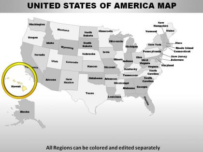
Slide 1: This slide shows Map of UNITED STATES OF AMERICA with all 50 states and the federal district, highlighting Hawaii.
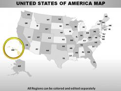
Slide 2: This is another map of UNITED STATES OF AMERICA with short form of states names.
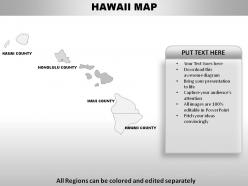
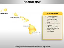
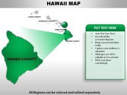
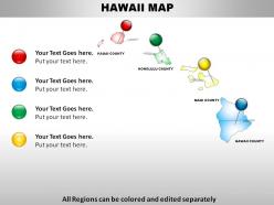
Slide 3: This slide presents HAWAII MAP displaying- HAWAII COUNTY, MAUI COUNTY, HONOLULU COUNTY, KAUAI COUNTY.
Slide 4: This is another slide of HAWAII MAP with- HAWAII COUNTY, MAUI COUNTY, HONOLULU COUNTY, KAUAI COUNTY.
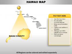
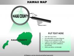
Slide 5: This slide represents HAWAII MAP highlighting KAUAI COUNTY.
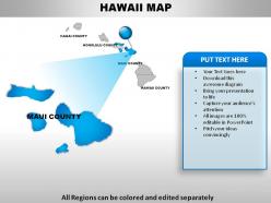
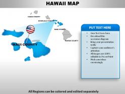
Slide 6: This slide shows HAWAII MAP highlighting MAUI COUNTY.
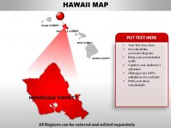
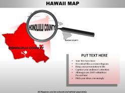
Slide 7: This slide presents HAWAII MAP highlighting HONOLULU COUNTY.
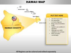
Slide 8: This slide represents HAWAII MAP highlighting HAWAII COUNTY.
Slide 9: This slide showcases HAWAII MAP with islands and additional text boxes to elaborate information.
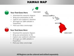
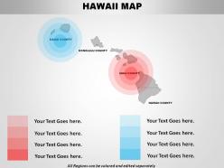
Slide 10: This slide presents HAWAII MAP highlighting HAWAII COUNTY and KAUAI COUNTY with additional text boxes to show information.
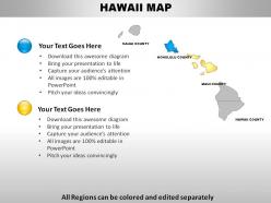
Slide 11: This slide represents HAWAII MAP highlighting MAUI COUNTY and HONOLULU COUNTY with additional text boxes to show information.
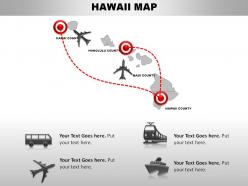
Slide 12: This slide displays HAWAII MAP with modes of transportation to travel across various islands.
Slide 13: This slide shows HAWAII MAP with zone areas and text boxes to elaborate.
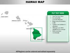
Slide 14: This slide presents HAWAII MAP highlighting HAWAII COUNTY with colour green along with text boxes to show information.
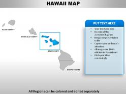
Slide 15: This slide represents HAWAII MAP highlighting MAUI COUNTY with colour blue along with text boxes to show information.
Slide 16: This slide shows HAWAII MAP highlighting KAUAI COUNTY with colour green along with text boxes to show information.
Slide 17: This slide presents HAWAII MAP hightlighting HONOLULU COUNTY with colour red along with text boxes to show information.
Slide 18: This slide represents HAWAII MAP with HAWAII COUNTY in highlight.
Slide 19: This slide shows HAWAII MAP with MAUI COUNTY in highlight.
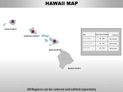
Slide 20: This slide presents HAWAII MAP with city, Sales Representative and contact number.
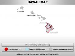
Slide 21: This slide HAWAII MAP with distributors. You can change it as per requirements.
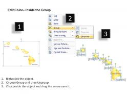
Slide 22: This slide shows how to edit or change the colours of maps.
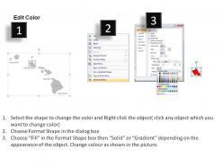
Slide 23: This is another slide that shows how to edit or change the colours of maps.
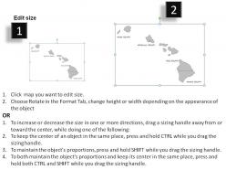
Slide 24: This slide shows how to Edit size or change size of the maps.
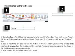
Slide 25: This slide shows how to Insert names using text boxes.
Usa hawaii state powerpoint maps with all 25 slides:
Dedicate yourself to the cause. Confirm you commitment with our USA Hawaii State Powerpoint Maps.
FAQs for Usa hawaii
Go for vector graphics you can actually edit - trust me on this one. You'll definitely want to change colors and highlight certain islands. Make sure it has all the main ones (Oahu, Maui, Big Island, etc.) with labels you can tweak. Some templates look amazing but turn out to be just static images which is annoying as hell. Check it works with your PowerPoint version. The good ones have multiple layouts - full island chain plus individual island views. Also look for city markers and proper slide sizing so you're not wrestling with dimensions later.
Dude, those Hawaii PowerPoint maps are actually perfect for this! You can literally click on Maui and boom - volcano stats pop up. Way better than boring bullet points, trust me. Start with the full island overview, then zoom into whatever you're talking about. Your audience can follow the geography instead of getting lost in random facts. Like when you highlight Pearl Harbor's exact spot? People actually get it. Makes you look super prepared too. The whole spatial thing really helps them remember stuff better - I've seen it work so many times.
Choropleth maps are your best bet for Hawaii - perfect for showing stuff like population density or tourism revenue across different islands. Heat maps work really well too, especially for visitor hotspots or weather data. The tricky part? Those islands are so spread out it's annoying sometimes. That's where proportional symbol maps save the day - just use different sized circles for each data point. Oh, and make sure your map projection actually shows all the islands at a decent scale. Nothing worse than squinting at tiny dots when you're trying to make a point!
Right-click any map element first - that's your gateway to all the formatting stuff. Change colors to match whatever vibe you're going for. Tourism presentation? Go with those bright tropical colors and drop hotel icons on the islands. Environmental thing works better with earth tones and data callouts for conservation zones. Honestly, the color choice makes way more difference than people think. You can mess with transparency levels too, add custom legends, throw in some text boxes with stats. Oh and layering data overlays is clutch if you've got multiple themes happening.
Oh totally, you'll want to check the licensing first. Professional templates from sites like SlideModel usually come with commercial rights built in. Free maps though? Those can be sketchy - some are personal use only or need attribution. I got burned once when our legal team caught a restricted image in a client deck. Not fun. The paid template sites generally have you covered for business stuff, but honestly the free ones are a gamble. Just save the license info with your files so you can prove you're good to go if anyone asks later.
Honestly, the worst thing you can do is use pixelated, low-res maps - they look terrible projected. Also don't cram everything onto one slide. I made the classic mistake once of putting light blue text over ocean areas... nobody could read a thing lol. Make your text big enough so people in back can actually see island names. Oh, and cite your sources if you didn't make the map yourself. Test everything on the actual projector first because colors always look different than on your laptop screen. Keep it clean and simple - that's really all you need.
Match your Hawaii map colors and fonts to whatever theme you're already using - consistency is everything. Position it smart too, like as a full background or tucked next to your main points. I swear, nothing's worse than a random map just floating there doing nothing! Make sure your text actually shows up against the background (learned that one the hard way). Use callouts or little icons to point out specific islands you're talking about. Think of the map as part of your story, not just pretty filler. Oh, and group your data points near where they actually happen geographically - makes way more sense that way.
Just use PowerPoint honestly - you can ungroup the map pieces and mess with colors, text, whatever. Works great for basic stuff. If you need fancy vector editing, Illustrator's amazing but kinda overkill unless you're doing complex design work. Canva's a nice middle ground too. I always tell people to try PowerPoint first though. Most Hawaii map tweaks are just changing island colors or dropping in some pins, and PowerPoint handles like 90% of that stuff no problem. Why make it harder than it needs to be, you know?
Stick with official stuff like US Census Bureau or Hawaii's GIS Program - they actually update their data regularly. Hawaii's districts change way more often than you'd expect, which is honestly annoying when you're trying to map things. Always cross-check population numbers with the latest census data. For economic or tourism stats, go straight to Hawaii's Department of Business Development. Random online maps are garbage most of the time. Your audience will totally call you out if Honolulu County looks weird or you're still using 2010 population data.
Okay so first thing - show the whole island chain, then zoom into specifics. Hawaii's weirdly spread out (I always forget how far apart those islands actually are lol). Use contrasting colors since the islands look tiny on most screens. Build up your info in layers - big picture first, then add cities or whatever data you're working with. Make your text huge so people in back can actually see it. Callout boxes work great for key stats. Don't go crazy with colors - 3 or 4 max. And definitely add a simple legend or your audience will be totally lost.
Try ocean blues and sunset oranges for your color scheme - those traditional Hawaiian palettes look amazing on maps. Instead of boring location markers, use hibiscus flowers or sea turtle icons. Honestly, those little touches make such a huge difference. Don't just mark beaches either - add cultural spots like heiaus, luau locations, or famous surf breaks. Oh, and use the original Hawaiian place names when you can instead of just English versions. Your audience will totally feel the island vibe while still getting the geographic info they need.
Dude, maps in PowerPoint are a game changer for Hawaii projects. Stakeholders can actually see which islands or communities you're hitting, instead of just hearing about it. Color-code your phases, mark where infrastructure goes, show environmental stuff - whatever. People don't tune out like they do with boring bullet points. Multi-island projects especially make way more sense when mapped out. I learned this the hard way after too many confused faces in meetings. Just throw in some callouts for key spots and watch how much better your presentations go.
Make your Hawaii maps interactive! Ask people which islands they've visited or want to explore - seriously, everyone has Hawaii opinions. Use their answers to guide where you go next in your presentation. Add some storytelling by highlighting specific spots while sharing cultural stuff or travel tips. Oh and don't dump everything on screen at once - try clickable hotspots or animations that reveal info bit by bit. I'd start with something like "Who's been to the Big Island?" You'll see people perk up immediately. Works every time.
Honestly, PowerPoint's got some decent interactive stuff built in. Hyperlinks and action buttons work great - just link different islands to separate slides with all the details. Trigger animations are cool too, they activate when people click specific spots. Oh, and the morph transition? Game changer for smooth island-to-island movement. Drop in clickable icons for hotels, attractions, whatever - they can reveal pop-up text or zoom views. Just test everything first though! Nothing's worse than clicking something during your presentation and... nothing happens. Super awkward.
Check out Hawaiian Airlines' route expansion presentations - they're honestly genius at this. They use island maps with data overlays that tell compelling growth stories. Marriott does something similar with color-coded property locations and occupancy rates. Way better than staring at boring spreadsheets, right? Local government infrastructure pitches also look so much more professional when they ditch bullet points for visual maps. The trick is being smart about layering data - don't just dump numbers everywhere. Study how these companies use color and visual hierarchy to guide where you look first.
-
Excellent template with unique design.
-
Excellent template with unique design.