

Vector indicating singapore city skyline powerpoint presentation ppt template




Try Before you Buy Download Free Sample Product
 Impress Your
 Audience
 100%
100% Editable
 Save Hours
 of Time


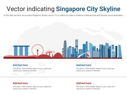
In this slide we have showcased Singapore Skyline vector. It is a island city-state in maritime southeast Asia and popular tourist destination.
People who downloaded this PowerPoint presentation also viewed the following :
Vector indicating singapore city skyline powerpoint presentation ppt template with all 2 slides:
Use our Vector Indicating Singapore City Skyline Powerpoint Presentation Ppt Template to effectively help you save your valuable time. They are readymade to fit into any presentation structure.
FAQs for Vector indicating singapore city skyline powerpoint
You'll usually see Marina Bay Sands with that crazy infinity pool, plus the Singapore Flyer and those spiky Esplanade theaters that look like durians. Most vectors throw in the financial district towers too. The Supertrees from Gardens by the Bay show up a lot now since they're so iconic - honestly those things are way cooler than I expected when I first saw them. Oh, and sometimes the Merlion's there, though it always looks kinda underwhelming as a tiny graphic compared to real life. Just check what's actually in your specific vector since artists pick different stuff depending on their style.
Vectors make Singapore's skyline look insanely crisp - all those perfect geometric lines really show off the modern architecture. Marina Bay Sands looks amazing in vector form. The best part? You can scale it to any size without losing quality, so it'll look sharp on anything from business cards to huge billboards. I love how you can play with bold colors and gradients too - makes the whole thing more dynamic. Honestly, it just captures that futuristic vibe Singapore has better than photos sometimes do. Perfect for that sleek, contemporary look.
Illustrator's probably your best choice here - the pen tool is amazing for building silhouettes once you get the hang of it. Affinity Designer works great too if you don't want to shell out for Adobe. Inkscape is free but honestly? The interface drives me crazy sometimes. You'll want something good with gradients since those Marina Bay Sands sunset shots are absolutely gorgeous. I'd start simple with basic shapes then add detail. Oh, and Singapore's skyline has so many unique buildings - way more interesting to draw than boring rectangles!
Mix up Singapore's architecture - throw in Raffles Hotel next to those crazy modern towers, plus the colorful shophouses (honestly my favorite part). Marina Bay Sands is obvious but works great. Hawker stalls add that authentic touch too. Play around with colors from different neighborhoods - Chinatown's reds and golds, Little India's bright everything. The cool thing about vectors is you won't lose quality when you're moving stuff around, so just keep experimenting with layouts until it feels right. Maybe start with one iconic building and build from there?
Dude, go with vector for sure. You can blow that skyline up to billboard size or shrink it down and it'll stay crisp - no pixelated mess like you get with regular images. The best part? You can tweak individual buildings later without redoing the whole thing. Trust me, your clients will love you for that flexibility. File sizes are tiny too, which is nice for websites. I learned this the hard way after spending hours on a raster skyline that looked terrible when they wanted it bigger. Vector just makes sense for this kind of work.
Dude, Marina Bay Sands is gonna be your main focal point no matter what – that infinity pool shape is just too iconic to mess with. I'd put it front and center since everyone recognizes it instantly. Those three towers make everything else look kinda plain honestly, so be picky about what other buildings you add. The Helix Bridge works great nearby, creates nice visual flow. Oh and the ArtScience Museum too – that lotus thing is pretty cool. Just don't overcrowd it with competing elements or you'll lose the impact. That tripod silhouette really carries the whole composition.
Okay so for Singapore's skyline, definitely go with blues and teals - that whole tropical harbor thing, you know? Deep navy bleeding into lighter blues works great for sky and water. Those glass buildings and Marina Bay Sands look amazing with cool metallics and whites. But honestly? The sunset option might be your best bet - warm oranges and pinks against those silhouetted buildings are chef's kiss. Don't sleep on Singapore's crazy green spaces either, could be a cool bold choice. I'd make a few mood boards first though - day, sunset, night versions so they can pick their vibe.
Try contrasting line weights - sharp, clean geometry for the modern towers, but give your traditional buildings more detailed linework with all those decorative touches. Singapore's skyline is actually perfect for this! Different color palettes work great too. Cool blues and grays for the contemporary stuff, then warmer earth tones for heritage buildings. The trick is keeping everything cohesive while letting each style speak its own language. Honestly, it's like watching different eras have a conversation in one drawing.
Definitely sketch the composition first - saves so much time later! Strong silhouettes are key, and layer your buildings front to back for depth. Keep it simple with maybe 3-4 colors max. I always want to cram in every detail but honestly? Less is more here. Focus on the iconic stuff like Marina Bay Sands and those CBD towers that scream Singapore. Your proportions don't need to be perfect, just balanced. Oh and resist going crazy with tiny details - they'll just muddy everything up in vector format anyway.
Dude, shadows and gradients totally transform vector skylines! Drop shadows make buildings pop instead of looking flat. Gradients are trickier though - keep them super subtle or you'll get that weird 90s vibe. For lighting, try warmer tones at sunset, cooler blues for night scenes. Singapore's skyline is perfect for dramatic long shadows from Marina Bay Sands. Actually, I'd start with basic drop shadows first since they're way easier to nail. Once you get comfortable with those, then mess around with gradients on building faces. Trust me, even simple shadows make a huge difference!
Vector illustrations are perfect for Singapore's skyline because the city is basically a planner's wet dream - everything's so geometrically precise. Show those traditional shophouses next to the massive skyscrapers, or how they've managed to squeeze green spaces everywhere. The clean vector style really captures that contrast between old and new. Layers work great here - you can separate different development phases or color-code districts. Honestly, clients eat up those evolution stories where you show decades of change. It's like urban planning porn but actually useful for presentations.
Honestly, the biggest issue is detail. Vector graphics are perfect for clean, geometric cityscapes but they fall apart when you need intricate stuff like architectural details or realistic textures. You're basically stuck with minimalist interpretations instead of complex facades with actual windows and weathering. Also, file sizes get crazy bloated if you add too many anchor points - trust me on that one. Vector just can't capture those organic imperfections that make cities feel real. For Singapore specifically? Focus on those iconic silhouettes and bold shapes. Don't try recreating every tiny building detail or you'll go insane.
Okay so for the green stuff - definitely throw some solar panels on those rooftops, especially the Supertrees at Gardens by the Bay since they're already iconic. Rooftop gardens scattered around would look awesome too. Marina Barrage is perfect if you want to show water sustainability, and honestly wind turbines could be cool even though Singapore doesn't really use many lol. I'd go with a subtle green color scheme throughout. Maybe add some vertical gardens creeping up the sides of buildings? Just don't go overboard - you still want Marina Bay Sands and the other landmarks to stand out. Start simple with like two elements first.
Honestly, symbol libraries are a game changer for stuff like windows and building details - keeps everything crisp without bloating your file. Also separate your foreground buildings from background elements on different layers. You'll thank me later when you need to tweak things. My Singapore skyline looked like garbage the first time because I ignored this advice lol. Stick to geometric shapes instead of crazy complex paths, and don't go overboard with anchor points. Oh, and test it at thumbnail size AND billboard size while you're working on it, not after you've already spent hours on the thing.
Dude, night scenes are game-changers for vector skylines! The dark sky makes lit buildings just pop out naturally - way better than daytime stuff. All those glowing windows? They're like little magnets for your eye, pulling you through the whole design. I always go with warm yellows for the building lights against cool blues in the sky - the contrast is chef's kiss. Oh, and if you add water reflections or some gradient action in the background, suddenly everything feels way more 3D. Honestly can't believe more people don't try this approach.
-
I discovered this website through a google search, the services matched my needs perfectly and the pricing was very reasonable. I was thrilled with the product and the customer service. I will definitely use their slides again for my presentations and recommend them to other colleagues.
-
Amazing product with appealing content and design.
-
Amazing product with appealing content and design.