Weekly business updates report with key results

Rating:
90%
Weekly business updates report with key results
Slide 1 of 2
Favourites Favourites

Try Before you Buy Download Free Sample Product

Audience Impress Your
Audience
Editable 100%
Editable
Time Save Hours
of Time
The Biggest Sale is ending soon in
0
0
:
0
0
:
0
0
Rating:
90%
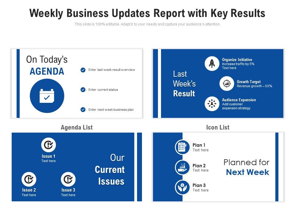
Introducing our Weekly Business Updates Report With Key Results set of slides. The topics discussed in these slides are Growth Target, Organize Initiative, Audience Expansion. This is an immediately available PowerPoint presentation that can be conveniently customized. Download it and convince your audience.

FAQs for Weekly business updates report

People are totally over boring slide presentations now. Add polls or Q&A breaks - honestly, anything that gets them participating. Keep it short though, like 20 minutes tops because attention spans are brutal these days. Storytelling with good visuals is where it's at, and throwing in video clips actually works pretty well. Oh, and ditch the formal presentation vibe - make it more like a conversation. For your next update, I'd go heavy on visuals, light on text. Maybe plan two interactive moments? Trust me, beats watching everyone scroll through their phones while you're talking. The whole thing just flows better when people can jump in.

Honestly, charts and graphs are game-changers for presentations. People absorb visual info way faster than endless spreadsheet numbers. Your audience will actually stay awake too - nobody wants to sit through someone reading data out loud. When you show quarterly results as a simple bar chart, people get it immediately and ask smarter questions. Builds way more credibility since they can see how you reached your conclusions. I'd start with basic charts in PowerPoint first (the fancy software can wait). Trust me, even simple visuals beat text walls every time.

Templates are honestly a lifesaver for brand consistency - same fonts, colors, layouts every time so your weekly updates don't look like a hot mess. I've seen presentations where someone went rogue with Comic Sans (why??). They save you from starting over each week too. Your stakeholders get used to seeing everything in familiar spots, which makes comparing week-to-week data so much easier. Plus nobody has to guess where to find stuff. Really though, consistent formatting just makes you look way more professional than teams who wing it every time.

Here's the thing - turn your whole presentation into one story. Start with a problem you guys actually faced, show how you worked through it, then hit them with the results. Way more memorable than boring bullet points, trust me. Instead of saying "conversion rates went up 20%," try something like "Mike finally closed that deal he'd been chasing for months." People eat that stuff up. The trick is making it feel like one connected journey, not just random examples thrown in. Oh, and map it out like beginning-middle-end before you even start. Works every time.

Honestly, less is more with these things. Pick 2-3 colors from your brand and call it a day - people get weird about clashing colors. I always use the same two fonts (one for headers, one for everything else) because switching fonts mid-presentation looks amateur. White space is your friend! Don't cram everything together like I used to do. Font size should be at least 24pt or bigger. Nobody wants to squint. Build yourself a master template with your logo and basic layouts, then just copy and paste each week. Takes like 5 minutes and you'll look way more professional. Trust me on this one.

Get a few people you trust to look at your templates, but ask them super specific stuff. Like "can you actually read this chart?" or "does section 2 flow into section 3?" I used to just say "what do you think?" and got back tons of worthless "looks great!" responses that made me want to scream. Write down what people tell you in a doc somewhere - you'll start seeing the same issues pop up. Then fix one thing at a time and see how your next presentation goes. It's honestly the fastest way to figure out what's actually working.

Honestly, PowerPoint or Google Slides are probably your best bet since everyone already knows how to use them. You can create master templates with your branding and set up placeholders for the stuff that repeats every week - metrics, project updates, whatever. Canva's decent too if you want something prettier, though some of their business templates look way too much like Instagram posts (which might not fly with your team). There are also tools like Pitch or Beautiful.AI that are specifically made for this kind of thing. I'd figure out what sections you need each week first, then build around that.

So basically, companies just figure out what their people actually want to hear about. Tech folks are obsessed with data and dashboards - they eat that stuff up. Retail's more about the visual stuff and customer stories. Healthcare has to be super formal because of all those regulations (honestly kind of boring but whatever). Manufacturing? They're all about safety numbers and how efficiently things are running. The trick is knowing if your audience wants the quick version or all the nitty-gritty details. Then you just match how they like to communicate. Pretty straightforward once you get their vibe.

Blues and greens make people feel calm and trustworthy - way better than reds which just stress everyone out (learned that one the hard way with an orange presentation disaster). For weekly updates, stick with cooler tones since they won't fight your data for attention. You'll want 2-3 colors tops, and honestly? Test everything in grayscale first. If it's readable then, you're golden. Make sure there's enough contrast too - remote people will thank you when they can actually see your charts. Oh, and avoid going crazy with bright colors unless you want weird feedback like I got!

Honestly, virtual meetings are brutal for presentations - everyone's squinting at tiny laptop screens. Bump up your font sizes way bigger than normal and use high contrast colors. Less text per slide too, trust me on this one. White space is your friend because cluttered slides look absolutely terrible on video calls. I always add slide numbers now so people can reference stuff later without the awkward "wait, go back to that slide with the chart..." thing. Oh, and those little takeaway boxes at the bottom? Game changer for important points. Test it on your phone first though - if you can read it there, you're golden.

Oh man, the worst thing you can do is cram a novel onto every slide. Seriously kills the vibe. Don't feel married to whatever colors or fonts came with the template either - make it actually look like YOUR brand, you know? And here's something people don't think about: using the exact same layout for a board meeting vs. a casual team update is just lazy. Templates should save you time, not make everything look cookie-cutter. Pick one that actually fits what you're trying to say, tweak the colors, and please don't make people squint to read tiny text. That's my biggest pet peeve honestly.

Honestly, colors are way trickier than people think - red screams "danger" to Americans but it's lucky in China. Super easy to mess that up. Research your audience first, obviously. Some cultures want tons of context and backstory, others just want you to cut to the chase immediately. Text direction matters too if you're going international. Oh, and hierarchy stuff - who gets introduced first, how formal you sound, all that. I'd definitely find someone from that background to give your presentation a quick once-over before you go live. Trust me, it's worth the extra step.

Dude, multimedia seriously saves boring presentations. People remember 65% of visual stuff after three days but only 10% of text - that's huge. Videos, charts, animations... anything beats walls of bullet points. I've noticed even simple changes work wonders. Your audience won't be scrolling Instagram if there's actually something worth watching. Honestly, we've all been tortured by those endless text slides before. Start with baby steps though - maybe swap one heavy slide for a quick chart or video clip. You'll see the difference immediately when people actually stay awake and engaged.

Honestly, the real test isn't during your presentation - it's what happens after. Did people actually do what you asked them to? Follow up within a day or two with specific questions, not just "thoughts?" During the actual talk, watch for the usual stuff: are they asking questions or scrolling Instagram? Questions are gold, phone-checking is... less ideal. I always set clear goals beforehand so I'm not just guessing if it worked. Like, did I get approval for the budget or just polite nods? The post-presentation emails tell you everything - crickets usually means you lost them somewhere.

Dude, presentations are getting wild these days. AI's doing half the design work now, which is honestly pretty cool. Everyone's expecting interactive stuff - like live polls right in your slides and content that changes based on who shows up. Mobile design matters more since half your audience is probably dialing in from their couch anyway. Static PowerPoints? Yeah, those are basically dead at this point. You're gonna need live data charts and stories that shift in real-time. Oh, and definitely mess around with Mentimeter or Figma before your boss springs some fancy quarterly review on you. Trust me on that one.

Ratings and Reviews

90% of 100
Review Form
Write a review
Most Relevant Reviews
  1. 80%

    by Drew Alvarado

    Informative presentations that are easily editable.
  2. 100%

    by Efrain Harper

    Easy to edit slides with easy to understand instructions.

2 Item(s)

per page: