

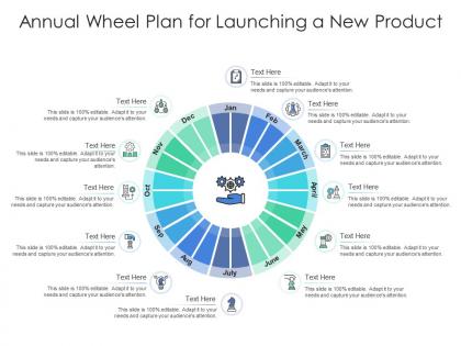
Annual wheel plan for launching a new product infographic template




Try Before you Buy Download Free Sample Product
 Impress Your
 Audience
 100%
100% Editable
 Save Hours
 of Time


Professionals belonging to any sector can use this set titled Annual Wheel Plan For Launching A New Product Infographic Template. From managers, executives to lower level employees, every individual can use this tool to present insightful details and implications in a well structured format. Various charts and graphs are added to this infographic design that makes it a resourceful set. Not only will this add to the informative qualities of this template, but it also makes it an instant attention grabber. Apart from this, it offers at a glance view of the topics, thus simplifying complex concepts. This helps in retaining the information presented for a long time. The biggest quality of this template is its visual elements, all added to elevate the aesthetic appeal of the presentation. Therefore download this template and present a customized version of it without any trouble.
People who downloaded this PowerPoint presentation also viewed the following :
Annual wheel plan for launching a new product infographic template with all 2 slides:
Use our Annual Wheel Plan For Launching A New Product Infographic Template to effectively help you save your valuable time. They are readymade to fit into any presentation structure.
FAQs for Annual wheel plan for launching a new
Honestly, just stick to the stuff that actually matters - revenue, units sold, customer numbers. Those are your bread and butter. App downloads and website traffic spikes look pretty solid on charts too. Market penetration data is clutch, and I'd definitely throw in some competitive comparisons because people eat that up. Customer satisfaction scores show you're not just a flash in the pan. Keep it to like 5-7 metrics max though - nobody wants to decode a visual nightmare. Oh, and make sure everything ties back to what you originally wanted from the launch. Otherwise it's just random numbers that don't mean anything.
Honestly, visuals are a game-changer for product launches. Nobody wants to read another boring text block. Try using timelines to show your development process, icons for key features, and charts to make your stats actually look impressive. Colors and images hit people emotionally way harder than bullet points ever will. Oh, and don't just throw in random pretty graphics - that's annoying. Map out your story first, then figure out which visuals actually support each part. Think of it like chapters in a book. Each visual should have a purpose beyond just looking nice.
OK so basically you want your headline and main message right at the top - that's the hook. After that, walk them through the story: what problem you're fixing, how your product works, why they should care, then tell them what to do next. People mostly just scan these things anyway (let's be real), so break up your text and use visuals that actually explain stuff. White space is your friend. Match your brand colors obviously, and throw in some testimonials if you've got them. Oh and make your call-to-action super obvious - like "sign up here" not some vague button that says "explore." You don't want people guessing what you want them to do.
Your presentations will hit so much harder with good visuals. People absorb images like 60,000 times faster than text - which honestly sounds made up but whatever, the point stands. Skip the endless bullet points about features. Use charts, progress bars, comparison graphics instead. Way more memorable. Remember that presentation that nearly put you to sleep? Probably zero visuals. Interactive infographics and animated timelines keep people actually watching. For your annual launch, tell a visual story that walks them through the product journey. Trust me, nobody wants to read paragraphs of specs on a slide.
Start with your brand colors as the base - primary for headlines and key data, then sprinkle in secondary colors for accents. Font-wise, use your brand typography if you've got it. No brand fonts? Pick something that fits your vibe - sans-serif for modern/tech stuff, serif if you're more traditional. Honestly, being consistent beats chasing trends every time. Just make sure there's good contrast so people can actually read it, especially on social where everyone's scrolling like maniacs. Oh, and test on mobile first since that's where most folks will see it anyway.
So for testimonials in your infographic, definitely use quote bubbles with customer pics and star ratings scattered around. Grab the specific ones - like "saved me 3 hours weekly" beats boring generic stuff any day. Numbers make everything more believable honestly. You could do a whole section with little customer profile cards too, showing their job/company. Oh and screenshots of real reviews look super authentic - way better than just typed quotes. Just make sure whatever you pick ties back to the actual features you're showing off. Keep the quotes short so people actually read them.
Honestly, the worst thing you can do is cram everything into one graphic - I see this all the time and it's painful. Keep it to 3-5 main points max. Skip the walls of text too. Use charts and icons instead of paragraphs because nobody's reading an essay on your infographic, you know? Oh, and don't forget your brand colors! Sounds obvious but I've seen launches where the design looks like it's for a totally different company. Test on mobile since that's where everyone'll see it anyway. Make sure there's a clear call-to-action at the end.
Lead with your biggest finding right at the top. Then break everything down with icons and charts - bar charts are perfect for comparisons, pie charts work well for percentages. Keep your colors logical so people's eyes follow the story you're telling. Here's the thing though - cut your text way down. Like, single sentences max. People need to get your main points in 30 seconds of scanning, so don't make them work for it. Oh, and always end with a clear "so what" moment. What does your launch team actually need to do with this info? That's what matters.
Honestly, infographics are perfect for this stuff. People would way rather look at a cool visual than slog through paragraphs about product specs – I know I would. They're super shareable too, which is huge for social media engagement. For your annual launch, maybe do something that walks through your key features or development timeline? The visual storytelling aspect really helps complex info stick. Just keep your brand colors consistent and don't cram too much text in there. Oh, and they definitely help you look more professional than just posting plain text updates all the time.
Honestly, timelines are perfect for product launches because people can actually follow what happened when. The whole left-to-right thing just clicks with how our brains work – weird but true. You'll want to show how each milestone connects to the next one, plus it's super easy for stakeholders to jump to whatever phase they care about. I'd definitely use icons for the big moments and include real dates. Oh, and don't forget to show overlapping phases! That's where it gets interesting because you can see how long things actually took versus what everyone expected.
Honestly, just look at what's trending right now and borrow from it. Use those color schemes everyone's obsessing over, or go with whatever aesthetic is hot - like that retro wave that won't seem to die. Trending hashtags can actually work as design elements if you're creative about it. Memes are tricky though - only reference them if they truly fit your brand, otherwise it feels forced. Short sentences work well. Data viz styles that are getting shared constantly right now? Perfect for your infographic. Same with popular icons your audience already recognizes. The whole point is making it feel current so people want to share it, but don't sacrifice showing off your product properly.
So first thing - add alt text to everything visual and bump your fonts to at least 14pt. High contrast colors are clutch too. I'd definitely test it with a screen reader if you can swing it, honestly makes such a difference. Skip the jargon and keep language simple so people from other departments actually get it. Oh, and don't just rely on color-coding - throw in some icons or patterns so colorblind people aren't left guessing. The best advice though? Get someone totally outside your team to look it over first. They'll spot confusing stuff you'd never notice.
Honestly, Canva's probably your best bet if you want something that just works. Super easy templates, and I use it all the time now. Adobe Illustrator's amazing if you actually know design stuff - way more control over everything. But there's also Piktochart and Venngage sitting right in the middle if you want something decent without the learning curve. Oh, and definitely figure out your data story before you even pick a tool. That's huge. Download some free trials first though - you'll know pretty quick which one doesn't make you want to throw your laptop out the window.
Track views, shares, and downloads first - that's your spread. Then check engagement stuff like time spent looking and click-throughs to your product pages. Running brand awareness surveys before and after is honestly the best way to see if people actually remember you. Don't forget UTM codes on all your links so you know which channels work. Also watch for spikes in direct traffic or people searching your brand name during the campaign. Social mentions matter too. The whole point is connecting those metrics to actual awareness, which is trickier than it sounds.
Honestly, just focus on making it look good and easy to scan quickly. Bold colors and clean fonts are your friends here. People love sharing cool stats, so throw in some impressive numbers if you have them. Your logo should be visible but not screaming at people, you know? Design it vertically since that works better on social media. Don't forget the share buttons - seems obvious but people miss this all the time. File size matters too because nobody waits for slow images to load. Oh, and definitely check how it looks on your phone first since that's probably where most people will see it anyway.
-
Really like the color and design of the presentation.
-
Easily Editable.
-
Great product with highly impressive and engaging designs.
-
Use of icon with content is very relateable, informative and appealing.