


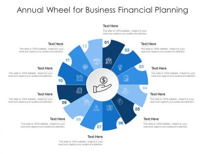
Annual wheel for business financial planning infographic template




Try Before you Buy Download Free Sample Product
 Impress Your
 Audience
 100%
100% Editable
 Save Hours
 of Time


Derive factual results using this Annual Wheel For Business Financial Planning Infographic Template. Deploy this PowerPoint template to make and display prospective strategies using impressive graphics that enhance the visual quotient of the presentation. This infographic template also helps in elevating the aesthetic appeal of the presentation, making it useful for every organization. Apart from this, things and projects can be visualized from the onset using this PPT design. As this PowerPoint visual provides an abundance of information in a single layout, it can impress any viewer or higher managerial staff. It also boosts business actions by presenting flawless presentations. The biggest advantage of this slide is that it can be reproduced in various formats, including Google Slides. Therefore, download it now to present a unique presentation every time.
People who downloaded this PowerPoint presentation also viewed the following :
Annual wheel for business financial planning infographic template with all 2 slides:
Use our Annual Wheel For Business Financial Planning Infographic Template to effectively help you save your valuable time. They are readymade to fit into any presentation structure.
FAQs for Annual wheel for business financial
Honestly, start simple - just throw in your months/quarters first, then add the big milestones and deadlines. I always screw up the spacing initially so don't stress about that part! Color-coding is a game changer though - maybe blue for planning stuff, red for when things are actually due. Leave room for who's doing what and how tasks connect to each other. Oh, and recurring activities too since those always sneak up on you. White space is your friend here - cluttered timelines are impossible to read. Once your team gets the hang of it, then you can make it fancier.
So basically you just drop your big goals right into each quarter or month on the wheel. Way more visual than those spreadsheet timelines that make everyone's eyes glaze over. Q1 becomes your product launch, Q2 is market expansion, whatever. The cool thing is how it shows connections between different phases - like you can actually see how one quarter feeds into the next. Color-code your different focus areas too, makes it super obvious if you're cramming too much into certain periods. Oh and it naturally highlights seasonal stuff in your business which is honestly pretty handy.
Honestly, the biggest thing is making sure people can actually read your text - I've sat through way too many presentations where I'm squinting at microscopic fonts. Start with January at the top and go clockwise from there. Keep your colors consistent for each season or quarter, and don't cram everything together. White space is clutch here. Throw your main title in the center, then use little icons instead of paragraph dumps for each section. Oh, and definitely test it on your laptop screen first - what looks good on your monitor might be tiny when you're actually presenting.
Here's the thing - people love seeing how everything connects over time, and that's exactly what the wheel does. It shows your audience the full picture instead of random disconnected posts. When you map out content seasonally, it just clicks for people. They can figure out where they are right now and what's coming next. Makes total sense, right? I'd definitely make it interactive - ask them which phase they're in or what part hits home for them. Creates natural conversation starters too. The cyclical thing works because our brains are wired for patterns and seasons anyway.
Honestly, annual wheels work best for anything with seasonal ups and downs. Sales data is perfect since most businesses naturally fluctuate. Website traffic, customer sign-ups, team productivity - all good options. I've seen people use them for social media engagement too, which actually makes sense when you think about it. Revenue is probably your safest bet to start with. Just make sure whatever you pick actually changes throughout the year, otherwise you'll end up staring at a pretty useless circle. Support tickets and inventory stuff can work well too. Pick your main KPI that you think might have seasonal patterns - that's where I'd start.
So basically it's like a clock but for your whole business year - way better than those confusing timeline charts nobody actually likes using. You can see everything at once: busy seasons, when projects overlap, budget deadlines, all that stuff. I swear it's a game changer for catching problems early. Like, you'll spot that your big product launch is happening right when half your team is on vacation (whoops). Executives love these things too because they don't have to squint at spreadsheets. Just draw a circle, map out your major stuff by month, and boom - you've got your year sorted.
Think of each season/milestone as a chapter in your company's story. Where did you start? What challenges are you facing now? Where are you headed? People actually retain info way better when there's a narrative arc to follow. Customer wins work great for this, or maybe how your team evolved over time. Growth metaphors are solid too since they match the wheel concept naturally. Honestly, anything beats just throwing data at people. The trick is making your audience feel like they're following real characters through something that matters. Just pick one main story thread and stick with it throughout.
Don't cram everything on there - you'll end up with an unreadable mess. Just stick to major milestones or key phases. Also make sure people can actually READ it... seriously, I've watched so many presentations where everyone's squinting at tiny text. Use good color contrast too. Oh and here's the thing - not everyone knows how to read a circular timeline right away, so quickly explain which direction it goes when you show it. The whole point is telling a clear story, not just dumping random events around a circle. Keep it simple and it'll actually be useful.
Colors make such a huge difference in how people react to your annual wheel! I use warm colors (reds, oranges) for high-energy stuff like product launches. Blues and greens work better for planning or reflection time since they're calming. Honestly, my first attempt was way too bright and stressed everyone out - oops. Seasonal colors are pretty smart too. Spring gets greens for growth, winter gets deeper blues for planning mode. You just want to think about what vibe you're going for in each section, then pick colors that actually match instead of working against you.
Retail and agriculture are huge winners with annual wheels - they've got those predictable seasonal spikes. Marketing agencies love them too since they need that full-year view for campaign planning. Hospitality works great, and so does education with their natural quarter systems. Manufacturing can benefit when dealing with seasonal production stuff. Honestly, the format just makes sense when you have activities that repeat every year - it makes planning way less of a headache. Oh, and your team will actually understand what's happening instead of staring at confusing charts.
So instead of those static annual wheels, try hooking yours up to live data feeds through APIs or whatever automated pulls you can set up. Tableau and Power BI work great for this stuff - I've watched teams build some really slick dashboards that way. Monthly snapshots are solid too, where you can see current performance layered over your planned timeline. Honestly, the automated refresh part is what makes or breaks it - nobody wants to manually update this crap every week. I'd start small with maybe two key metrics, then build it out once you've got the hang of it.
Definitely keep each section to 3-5 items max or it gets crazy overwhelming. Use colors that actually make sense and simple icons people will get right away. I've honestly seen too many wheels that look gorgeous but nobody can figure out what they mean lol. Plain language only - skip the corporate speak entirely. Make the text big enough so it's readable when you print it out. Test it with a couple teammates first. If they're squinting or going "huh?" then simplify more. The whole point is quick visual reference, not making people work to decode it.
Honestly, just swap out whatever doesn't fit your audience. B2B folks care about fiscal quarters and industry conferences way more than Valentine's Day. Schools? You better nail back-to-school timing or you're screwed. Consumer brands should focus on shopping seasons and cultural moments when people actually spend money. Don't just copy some template everyone else uses - that's boring. Map out what your specific people actually care about throughout the year. Like, if you're targeting parents, summer break is huge but Q4 earnings calls? Not so much. It's really about knowing your audience's rhythm instead of forcing generic holidays on them.
Dude, you HAVE to get feedback on your annual wheel template - it's a game changer. I thought mine was solid until I actually asked people what they thought. Brutal wake-up call! Different audiences will tell you exactly where you're losing them. Maybe your visual flow sucks, or they need totally different info than what you're showing. After each big presentation, just ask a few people what worked and what didn't. Look for patterns in their responses, then tweak your template accordingly. The whole point is making something that actually communicates with your stakeholders, not just impressing yourself with fancy design.
Oh man, this is such a real thing! Your team's gonna interpret those annual wheels totally differently based on where they're from. Like, you're planning summer campaigns while your Australian coworkers are literally in winter - it's wild how backwards that feels. Religious holidays mess with timing too, plus some cultures think about time in cycles instead of straight lines. Family seasons matter way more than business quarters in certain places, which honestly makes sense. Different fiscal years don't help either. I'd make a hybrid wheel that hits everyone's major cultural stuff, then just be super clear about what's negotiable and what isn't.
-
Informative design.
-
Professional and unique presentations.
-
Awesomely designed templates, Easy to understand.
-
Great designs, really helpful.