


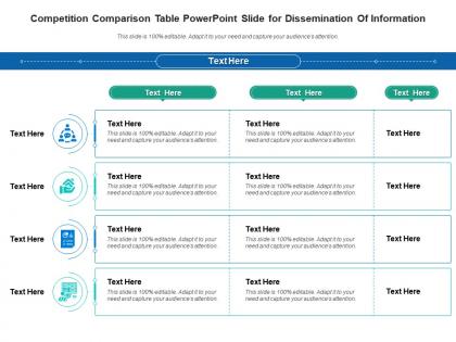
Competition comparison table powerpoint slide for dissemination of information infographic template




Try Before you Buy Download Free Sample Product
 Impress Your
 Audience
 100%
100% Editable
 Save Hours
 of Time


Derive factual results using this Competition Comparison Table Powerpoint Slide For Dissemination Of Information Infographic Template. Deploy this PowerPoint template to make and display prospective strategies using impressive graphics that enhance the visual quotient of the presentation. This infographic template also helps in elevating the aesthetic appeal of the presentation, making it useful for every organization. Apart from this, things and projects can be visualized from the onset using this PPT design. As this PowerPoint visual provides an abundance of information in a single layout, it can impress any viewer or higher managerial staff. It also boosts business actions by presenting flawless presentations. The biggest advantage of this slide is that it can be reproduced in various formats, including Google Slides. Therefore, download it now to present a unique presentation every time.
People who downloaded this PowerPoint presentation also viewed the following :
Competition comparison table powerpoint slide for dissemination of information infographic template with all 2 slides:
Use our Competition Comparison Table Powerpoint Slide For Dissemination Of Information Infographic Template to effectively help you save your valuable time. They are readymade to fit into any presentation structure.
FAQs for Competition comparison table powerpoint slide for dissemination of
Definitely include pricing and your main features - that's obvious stuff. Customer support quality matters way more than people think, especially for B2B. Honestly, user ratings are gold because everyone checks those first anyway. Don't BS about where competitors beat you - just focus on your actual wins. Integration options are huge if your audience cares about that. Oh, and implementation time! People always forget that one but it's often the dealbreaker. Make it super scannable with checkmarks or whatever so they can spot differences fast without reading paragraphs.
Dude, color coding is your best friend here - like red for bad, green for good performance levels. Icons work great too for showing features quickly. I'd throw in some simple bars or charts because honestly, who has time to read paragraphs when you're trying to compare stuff? Make your headers bold and keep everything consistent. Oh, and definitely highlight where your company wins - that's the whole point, right? Try one visual thing per column first. Nobody wants to stare at a boring spreadsheet that looks like it's from 2003.
Start with the big three: market share, revenue, and growth rates. Customer acquisition costs matter a ton too - honestly, that's where you see who's really efficient vs just burning cash. Don't forget retention rates and pricing comparisons. Customer satisfaction scores are solid gold if you can get reliable data. Geographic presence might be relevant depending on your space. Here's the thing though - stick to maybe 6-8 metrics max. I've seen people try to track everything and then never actually use any of it. Pick what'll actually change how you make decisions.
Look, I'd say quarterly is a good baseline, but it really comes down to your industry pace. Tech moves crazy fast - if you're in SaaS, competitors are dropping new features constantly, so monthly checks make more sense. Traditional industries? Quarterly's probably fine. Watch for the big stuff - pricing shifts, major launches, new players entering your space. That's what actually affects your positioning. Oh, and definitely put it on someone's calendar with a reminder. I've seen too many companies say they'll do this and then... whoops, six months later they realize their main competitor completely revamped their pricing.
Put your best stuff right at the top - whatever makes you look amazing compared to them. I group similar things together so people aren't jumping around randomly. Features in one section, support stuff in another, you know? Honestly, I always make sure there's at least one section early on where we obviously crush them. That's kind of the whole point, right? Keep the category names simple - nobody wants to decode industry speak. Company info and boring details go at the bottom. Oh, and definitely test it with someone who doesn't work there first. They'll catch confusing parts you missed.
Honestly, the biggest thing is contrast - dark text on light backgrounds, none of that gray-on-gray nonsense that makes everyone squint. Arial or any basic sans-serif font works great (save the fancy fonts for your wedding invitations). Colors should actually help people, not hurt them. Use maybe 2-3 colors to group competitors or highlight big differences, but don't make it look like a unicorn threw up on your spreadsheet. Also, here's the real test: can someone scan it in 10 seconds and grab the key info? If not, simplify it.
Honestly, don't cherry-pick metrics just to look good - people can smell that BS from a mile away and it kills your credibility. Also make sure you're not using outdated competitor data because markets change crazy fast. I've seen this happen in meetings and it's so awkward when someone gets called out. Compare apples to apples too - same timeframes, similar customers, equivalent products. Oh and definitely double-check your numbers because one mistake can wreck everything. Just focus on what actually matters to whoever you're presenting to. Keep it straightforward.
Honestly, user feedback is like your sanity check for comparison tables. Real users who've actually tried these competitors will spill the tea on stuff you'd never find on company websites - hidden fees, awful support, features that straight up don't work. That's gold for positioning things correctly. They'll also catch blind spots where you missed important criteria completely. Quick tangent - I learned this the hard way when I totally missed a major pricing gotcha that three users flagged immediately. Just throw up a simple feedback form asking which competitors they've tested and what caught them off guard. You'll be surprised what comes back.
Canva or Adobe InDesign are solid if you need something that looks really polished. But honestly? I've made some decent comparison tables in just Google Sheets - not glamorous but super easy to tweak later. Excel works too obviously. For interactive stuff, try Airtable or Notion since people can actually filter and mess around with the data themselves. That's pretty handy for stakeholders who love clicking buttons. My take: just start with whatever you're comfortable using first. You can always make it fancier down the road if needed.
Focus on your real competitors first - like the 3-5 companies that keep popping up in your sales calls. Those are the ones prospects actually research against you. Don't just grab the biggest names (though sometimes they're the same). I'd toss in one rising competitor too, even if they're small now - trust me, they can sneak up fast. Look for companies solving similar problems for your customer type, not just matching features. Oh and pick ones where you can highlight differences without sounding bitter about it.
Honestly, stick to the big four: pricing, key features, market share, and customer satisfaction. Those tell you everything you need to know. I used to track like 20 different things and it was a nightmare - total information overload. You can throw in product quality and how fast their support team responds too. Oh, and whatever makes them "special" in their messaging. But seriously, don't go crazy with metrics. Pick what actually affects how customers choose between you and them. Start with those core ones, then maybe add 2-3 things that matter specifically in your industry.
So basically, a competition table shows you exactly where you stand against other players. You'll spot gaps in their stuff that you can totally exploit, plus figure out what you're actually good at. Your sales team will thank you too—they'll know how to handle those annoying "but competitor X does this" objections. Honestly, I'd start with just 3-5 main competitors and your biggest features. It's kind of like having insider knowledge on everyone else's playbook. Once you see it all laid out, your messaging gets way sharper. Trust me, it changes everything about how you position your product.
Don't just rehash what's in your table - tell the story behind it. What patterns jump out? Why are certain competitors crushing it while others aren't? Honestly, I hate when people just dump data without explaining what it actually means. Pick your 2-3 biggest discoveries and connect them to real opportunities or threats. Call out anything weird you found too. The whole point is helping people understand the "so what" factor. Wrap up with concrete next steps so everyone knows what to do with this info instead of just nodding and forgetting about it.
Honestly, just pick the stuff that matters most in your industry. SaaS? Focus on features, pricing, integrations. Retail companies care about price points and customer service ratings. Manufacturing is all about specs and certifications - that technical stuff really matters to them. Healthcare is different though - compliance has to be front and center or you're dead in the water. Here's what I'd do: talk to your sales team first. They know what questions customers actually ask, not what looks good on paper. Also ask a few customers directly. Then pick your top 3 decision factors and build everything around those. Don't overthink it.
Honestly, customer perception drives everything with these comparison tables. What matters is figuring out what your buyers actually care about - not what your internal team thinks is cool. Your devs might geek out over API speeds, but customers just want something that won't make them want to scream. Survey people who recently bought from you about their decision factors. Those insights will show you which competitor strengths actually freak out your prospects (and which flaws they'll totally ignore). Structure your whole table around those real pain points. It's way more effective than guessing what'll resonate.
-
Awesome presentation, really professional and easy to edit.