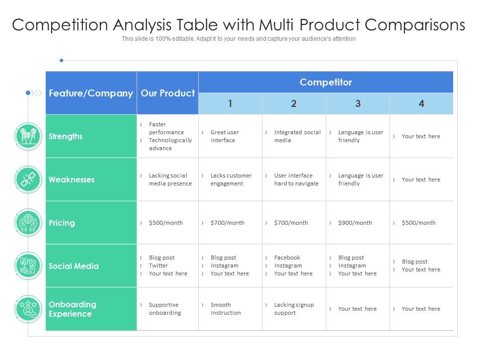
Competition analysis table with multi product comparisons
Try Before you Buy Download Free Sample Product
Audience
Editable
of Time
Our Competition Analysis Table With Multi Product Comparisons are topically designed to provide an attractive backdrop to any subject. Use them to look like a presentation pro.
People who downloaded this PowerPoint presentation also viewed the following :
Competition analysis table with multi product comparisons with all 2 slides:
Use our Competition Analysis Table With Multi Product Comparisons to effectively help you save your valuable time. They are readymade to fit into any presentation structure.
FAQs for Competition analysis table with
So the big ones right now are Canva, Slidebean, and Pitch going up against PowerPoint/Google Slides. Canva's got this huge template library that's super user-friendly - sometimes almost *too* simple if you want something fancy. Slidebean does the AI thing where it formats everything automatically. Pitch is more for teams since they're big on real-time collaboration stuff. There's also Beautiful.ai with smart templates and Prezi still doing their whole zoom-y thing (remember when everyone was obsessed with that?). Really comes down to what you need - quick personal stuff, team work, or just want the design done for you. I'd mess around with the free versions first honestly.
So here's the deal - pricing creates different customer types. Freemium gets budget users hooked, then some upgrade later. Premium pricing makes your templates feel more professional (honestly works every time). People get anchored to whatever price they see first. If Canva shows free stuff upfront, that becomes everyone's expectation baseline. The psychology is wild - customers literally screenshot features to compare dollar-for-dollar. They don't just want cheap though. They'll pay more if templates actually look worth it or include extras like animations. Check how competitors bundle things... might reveal gaps you're missing.
Dude, minimalism and dark mode are everywhere right now. Clean designs with tons of white space, bold fonts, smooth little animations. Data viz is getting way better too - charts that don't put people to sleep. Everyone's throwing gradient overlays and geometric shapes at everything (can be overkill tbh). Mobile-first is pretty much expected now since half the time you're presenting from your phone anyway. Check what Canva and Pitch are doing - they're usually ahead of the curve on this stuff.
So I dug into those customer reviews - turns out customization is king. People want templates they can tweak fast without fighting complicated formatting. Clean designs beat flashy ones every time, which honestly surprised me a bit. Professional look, decent colors, readable fonts - that stuff gets mentioned constantly. Multiple layout options in one package? Users love that. Oh, and having different slide variations helps too. When you're checking out competitors, focus on how easy their templates are to modify and whether they look polished right away. That's what actually matters to buyers.
Honestly, your competitors are doing okay but nothing amazing. They're crushing it on social - good engagement and reach. Email campaigns though? Super generic and boring. Here's what's weird - they're all about pushing low prices instead of actually explaining why their stuff is good. That's your opening right there. You could focus on quality or what makes you different. Their ads get clicks but people aren't buying, which is interesting. I'd look at what content works for them, then just do it way better or go after the audiences they're ignoring completely.
Your main customers are gonna be business folks - consultants, marketers, sales people - plus teachers and freelancers. Basically anyone 25-45 who needs decent slides but can't design or doesn't have time. Most competitors hit LinkedIn hard with productivity ads, though Canva casts a way wider net with their "everyone's a designer" thing. The specialized template sites? They go after specific industries instead. Everyone's obsessed with the time-saving angle, which honestly makes total sense since these people are drowning in work. I'd dig into their ad copy and see what problems they're hammering hardest for your audience.
Most companies dig through customer reviews and support tickets to find what pisses people off about their templates - like confusing layouts or nightmare customization. They'll stalk social media mentions too. A/B testing different designs is pretty standard. The smarter ones actually listen though - they've got feedback loops for quick fixes and community forums where users straight-up tell them what sucks. Honestly, some of these companies are way better at responding to complaints than others. Set up Google Alerts for their template products and check reviews monthly. You'll catch patterns in what customers want but aren't getting.
Dude, reputation is everything in the template game. Customers flock to big names like Envato because they know they won't get screwed over with garbage designs. Honestly, some people don't even look at previews - they just check who's selling it first. The crazy part? These established brands charge like 30-50% more for basically the same stuff, and people pay it. When you're scoping out competitors, definitely peek at their reviews and how long they've been around. That's where their real advantage comes from, not just pretty mockups.
From what I've noticed, the big players like Canva and Adobe drop new templates constantly - we're talking every 2-4 weeks or even more. Smaller platforms are way more chill about it, usually doing monthly or quarterly dumps. Holiday seasons are when everyone goes crazy with updates. Back-to-school, Christmas, Valentine's - you name it. Here's something weird though: the premium companies often test stuff on free users first before giving it to paying customers. Seems backwards but whatever works I guess. Set up some Google Alerts so you can track their moves without constantly checking manually.
Your competitors are mostly doing the same three things - selling on Amazon, running their own sites, plus getting into stores like Target and Walmart. Amazon's great for volume but honestly, those fees are brutal and everyone's fighting for the same customers. Their own websites? Better profits but way more work to get people there. Store partnerships hit that sweet spot though - decent money and people actually walking by your stuff. Smart brands don't pick just one - they're everywhere. I'd check where your biggest competitors are crushing it and see what they're missing.
Dude, your competitors are killing it with template previews and those before/after posts that people actually want to share. Instagram and TikTok are obvious wins, but don't sleep on Pinterest - that's where people hunt for design inspo. They're also teaming up with business influencers to hit audiences they'd never reach otherwise. Honestly, the boring tutorial stuff performs way better than you'd think. Go stalk 3-5 of your top competitors right now and see what's getting all the likes and comments. That'll tell you everything you need to know about what works.
So your competition is going all-in on AI that tweaks layouts automatically based on whatever content you throw at it. Real-time collaboration is huge now too - whole teams can jump in and edit at once. Templates are getting smarter, adapting to different screens and contexts without you doing anything. Voice-to-slide generation is a thing now, which honestly feels like science fiction but here we are. Interactive stuff like polls and clickable prototypes? That's becoming standard. The big trend is templates that actually learn from how you work and suggest improvements. I'd check what your top 3 competitors are doing every quarter so you don't get blindsided.
So companies basically build features that hit each industry's specific problems. Education templates get gradebook stuff, assignment tracking, student collab tools. Corporate ones? Way more boring - just project management, reporting dashboards, compliance junk. But they work. The real trick is how they market it though. Same exact product, totally different messaging. Notion's actually brilliant at this - they'll show students study planners and show enterprise teams workflow charts. Even the photos and language completely change. It's the same core tool but feels custom-built for whoever's looking at it.
Honestly, just stalk their press releases and social media - companies love showing off new partnerships. Set up Google alerts for "[competitor name] + partnership" so you catch stuff as it drops. Focus on the real deals: tech integrations, distribution partnerships, co-marketing stuff. Some are just fluff though, like those "exclusive" partnerships that don't actually mean much. The meaty ones usually involve shared resources or complementary skills. I'd start with your top 5 competitors' news sections first. Industry publications are solid too since they cover the bigger announcements you might miss otherwise.
Yeah, so free templates totally crush it - like 70-80% of people use them. Most companies do the whole freemium thing where they hook you with free stuff then try to sell premium features. Paid templates only grab maybe 20-30% but they make way more money per person. Here's the kicker though - only about 5% of free users actually upgrade, so you need tons of traffic. Honestly? Just peek at what your biggest 3 competitors give away for free. That'll show you exactly where everyone draws the line between free and paid stuff. Pretty telling usually.
-
Designs have enough space to add content.
-
Innovative and attractive designs.
-
Understandable and informative presentation.
-
Great quality slides in rapid time.