


Best practice approach
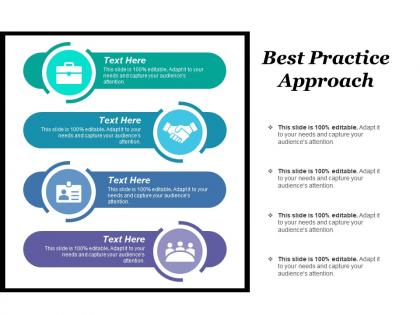




Try Before you Buy Download Free Sample Product
 Impress Your
 Audience
 100%
100% Editable
 Save Hours
 of Time


Overachievers can finally step away from their computers. With our Best Practice Approach flawless design is only an easy click away.
People who downloaded this PowerPoint presentation also viewed the following :
Best practice approach with all 5 slides:
When we create PowerPoint Templates and Slides we are not in a hurry. We always stand back and look so we are sure of a perfect job that our customers would love.
FAQs for
Honestly, start with consistent fonts and colors - that alone makes everything look way more professional. Don't cram a million bullet points on each slide (I do this constantly and regret it every time). White space is your friend. Your title slide needs to grab attention, then make sure each slide has a clear hierarchy - header up top, main points, then details. High-quality images help a ton. Oh and definitely include slide numbers and your logo if you need branding. Trust me, build a solid master template first. You'll thank yourself later when you're scrambling to finish at 2am.
Honestly, color choices can make or break your whole presentation. Warm colors like red and orange get people pumped up, while blues and greens feel more chill and trustworthy. I once watched this guy's presentation bomb because his color combo was straight-up painful to look at – everyone was squinting! People react to your colors before they even hear what you're saying, which is kinda wild. Don't go crazy with too many colors. Two or three that work well together is plenty. Make sure there's enough contrast so people can actually read your stuff. Oh, and definitely run it by someone first!
Okay so the basic structure is pretty straightforward - intro slide with your agenda, then one main point per slide (seriously, don't try to squeeze everything onto one slide, it looks messy), then wrap up with next steps. I always use the same fonts and colors throughout because it looks more professional. Less text is definitely better - your slides should back up what you're saying, not just repeat everything word for word. Oh and here's something I learned the hard way - always be ready to jump straight to your conclusion if you're running out of time. Happened to me last week and I was scrambling!
Your brain processes images like 60,000 times faster than text, which is honestly pretty wild when you think about it. Charts and diagrams give people different ways to absorb info, so retention goes way up. Plus nobody wants to sit through slide after slide of bullet points - that's just torture. The trick is making your visuals actually mean something instead of just looking pretty. I always do this "glance test" thing where if someone can't get your visual in 3 seconds, it's too complicated. Keep it simple and you'll be golden.
Dude, font size is everything! I learned this the hard way when nobody could read my presentation from like 10 feet away. Go at least 24pt for regular text - bigger is better honestly. Arial or Calibri are your friends since they show up crisp on screens. The worst mistake? Cramming tons of tiny text everywhere (guilty as charged). You really only need 2-3 different sizes: headers, body text, maybe captions. Sans-serif fonts just work better than the fancy stuff. Trust me, simple beats clever every time.
Do your homework on who you're presenting to first - their pain points, industry lingo, what visuals they actually care about. Healthcare folks need totally different stuff than a tech startup, you know? Ditch the generic stock photos for something that fits their world. Colors matter too - finance people expect those boring blues while creative agencies want something with more punch. Your examples should reflect their reality, not some random case study. Oh, and slide structure varies wildly by industry. Some want tons of backup slides, others just want the essentials. Test it with someone from their field before you present - they'll spot weird stuff you missed.
Definitely start with a master template - same fonts, colors, layouts for everything. I'd stick to maybe 2 fonts tops because honestly, some presentations look like a design disaster. Your headings should go in the same spot every time, plus keep bullet points and images consistent too. Spacing matters more than you think. Oh, and do a final scroll-through before presenting because there's always that one slide that looks totally off. People might not consciously notice the consistency, but it makes you look so much more professional. Way better than those chaotic decks where every slide's a surprise.
Honestly, less is more with data viz. One key point per slide - don't make it look like a dashboard threw up everywhere. Match your colors and fonts to whatever theme you're using. Start with the "so what" instead of jumping straight into numbers. People need context first. Make your labels big enough that nobody's squinting at tiny text (seriously, this drives me nuts in presentations). Practice talking through each chart beforehand so you're not stumbling over explanations. The whole point is that someone should glance at your chart and immediately get it within like 5 seconds.
Honestly, just go mobile-first and work your way up - it's so much easier than the other way around. CSS media queries are your best friend here. Ditch fixed pixels for percentages and ems wherever you can. I learned this the hard way lol. Sometimes you might need totally different templates for mobile vs desktop if they're really different experiences. Oh, and don't just resize your browser to test - actually pull out your phone and tablet. Browser dev tools lie sometimes. Set up a testing routine early or you'll hate yourself later when everything breaks.
Okay so first thing - make sure your text actually contrasts with the background. Gray on gray is the worst, don't do it. Go with at least 24pt fonts for presentations, and add alt text to images so screen readers work properly. Instead of cramming everything into paragraphs, break it up with headings and bullet points. Oh and test your colors with a colorblind simulator - super easy to find online. Honestly the smartest move is setting up slide masters with all this stuff built in. Then you don't have to think about it every single time.
Don't just throw in multimedia because it looks cool - make sure it actually helps your point. Good visuals, clear charts, or quick video clips can explain things way better than just talking sometimes. Audio's solid too, but seriously test that stuff first because tech fails are the worst. Keep files small so nothing crashes on you. Oh, and definitely have a backup ready - I learned that one the hard way! Bottom line: if it doesn't make your point clearer or keep people interested, skip it.
Check the licensing first - some need attribution or can't be used commercially. Also, think about representation because I've seen brands get absolutely roasted for tone-deaf stock photo choices. Don't perpetuate stereotypes or use images that feel inauthentic to the communities you're targeting. Save your licenses somewhere you'll actually find them later (learned that one the hard way). Consider investing in diverse stock libraries too. Trust me, it's way better to spend extra time upfront than deal with legal headaches or bad PR down the road.
Make your fonts way bigger and use bolder colors - screens make everything harder to see. Break up dense slides into multiple ones because honestly, people zone out so fast on video calls. Throw in some polls or breakout rooms to keep them awake. One thing I learned the hard way: test everything on the actual platform first! Your slides might look completely different in Zoom than they do in PowerPoint. Colors get weird, formatting shifts around. Give yourself at least a week to mess with it beforehand so you're not scrambling last minute when something looks off.
Oh totally do this! I learned the hard way after ignoring feedback for way too long. People kept telling me the same stuff - fonts too small, slides crammed with text, whatever. Now I actually write down the common complaints and fix them right in my template. Short sentences work better than I thought. When you see "hard to read" three times in a row, that's your cue to bump up font sizes permanently. I keep a little note on my phone about what people say, then update my templates every couple months. Honestly saves so much time later.
Honestly, templates are lifesavers when you're in a rush. They've got all the design stuff figured out already, so you won't make those weird spacing mistakes that drive you crazy later. Plus they keep everything looking consistent. But here's the thing - you'll probably end up with something kinda generic unless you really go ham on customizing it. Oh, and you might spot your template on someone else's site, which is always awkward. Building from scratch takes forever but you get total control. My take? Find a template that's maybe 70% what you want, then make it your own.
-
The Designed Graphic are very professional and classic.
-
Editable templates with innovative design and color combination.