Box plot iqr lower middle and upper percentage
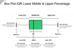
Showcase the data comparison and distribution of results with this Box Plot IQR Lower Middle And Upper Percentage slideshow. This box and whisker plot PPT layout can be effectively used to display a number summary of a set of data. Also, educational institutions can get this template to explain the various concepts of statistics and mathematics. You can use this box plot diagram for numerous purposes such as to find interquartile range, show the shape of the distribution, its central value and its variability. Perform effective data analysis and compare distributions across the groups utilizing this statistical graph PPT visual. This box plot chart is a very convenient way of displaying distributions through their quartiles. Also, this impressive graph template gives a good indication of how the values in the data are spread out. Highlight the steps to calculate the outliers with this readily available PPT theme. Represent the percentage values and make a meaningful presentation by downloading this dot box plot PPT slide.
- Google Slides is a new FREE Presentation software from Google.
- All our content is 100% compatible with Google Slides.
- Just download our designs, and upload them to Google Slides and they will work automatically.
- Amaze your audience with SlideTeam and Google Slides.
-
Want Changes to This PPT Slide? Check out our Presentation Design Services
- WideScreen Aspect ratio is becoming a very popular format. When you download this product, the downloaded ZIP will contain this product in both standard and widescreen format.
-

- Some older products that we have may only be in standard format, but they can easily be converted to widescreen.
- To do this, please open the SlideTeam product in Powerpoint, and go to
- Design ( On the top bar) -> Page Setup -> and select "On-screen Show (16:9)” in the drop down for "Slides Sized for".
- The slide or theme will change to widescreen, and all graphics will adjust automatically. You can similarly convert our content to any other desired screen aspect ratio.
Compatible With Google Slides

Get This In WideScreen
You must be logged in to download this presentation.
PowerPoint presentation slides
Presenting Box Plot Iqr Lower Middle And Upper Percentage template. This template supports both the widescreen (16:9) and the standard screen aspect ratios(4:3). Add appealing content like charts and graphs to the presentation. The slide is also compatible with Google Slides. This slide can be converted into common image formats like JPEG, PNG or document formats such as PDF. High-quality graphics will prevent the deterioration of slide components.
People who downloaded this PowerPoint presentation also viewed the following :
Content of this Powerpoint Presentation
Description:
The image is a PowerPoint slide titled "Box Plot IQR Lower Middle & Upper Percentage." It illustrates a box plot, which is a standardized way of displaying the distribution of data based on a five-number summary: minimum, first quartile (Q1), median, third quartile (Q3), and maximum. The slide divides the plot into three sections: the lower 25%, middle 50%, and upper 25%, each denoted by arrows. The middle 50% is represented by a box, which is the interquartile range (IQR), and includes the median. There are placeholders with "Your Text Here" at several points for the presenter to add specific data descriptions. The repeated phrase "This slide is 100% editable. Adapt it to your needs and capture your audience's attention." encourages customization of the slide.
Use Cases:
Box plots are versatile and can be used across various industries for statistical data analysis and presentation:
1. Finance:
Use: Analyzing the distribution of investment returns or financial forecasts.
Presenter: Financial Analyst
Audience: Investors, Management Teams
2. Marketing:
Use: Presenting survey results regarding consumer satisfaction or product ratings.
Presenter: Market Researcher
Audience: Marketing Team, Product Managers
3. Education:
Use: Teaching statistics students about data visualization and summary.
Presenter: Statistics Professor
Audience: Students, Academic Researchers
4. Healthcare:
Use: Summarizing patient data or results from clinical studies.
Presenter: Medical Researcher
Audience: Healthcare Providers, Researchers
5. Real Estate:
Use: Displaying housing price ranges within different market segments.
Presenter: Real Estate Analyst
Audience: Buyers, Real Estate Agents
6. Manufacturing:
Use: Showing quality control measurements and their variation.
Presenter: Quality Assurance Manager
Audience: Production Team, Management
7. Environmental Science:
Use: Illustrating the spread of various environmental data points, like pollution levels.
Presenter: Environmental Scientist
Audience: Policy Makers, Environmental Advocates
Box plot iqr lower middle and upper percentage with all 5 slides:
Bring in an extra dose of glamor with our Box Plot Iqr Lower Middle And Upper Percentage.They add an element of grandeur.
-
Appreciate the research and its presentable format.
-
Great quality product.


