

Business evolution process chart powerpoint graphics




Try Before you Buy Download Free Sample Product
 Impress Your
 Audience
 100%
100% Editable
 Save Hours
 of Time


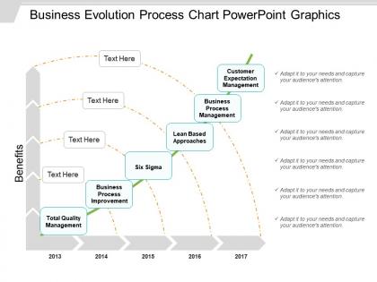
Download this business evolution process chart PowerPoint graphics slideshow which is used in the business method(s) for the collection of structured activities or tasks or equipment in a specific sequence to produce a service or product and serve a particular business goal for a particular customer or customers of the company. The evolution of business management process PowerPoint presentation can be used by the presenter at all organizational levels which may or may not be visible to the customers. The evolution of management systems PPT slide has been designed in such a manner that it can also be used as a flowchart of a sequence of activities with interleaving decision points or as a process matrix of a sequence of activities with relevance rules which are based on data in the process. The benefits of using this evolution of management systems PPT slide are numerous few of them are; the PPT slide can be used by the presenter to explain the team and / or viewers about the factors that are required to be considered to improve the customer satisfaction, agility for reacting to rapid market change, break down the barriers of structural departments and / or try to avoid functional silos. Exhibit great competence with our Business Evolution Process Chart Powerpoint Graphics. Your accomplishments will become an accepted fact.
People who downloaded this PowerPoint presentation also viewed the following :
Business evolution process chart powerpoint graphics with all 5 slides:
Have a cracker of a time with our Business Evolution Process Chart Powerpoint Graphics. Your ideas will set of the fireworks.
FAQs for Business evolution process
So most business lifecycle charts show five main stages: startup/ideation, early growth, expansion, maturity, then either renewal or decline. Pretty straightforward stuff. Between each stage there are usually transition phases too - companies don't just magically jump from one to the next overnight. Some charts get fancier and break growth into multiple phases or throw in specific milestones like market penetration. Honestly depends on your industry and what model you're using. But those core five stages give you the basic framework to work with. Try figuring out where you currently sit on this cycle - it'll help you plan what moves to make next.
Honestly, visuals are a lifesaver when you're trying to explain how a business changed over time. Instead of reading through pages of boring text, people can just glance at a timeline or chart and get it immediately. I'm a huge fan of color-coding different phases - it makes everything pop. Flowcharts show how one thing led to another, and little icons help people remember each stage better. Your stakeholders will actually pay attention instead of zoning out (trust me on this one). Next time you're presenting business evolution stuff, try a simple color-coded timeline. Makes such a difference.
Think of market research as your GPS for business evolution - shows you exactly where you stand and where the market's going. You need both the hard numbers and the stories behind them to figure out what customers actually want. Honestly, skipping this step is like driving blindfolded. Use what you find to spot trends early and validate your next moves before committing resources. Each insight should tie directly to your evolution timeline - from analyzing your current position to hitting future goals. I've seen too many businesses guess their way into expensive mistakes when solid research could've saved them.
Honestly, just pick clear metrics for each phase and actually measure them - don't wing it. Revenue, customer satisfaction, whatever matters for your goals. But here's the thing most people mess up: get your baseline numbers BEFORE you start changing anything. Otherwise you're basically flying blind later. Monthly check-ins work well to compare your real results against what you planned. If something's not tracking right, pivot early. I know it sounds obvious but so many teams skip the measurement part and then wonder why their transformation feels like chaos.
Honestly, the biggest mistake is overcomplicating everything from day one. Your team will take one look at some massive flowchart and just... nope out. Start simple - maybe 3-5 stages tops with stuff you can actually measure. Don't forget feedback loops between each phase either (trust me on this one). Business stuff never goes in a straight line. Oh, and define what "winning" looks like at each step or you'll just be spinning your wheels. Test it on something small first, then add more complexity once everyone's not completely lost. Way easier than trying to fix a mess later.
Don't wait until the end to get feedback - that's where most people mess up. Build it into every major step instead. Weekly or bi-weekly check-ins work great for catching problems early. Get input from customers AND employees (seriously, so many companies forget about their own team). The whole point is useless though if you don't actually use what you learn to change direction. I'd say pick one simple way to collect feedback this week and just try it. Better to start small than overthink it forever.
Honestly, I'd go with Lucidchart or Miro first - both are super easy for teams to jump in and collaborate on. Visio's the old standby if you're already deep in Microsoft stuff, but it feels dated now. Actually tried draw.io recently (they renamed it to diagrams.net) and was shocked how decent it is for free. Short sentences work better anyway. If you need something more advanced later, Bizagi and ProcessMaker can handle actual workflow stuff beyond just making pretty charts. But seriously, start with Miro - your team won't hate you for picking something that actually makes sense to use.
Startups are just way faster at everything - you can pivot in like a week based on what customers tell you. Big companies? They've got approval processes that take forever, risk meetings, gradual rollouts... it's a whole thing. Your chart should actually show that speed difference. More pivot points, shorter timeframes. Honestly mine looked pretty messy at first compared to those clean corporate flowcharts, but that's kinda the point - you're not following some predetermined path. Make it reflect how you actually work, not how you think it should look.
Honestly, I'd focus on both the hard numbers and the softer metrics. Revenue growth, profit margins, cash flow - those are obvious. But also track things like customer acquisition cost and how long it takes to launch new products. Employee engagement scores matter way more than people think, trust me on that one. Process stuff like cycle times and error rates will show you if things are actually improving or just looking pretty on paper. Oh, and customer retention rates - those can make or break you. Keep it to maybe 5-7 metrics though, otherwise you'll drive yourself crazy trying to monitor everything.
Honestly, these charts are super helpful for seeing your company's changes laid out visually. Makes spotting patterns way easier. You can actually tell which moves worked and which ones totally bombed - sometimes the results surprise you. Plus you'll spot those critical points where you needed different resources or skills. The cool part? You can test future strategies against what actually happened before. I'd start by mapping your last 3-5 big shifts first. Then use that info to figure out your next moves. Way better than just guessing, you know?
Start by telling a story - where you came from, the big shifts, where you're going. Honestly, skip the messy flowcharts with arrows everywhere, they just confuse people. Show realistic timelines and explain WHY things changed, not just what happened. Your stakeholders want to hear about results and benefits way more than boring process stuff. Try making it interactive too - let them jump in with questions instead of you droning on for half an hour. They'll actually stay engaged that way.
Your company's culture basically controls everything - how fast you adapt, whether teams work together or against each other, if leadership takes risks or plays it safe. Some cultures love testing new stuff constantly while others take forever to make decisions (honestly both can work). Culture also shapes how you read customer feedback and roll out changes. The trick is figuring out your cultural blind spots early. Then you can either lean into what works or actively fight against the stuff that'll bog you down.
So basically, it gives everyone the same visual roadmap instead of people making up their own assumptions about what's happening. You can see all the milestones and who's supposed to do what at each step. Prevents those awkward "oh wait, wasn't that your job?" conversations. When people start arguing about priorities, you've got something concrete to point to rather than just opinions flying around. I'd stick it somewhere accessible - maybe even bring it up in regular meetings so it doesn't just collect digital dust. Honestly, half the battle is just getting everyone on the same page about the timeline.
Look, quarterly is the bare minimum but really depends on your industry. Tech moves crazy fast so maybe monthly? More stable stuff can go every six months. Don't wait for something big to happen though - you'll already be playing catch-up by then. Short bursts work better anyway. Set up calendar reminders and make someone actually own it, otherwise it just becomes that thing you keep saying you need to do. I learned this the hard way when we let ours sit for like eight months once.
Honestly, tech is a total game-changer for business evolution. You get instant data and can test ideas way faster than before. Digital feedback from customers? Game over - you'll know what works immediately. That whole "fail fast" thing people won't shut up about on LinkedIn actually makes sense now. Quick pivots become doable instead of these massive, painful overhauls. Cloud tools let you experiment without dropping serious cash upfront, which is clutch. Figure out what tech fits each stage of your process and you're looking at cutting your testing time in half, maybe more.
-
Informative presentations that are easily editable.
-
Visually stunning presentation, love the content.